How to Design a Landing Page That Actually Converts
Here’s a fun reality check: landing pages convert at an average of 6.6 percent, according to Backlinko. Not 90. Not 50. Six. That means most visitors do exactly what you already suspect—they show up, skim like they’re speed-running the page, scroll a bit, and vanish into the digital void like they were never there.
And yet landing pages matter. A lot. They’re the quiet workhorses of marketing, the pages that convince a stranger on the Internet to trust you enough to sign up, buy something, book something, or hand over their email. They’re not glamorous, but they make revenue happen.
But here's the catch: most people don’t actually know what a landing page is. Even in marketing teams, the term gets mixed up with homepages, service pages, or whatever someone “thinks” will work because they liked a template they saw once.
What a Landing Page Actually Is
A landing page isn’t just another page on your site. It’s not a service page. It’s not your About page. It’s definitely not your homepage with one extra button.
A landing page is a single-purpose page designed for one action. Nothing else.
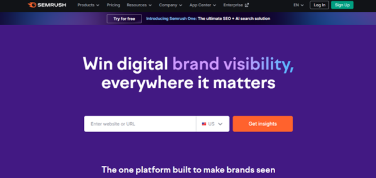
Source: Semrush. Ultra-compelling CTA + strong social proof = success!
For example, when businesses run paid campaigns, SEO initiatives, or email promotions as part of their broader digital marketing strategies, the landing page acts as the final conversion point, aligning traffic intent with a single, focused action.
If your homepage is the multiplex theater with snacks, trailers, Dolby surround sound, and a hundred things happening at once, your landing page is that tiny indie cinema playing one film with one door and one exit.
It exists to get visitors to:
- Sign up
- Buy
- Book
- Download
- Register
- Start something
- Commit to some form of tiny yet meaningful digital action
Think of it as the Internet’s version of “Just tell me what you want me to do.”
Now that we’ve cleared that up, let’s talk about design.
And yes, I know what you’re thinking: “Design tips? Really? What is this going to teach me that I don’t already know?”
But hear me out.
You’d be surprised how many experienced marketers still build landing pages the same way a teenager decorates their bedroom—throwing a bunch of “cool-looking stuff” on the walls and hoping the vibe is enough.
Let’s fix that.
Keep One Goal and One Goal Only
If your landing page feels like a Christmas tree—lights, ribbons, ornaments, all trying to be the star—the visitor won’t know where to look.
Choose one goal. Make everything else serve that goal.
A landing page without focus is like a restaurant that sells pizza, sushi, pancakes, and burritos. You don’t trust it. Visitors won’t trust your page either.
Build a Headline That Says Something Real
Your headline is your opening line in a first date conversation.
If it's boring, vague, or trying too hard, the other person is already mentally leaving.
Good headlines:
- Say exactly what someone gets
- Speak like a human
- Get to the point fast
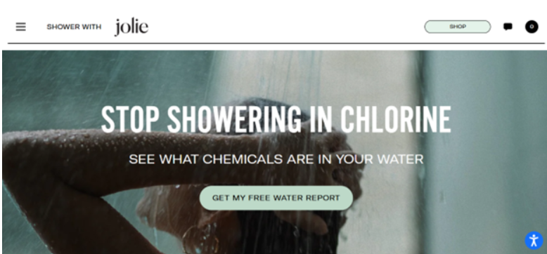
Source: Jolie. A great example of a headline that you just can’t ignore.
Aim for that energy.
Make the Page Scannable (Because Everyone Scans)
Let’s be honest: nobody reads entire landing pages unless they’re extremely bored or extremely desperate.
People scan.
Fast.
Like they’re on a mission.
Your job is to make that mission easy:
- Short paragraphs
- Bold important phrases
- Subheadings that actually say something
- Bullet points (bless them)
- Enough white space to let the page breathe
Use Visuals That Help, Not Distract
A good visual should act like a supporting actor, not a scene-stealer.
Choose visuals that:
- Show the product in action
- Make benefits obvious
- Feel real (no fake stock-photo smiles, please)
- Load fast
If your image takes longer to appear than a new season of “Euphoria,” visitors won’t stick around. Using lightweight spot illustration can help convey key points quickly without slowing down your page.
Write a CTA That Sounds Like a Real Person
Your call to action should feel like a gentle nudge from a friend who genuinely believes you’ll like something, not a robotic command from a malfunctioning vending machine.
Examples:
- “Start free trial.”
- “See pricing.”
- “Get the guide.”
- “Book your demo.”
Bad CTA energy:
- “Submit”
- “Click here”
- “Send request”
Make it clear. Make it conversational. Make it something a real person would say without sounding like a motivational poster.
Place Your CTA Like You Mean It
Don’t bury your CTA at the bottom like it’s a plot twist.
Place it:
- Above the fold
- After major sections
- At the bottom, once someone has all the info they need
It should appear often enough to be easy to find, but not so often that it feels like a YouTube ad you can’t skip. Balance is key.
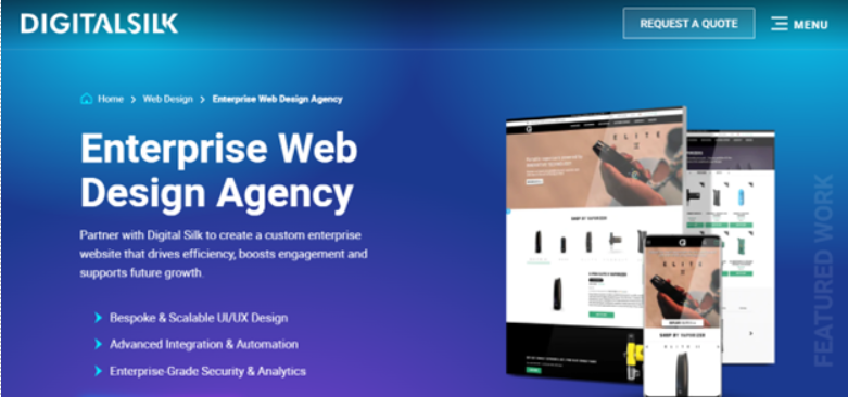
Source: DigitalSilk. Their ‘Enterprise Web Design Agency’ landing page has a big, bold, and hard-to-miss CTA.
Build Trust Fast
You have about six seconds to convince someone you’re not shady.
Add trust signals quickly:
- Testimonials
- Client logos
- Press mentions
- Stats, if they’re real
- Guarantees
- Clear privacy statements
People want to know they’re not handing their email to a suspicious digital black hole. Reassure them early.
Kill the Distractions
A landing page design should feel like a clean hotel room—everything in the right place, nothing unnecessary lying around.
Remove:
- Extra navigation menus
- Sidebars
- Pop-ups
- Random links
- Anything that isn’t pushing toward the main goal
Every extra clickable thing is an escape route. Close those doors.
One of the easiest ways to maintain this focus is to build your landing pages using a dedicated layout that is designed to keep visitors on track.
Make It Load Fast
Slow landing pages kill conversions faster than you can say “Wi-Fi issues.”
Compress your images.
Cut unnecessary scripts.
Use reliable hosting.
If your page loads slowly on mobile data, you’ve lost.
Think Mobile First
Design as if the user is on a bus, holding a phone with one hand, half-paying attention, and scrolling with their thumb.
That’s reality.
That’s who your landing page is for.
Make buttons big.
Make text readable.
Make forms short.
Use Social Proof Without Turning It Into a Parade
Social proof is powerful—if you use it right.
Don’t overdo it with a 40-mile-long testimonial scroll.
Sprinkle it:
- Near CTAs
- Under benefit statements
- In a “Customers love us” block
Short, real, and straightforward.
Test Everything (And I Mean Everything)
Landing pages aren’t one-and-done. The best-performing ones are basically living organisms—they evolve.
Test:
- Headlines
- Button text
- Visuals
- Form length
- Layout
- CTA placement
- Color contrast
Give the Page a Logical Flow
A landing page should feel like a conversation that makes sense.
- Here’s what this is
- Here’s why it’s good
- Here’s proof
- Here’s how to get it
Visitors shouldn’t have to think. They should just move.
Final Thought: Keep It Human
The best landing pages feel like someone took the time to understand the visitor—not like someone copy-pasted a “conversion-optimized template” and hoped for the best.
Be clear.
Be real.
Be helpful.
Be a little funny if that’s your style.
Landing pages aren’t billboards. They’re more like polite, persuasive conversations. And the better the conversation, the better the conversion.
About the Author