How Smart Form Design Increases Conversions in Online Lending
In lending, your form is often the first real interaction with a potential borrower. When people encounter a slow, unclear, or outdated form, they tend to leave. A well-structured and easy-to-use form helps create confidence. Today’s borrowers look for clarity, speed, and security. A better form experience can influence how many users complete the process and turn into leads.
Photo credit
First Impressions Are Everything—Especially in Lending
In a world where consumers can order dinner, schedule a ride, and refinance their mortgage—all without speaking to a human—your lead form is your brand’s first real impression. If it’s slow, clunky, confusing, or designed like a tax return from 2007, you’ve already lost them.
Especially in fast-paced industries like online lending companies, where borrowers expect immediacy, clarity, and trust, bad form experiences are more than just an inconvenience. They’re a conversion killer.
The Data Doesn’t Lie: Most People Quit Before They Even Start
Usability research on effective web form design shows that designs with too many fields or unclear structure often lead to high abandonment rates, especially on mobile devices. It is not that users lack intent. They leave because the process feels unnecessarily difficult.
And here’s the kicker: most businesses don’t even know this is happening. They’re watching their traffic rise, but their leads stagnate. Sound familiar?
It’s Not About Shorter Forms. It’s About Smarter Ones.
Cutting your form down to four fields might feel like a win, but what if it’s still ugly, glitchy, or makes the user feel like they’re being interrogated?
Here’s what modern borrowers actually want:
a. Mobile-first design that doesn’t require two hands and a desktop monitor
b. Progress indicators that show how far along they are (and how much longer it’ll take)
c. Logic-based questions that adapt to their responses
d. No unnecessary repeats if they gave you their ZIP code, don’t ask them for their city again
e. Security cues that make them feel safe giving up their personal info
Borrower Psychology Isn’t a Buzzword. It’s the Blueprint.
Consumers today don’t want friction. But more importantly, they don’t want to feel uncertain. And that’s what bad forms create: tiny moments of doubt.
a. “Why are they asking for this already?”
b. “Is this even secure?”
c. “How long is this going to take?”
Each of these questions adds cognitive load. And in lending, where the stakes are high and personal data is involved, that cognitive load becomes emotional friction.
What Lending Funnels Can Learn From E-Commerce
E-commerce figured this out years ago. That’s why:
a. Amazon has one-click checkout
b. Shopify stores auto-fill your info
c. Apple Pay skips forms entirelyYet many lending sites still expect users to fill out long, non-dynamic forms that look like they were designed during the MySpace era.
It doesn’t have to be this way. The same dynamic principles that fuel e-commerce conversions apply to online lending companies too.
The Trust Gap: What Your Form Is Actually Saying
Your website might say “We value your privacy”, but if your form looks suspiciously like a phishing scam, no one’s buying it.
Good forms don’t just collect data. They build trust through:
a. Clean visuals
b. Friendly, human copy
c. Consistent branding
d. Secure indicators (like SSL badges or trust seals)
e. Fast load speeds
Borrowers want to feel like they’re in the hands of a reliable lender, not a startup still figuring out its domain name.
Less Is More—But Only If It’s Enough
Trimming fields is smart. But what’s smarter is only asking for what you need, when you need it.
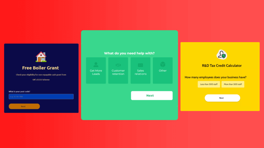
Multi-step forms with conditional logic are the secret weapon here. They feel lighter, keep users engaged, and let you segment your leads without overwhelming them upfront.
LeadGen App’s approach to conditional forms does exactly that. It meets the user where they are, based on the path they’re taking, just like a good conversation.
A Note on Compliance (Because It Matters)
Especially for online lending companies, compliance isn’t optional. But too often, companies hide behind disclaimers instead of integrating them thoughtfully.
Smart lead forms:
a. Display disclosures clearly without killing conversions
b. Include consent checkboxes that feel like part of the flow
c. Build transparency into the experience itself, not just the fine print
When compliance is built into UX, not slapped on after, it becomes a competitive advantage.
You Can’t Fix a Funnel You Can’t See
Still using a form tool with zero analytics? You’re flying blind.
Form abandonment tracking, field-level drop-off metrics, and A/B testing aren’t just for nerds in the marketing department. They’re essential if you want to stop losing leads silently.
Platforms like LeadGen App let you see exactly where borrowers leave and why. From there, every edit becomes strategic, not a guessing game.
Want Better Leads? Create a Better Experience.
The truth is this: you’re not losing leads because they weren’t interested. You’re losing them because they didn’t feel seen, safe, or supported.
Fix that, and you don’t just boost your conversion rate. You earn trust in a market where trust is everything.
Especially for industries like online lending companies, where competition is brutal and skepticism is high, your form isn’t just a form. It’s your brand in action.
Conclusion
Improving the form experience is a practical step toward increasing completed applications. Clear design, useful logic, and secure presentation reduce the chances of users abandoning the process.
Borrowers respond well to forms that are simple and relevant. By focusing on the user journey and reducing friction, lending companies can improve the overall quality of their incoming leads.


