5 Instant Ways to Improve Your Online Forms (and Ask Better Questions)

Most businesses run marketing campaigns on their websites in a bid to get potential clients to either call them or fill out an online form for them (the businesses) to reach out. This is a long shot and businesses have to make sure that everything works well.
There is very little that businesses can do on their websites to convince visitors to call them apart from building the right landing pages with exciting messages. On the other hand, many factors can influence a website visitor to fill out or not fill out your online form.
Fortunately, you can control most of these factors. It is however important to understand that people do not like filling out forms. It consumes time and can be annoying.
So what can you do to improve your online forms and ask better questions?
Use Meaningful Validation Messages
Form validation is one of the most important things to include in your online forms. This is because it notifies your users about any incorrect information that they might have entered into your form.
In such a case, the user will know what is wrong and how to fix it. This ensures that you get the correct information from your users. You, therefore, need to make sure that you are using meaningful validation messages.
For instance, if a user needs to create a password and you have certain requirements for passwords, ensure that you have included these messages for users. They should not struggle to understand your validation messages.
Group Related Information
Some businesses require different types of information from their clients. For instance, if you are running an eCommerce store, you might ask for personal information, payment details, and residential information, among others.
When building your form, you need to ensure that this information is grouped depending on how it is related. This means that you should group your form fields into sets that make it easy for your users to not only fill but also review the filled information.

In addition, ensure that you have grouped the form fields logically. If you need any mandatory information, ensure that you have indicated it on the form. It is also good to indicate the optional parts of the form.
Ensure Your Call To Action Stands Out
What would be the need of a user to fill out a form and then struggle to submit the information? To start with, you will have ruined the reputation of your brand. Additionally, you will not even get the information that you are desperately looking for.

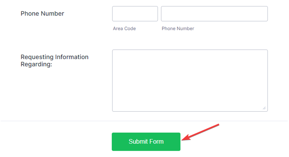
To avoid this, you need to ensure that your call-to-action buttons stand out. You can do this by making it easy for your users to find the buttons and also making them look good. You can place these buttons below the form, close to the last input field. This is important in making your online form convert better.
If you have more than one button, then make sure that users can easily differentiate the buttons. You can use different colors but the focus should remain on the primary button. For instance, you can use a link for the secondary CTA and a button for the primary one.
Ask Relevant Questions
This is a mistake most businesses commit. You should make your questions highly relevant to your industry. For example, bars could ask about favorite beers. If you would like to know anything about beers to help you ask the right questions, you can find help at Untappd.
Why would you be asking users to provide you with their residential address when you are not going to use it anywhere? It is important to understand that people are sensitive when it comes to their personal information.
If you ask for irrelevant information, you will be hurting your conversion rates. This might end up affecting your business marketing efforts, leading to losses. You should also abide by set regulations when collecting data or personal information.
Avoid Using Placeholder Text
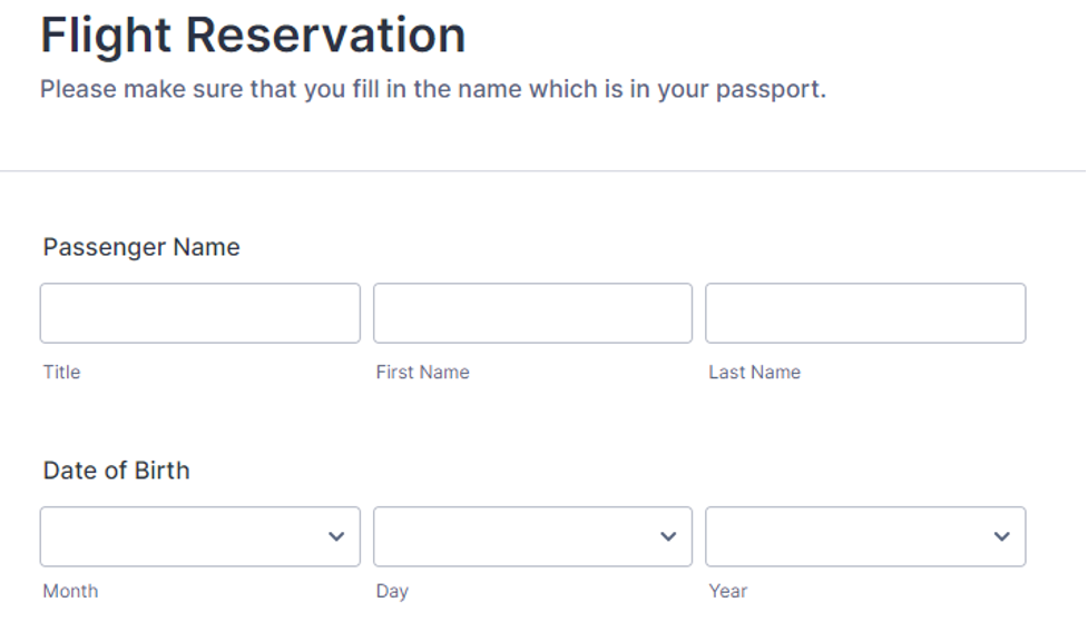
This is a little bit tricky and depends on the design of your online forms. However, try as much as you can to avoid using placeholder text. Instead, ensure that the text fields are labeled well.
Using blank forms makes it easy for users to see where information is needed. Sometimes, your placeholder text might confuse users who assume that the text fields have already been filled in. This leads to frustration due to errors thrown by your form.
Following the tips discussed above, you will improve your online forms instantly and ask better questions.


