Form Conversion Tips: 10 Best Practices for Optimal Results
The effectiveness of online forms, including form conversion tips and best practices, plays a pivotal role in shaping user interactions and driving conversions. Whether it's a contact form, a signup page, or a survey, optimizing your forms is essential for creating a seamless and engaging user experience.
In the ever-evolving landscape of online engagement, optimizing form conversions is a pivotal aspect of ensuring a seamless user experience and achieving desired outcomes. Whether you're collecting customer information, generating leads, or facilitating transactions, the effectiveness of your online forms plays a crucial role in the success of your digital initiatives.
What are form conversions?
To maximize form conversion rates, consider implementing the following ten tips and best practices:

These strategies are designed to streamline the form completion process, enhance user satisfaction, and ultimately lead to higher conversion rates for your online forms. Form conversion refers to the transformative process of turning a visitor to a website or other online platform into a potential lead or customer. Essentially, form conversions represent the individuals who have visited your online space and actively chosen to complete a form, expressing their interest in receiving additional information.
When visitors proactively seek more information, they signal a genuine interest in sustained interaction with your business. Subsequently, the forms meticulously crafted for conversions play a crucial role in collecting vital information about leads. This includes details such as their name, contact information, specific products or services of interest, and any other particulars relevant to your sales procedures.
The optimization of form conversions becomes a strategic endeavor aimed at maximizing lead acquisition and streamlining the sales process, ultimately enabling you to generate increased revenue with greater efficiency.
This guide explores ten comprehensive form conversion tips and best practices that go beyond the surface, delving into the nuances of design, user psychology, and strategic implementation
Let's embark on a journey to transform your forms into powerful tools that not only capture data but also enhance user satisfaction and drive meaningful conversions.
1. Clear and Concise Copy
Ensure that your form instructions and labels are clear, concise, and easy to understand. Use simple language to guide users through the form completion process.
2. Mobile Optimization
Design your forms to be mobile-friendly, as an increasing number of users access websites on mobile devices. Responsive design ensures a seamless experience across various screen sizes.
3. Progress Indicators
If your form happens to be lengthy, consider implementing progress indicators. These indicators effectively show users how far they are in the process, helping manage their expectations and encouraging completion.
4. Minimize Form Fields
Only ask for information that is absolutely necessary. Minimizing the number of form fields reduces friction and increases the likelihood of users completing the form.
5. Smart Form Logic
Implement conditional logic to show or hide certain form fields based on user responses. This creates a personalized and streamlined experience, preventing users from feeling overwhelmed.
6. Aesthetic Design
Opt. for a clean and visually appealing design for your forms. Use a visually consistent layout, color scheme, and font to create a professional and trustworthy impression.
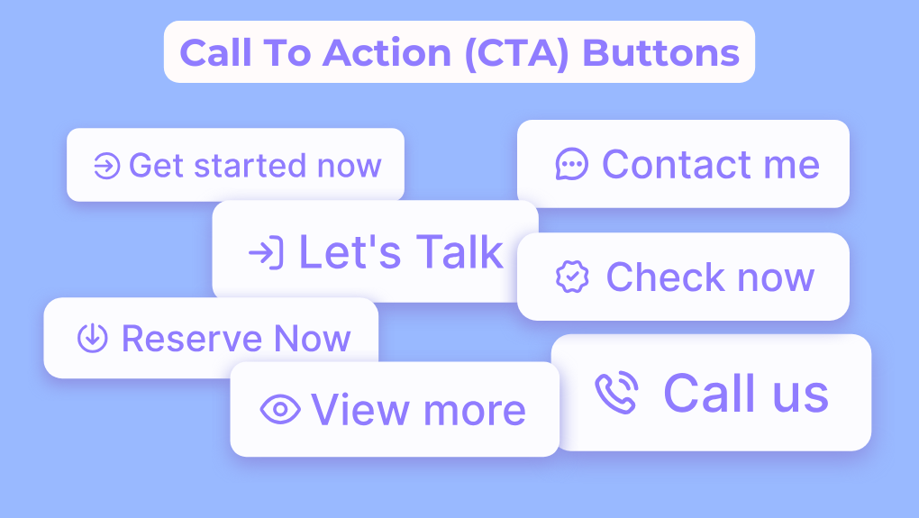
7. Compelling Call-to-Action (CTA)
Craft a compelling and action-oriented CTA button. Use language that conveys a sense of urgency or emphasizes the value users will receive upon completing the form.
8. Social Proof and Trust Seals
Incorporate social proof, such as testimonials or user reviews, to build trust. Additionally, display trust seals or security badges to reassure users about the safety of providing their information.
9. Inline Validation
Implement inline validation to provide immediate feedback on user input. This helps users correct errors in real-time, reducing frustration and preventing form abandonment.
10. Thank-You Page Optimization
After form submission, optimize your thank-you page. Use it as an opportunity to express gratitude, provide next steps, or even encourage users to take additional actions, such as sharing on social media.
Ensure to consistently test and analyze your forms' performance using analytics tools. This helps identify areas for improvement. By continually optimizing your forms based on user feedback and behavior, you can achieve increased conversions and create a more positive user experience.
Conclusion
Mastering the art of form conversion involves a strategic blend of user-centric design, clear communication, and seamless functionality. By adopting the ten tips and best practices outlined above, you position your forms as efficient tools for engagement and conversion.
Regularly analyze user feedback and performance metrics to refine your approach, ensuring that your forms evolve in tandem with user expectations. As you implement these strategies, remember that optimization is an ongoing process—a commitment to continuous improvement that aligns your forms with the dynamic needs of your audience.
With these insights, may your forms become not just gateways to information but seamless conduits to meaningful user interactions and successful conversions.


