10 Ways to Create a Landing Page That Converts
Creating effective landing pages is a core part of your digital marketing strategy. By focusing your audience’s attention on one specific offer that’s targeted to them, landing pages can secure sky-high conversion rates, whether you’re hoping to collect customer information (e.g., on a lead capture form) or increase sales. However, when consumers visit one of your landing pages, several factors can potentially put them off and prevent you from achieving conversions. Therefore, if you want to create a landing page that actually converts, you need to avoid these mistakes and instead follow the best practices highlighted below.
In this informative guide, you’ll discover how to create a landing page that converts. With these helpful tips, you’ll be able to pique your customers’ interest and reduce the likelihood of people clicking away from your pages without converting.
1) Ensure That Your Messaging Is Consistent
A landing page features an offer that’s created by a professional designer for a specific target audience, with the aim of maximizing conversions. Therefore, when someone lands on this page by clicking a link in the SERPs, an email, an ad or another digital location, they want to immediately know if you’re offering something useful to them.
This is why you should hire a freelance graphic designer to make sure that messaging is always consistent. If your CTA or meta title doesn’t match the actual title on the page once the user arrives, they may think they’ve been directed to the wrong place. This means they’ll be more likely to click away and search for what they need elsewhere.
2) Include A Soft Conversion Option
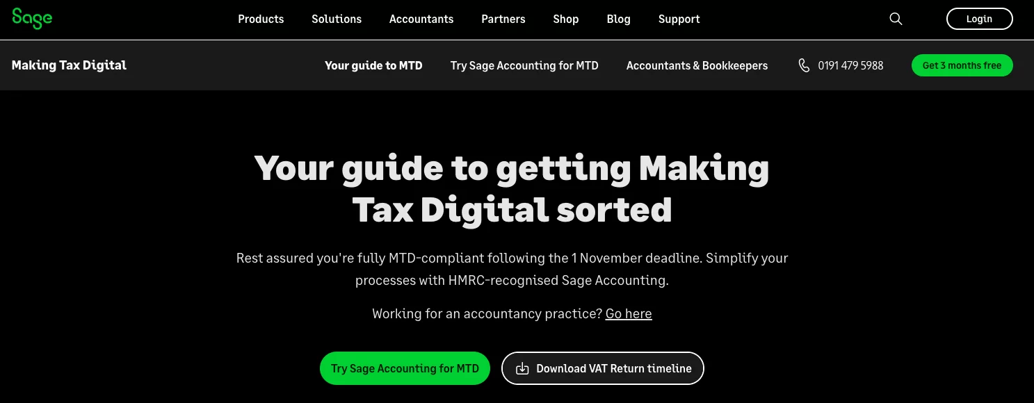
In order to cater for users who want to engage with your brand but are not ready to purchase, you should always have a "soft" conversion available. This could be a free download or newsletter sign-up (or something similar). A good example of this is here, where you can see there is the chance to download the "VAT timeline" as well as the "Angebotssoftware" sign-up button, providing users with easy access to valuable resources and software tools. By downloading the free .PDF users have a piece of company collateral and should be more inclined to make a purchase and/or further brand engagement in the future.
3) Optimise Your Content
Since you’re targeting a specific audience, you need to ensure that the content on your landing page is optimised for them. This will help them gauge whether they’re interested in what you’re offering. For example, the keywords in your content should match what this demographic is searching for in the SERPs, as this will direct them to your page and reassure them that this offer is relevant to their needs. To help you do this, you need to create a target persona for each landing page by using customer data. This data will tell you key details about your average customer, such as their demographic details, interests, goals and pain points.
Once you’ve created a target persona for the landing page, you can tailor your content to them. This means using relevant keywords and adding value to your offer by addressing their specific problems and how you can solve them. Finally, make sure that you’re as brief as possible while still emphasising value in your content. Too much content on a landing page can be off-putting, so you need to get to the point and facilitate easy reading by using bulleted lists.
4) Remove Navigation Options
Another reason why you don’t want too much content or clutter on the page is that this can distract from your offer. Since your landing page is solely focused on this offer and boosting conversions, any distractions can be harmful to your goals.
This includes common webpage elements such as the navigation bar. Other pages on your website should allow visitors to move through the site and hopefully convert, but if a user is on your landing page, you want to keep them there so they can consider your offer.
5) Boost Page Loading Speed
Slow loading speeds could drive customers away before they even see your offer. Nowadays, most internet users will immediately click away from a page if it doesn’t load within a few seconds, so if your landing page has a slow loading speed, you’re already setting yourself up for failure.
To boost your page loading speed, make sure you remove unnecessary clutter from the page. If you have lots of images, you may want to get rid of some of them or reduce the image sizes. This will reduce the time it takes for your page to load and hopefully slash your bounce rate.
6) Don’t ask for too much information
As we’ve established, users can be pretty impatient. Not only does this mean that they’re likely to bounce if your landing page loads too slowly, but it also means they could give up on your lead capture form if there are too many boxes to fill in.
Therefore, if you’ve chosen a lead capture form as your conversion option, you need to ensure that you’re only asking for essential information. This will make it much easier for customers to quickly fill in their details, thus increasing the chance that they’ll complete the form. Alternatively, you could reduce the amount of space between each field to make the form look shorter and less time-consuming.
7) Include Testimonials
Consumers may be hesitant to buy your product or give up their information if they don’t know a lot about your business. No matter how good your content is, nothing will beat an honest testimonial from a satisfied customer. Including these testimonials will reassure visitors that what you’re offering is high-quality and legitimate, which will make it more likely for them to convert.
8) Position Your CTA(s) Correctly
To maximise your chances of securing conversions, you should always try to place your CTA above the fold so that the user doesn’t have to scroll down to find it. If your CTA isn’t immediately visible, users may not notice it and decide to click away.
If placing your CTA at the top isn’t possible, you need to ensure that it’s clearly marked on the page, such as with animations, a large button, bright colours or arrows. Similarly, if you’ve placed your CTA at the top but the rest of your landing page is filled with content, it’s a good idea to include another CTA at the bottom and add these markers to draw attention to it. This will remind the consumer to act after reading your content.
9) Encourage Sharing
Unfortunately, you can’t expect every user to convert on your landing page. However, by making your content shareable, you could potentially secure more conversions from other users sharing your page with their followers. To make your content shareable, you need to provide both original, interesting content and social media sharing buttons that are clearly visible on the page. Also, remember to include your brand logo design; for example, if you offer lawn care services, introduce your lawn care logo design on the landing page.
10) Link To Your Privacy Policy
Sometimes, your target audience may have reservations about the security or legitimacy of your site, rather than the loading speed, content or visibility of your CTAs. In this case, you need to reassure them that the information they input into your load capture form is secure.
To do this, it’s a good idea to include a link to your privacy policy. This could even be a legal requirement depending on your location, as laws like GDPR stipulate that you must provide this privacy information. In addition, including security seals and certifications can reassure users even further.
Boosting Your Conversions
By following these techniques and best practices, you can ensure that your landing page actually converts. Try implementing these simple changes to see how they can boost your conversion rate.
Finally, to improve your marketing efforts even more, you should focus on creating additional landing pages to cater to multiple offers and target personas. With more landing pages, you can generate more leads by creating further opportunities to target offers towards specific consumers.


