How You Can Make Long Forms Engaging
The questions in long forms and surveys can massively impact your response rate. In general, the more questions, the lower the response or conversion rate tends to be. I rarely fill in any surveys if there are more than 5 questions.

Still, there are cases when you need to ask for more information, e.g. for capturing medical and health details, for applications, questionnaires, quizzes. But the point is, how you're going to pull your customer's attention to take time to fill every form field.
There are a number of things you do to improve long forms for better user experience and higher conversions:
1. Use multi-step forms

Instead of using a long single-step form, build a multi-step form where you can group your questions into bite-sized chunks. You can also use a progress bar on top of the form to provide clarity on how many steps the user still needs to complete.
Every industry utilizes multi-step forms, whether it’s to capture a lead, collect data or facilitate registration. Especially online forms in the healthcare industry require dozens of field entries, you need to streamline the way you collect information.
Multi-step forms can make a big difference as they are so much more intuitive and lean vs. long forms that overwhelm the users with too much information.
2. Include media elements

Going through a long form is typically not fun a thing to do. This is where designers play an important role to create a better and more fun user experience. You need to work on form design and add images and video content within the question steps which increases engagement and keeps users interested.
Related: 6 Ideas To Make Online Form Filling Fun
3. Remove unnecessary questions
Be mindful what questions you ask in an online form. Most of the time, people like to collect all kinds of data, but in reality, there is little to no value in many of the questions asked.
The better approach would be to critically review your questions and to cut out those that are not adding value. It will save time and also you will likely see a better conversion rate.
Furthermore, it’s important to avoid questions that can confuse the user. Here is an example featuring two questions in one which is not a good way of asking questions:

Instead, be very specific with your questions and use the right question type. In this example, it would be much more useful to go with a multiple-choice question.
4. Run A/B tests
LeadGen allows you to create form variations and test them against each other with A/B testing. Create similar variations and test how users interact with it. Step by step, you can increase conversion rates and learn from the numbers. LeadGen will show you numbers on form visitors, conversion rates, leads and completion time. Make this an ongoing exercise and record as much tracking data as possible.
An A/B test doesn’t just stop after a single split-test. Instead, create multiple challenger form design variants and continuously challenge the winner variant for better results.
5. Optimize the landing page

Typically, online forms are hosted on a website or landing page. Use a professionally designed landing page in which your form is embedded. Don’t use a basic web-page, an empty page or send out the link directly if you have a long form.
In some cases, it makes sense to add an FAQ list and other resources to the page to help the users understand the context. The FAQ questions help address all the possible reasons why someone wouldn't fill it.
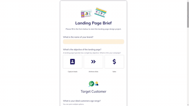
6. Use a start screen

A start screen in multi-step forms shows the user what type of questions and categories to go through. It prepares users mentally for the length of the form. So often, I was filling in survey forms and stopped it because it took more time than I expected.
Just recently, I got a survey email from an airline to rate my recent flight experience. I was quite happy with the experience, so I thought I will take a bit of time to go through the form. It had no progress bar or start screen, so I stopped, probably half-way through (I had no idea where in the survey I was).
The image above shows a start screen that provides an overview about the form before asking any question. You can build such a form in LeadGen with textboxes on the first form step.

7. Use icons and emojis
You can do a lot of stuff with your form design. Use custom icons, illustrations or emojis that appear within your form content. Other than full images, icons stand out more and create a great visual experience. The GIF image shows a long single-step form which is sub-divided by headings and icons.
Try out these best practices in your next online form and see the effect on your response rates! Get in touch to share your results with us.
About the Author


