The Impact of High-Converting Website Design on Lead Generation Success
A solid digital platform not only reflects a brand's identity, but also gently guides visitors to become interested prospects. It often combines a friendly layout, inviting prompts, and clear, relatable writing. With a structure that feels natural and welcoming, individual pages can further be transformed into nooks that spark curiosity and real inquiries.

Understanding User Psychology
By tapping into the feelings and thoughts of visitors like trust, belonging, and positive vibes, you can shape a journey that nudges them toward reaching out. This means using colors that stir up emotions, easy-to-read fonts, and images that feel just right.
Different parts of the site, from text spacing to picture choices, also play a role in how people feel about it. When words are clear and visuals support the message, it creates an overall vibe of honesty and warmth. This further encourages visitors to take action.
Optimizing Site Navigation
Organizing your content with clear sections and easy labels cuts down on confusion and keeps people interested. A logical setup also means visitors can move around without feeling lost. This often leads them to discover more about what you have to offer.
Clear navigation and simple titles further allow users to skim through your site effortlessly. When the layout feels like it has been specifically designed for the audience, it naturally boosts interest and conversions.
The Impact of Visual Appeal
The look of your pages can have a huge impact. Using top-notch images, a balanced mix of colors, and a fresh layout can quickly boost value. These visual touches also set a professional tone and invite people to stick around longer. At the same time, it is important that a cool look does not slow things down or make navigation tricky. The overall experience should remain smooth and simple, so visitors feel comfortable interacting with every part of the platform.
Creating Compelling Content
Strong, honest writing is the heart of any successful online space. The words should speak directly to the reader, addressing their needs and showing clear benefits of what you offer. A mix of friendly language and well-placed keywords helps more people find your site. It also keeps them engaged with simple and effective messages.
Additionally, breaking the text into clear parts with lists or steps makes it easy for literally anyone to follow along. This method not only clarifies the basics, but also urges visitors to take action.
Strategic CTA Placement

Invite buttons and links are essential in turning a casual visit into a real chance for connection. Placing these elements in just the right spots can help prevent them from feeling too pushy.
Whether it is a sign-up option, a download, or a contact form, these cues must also blend naturally. This means using contrasting details and clear, simple words to remove guesswork for visitors.
Leveraging Social Proof
Showing that others have had good experiences builds a sense of trust that can be hard to beat. Including reviews, success stories, or quick notes from happy buyers also adds a friendly and genuine touch. This kind of proof further makes it easier for individuals to feel confident about taking the next step.
Mobile Optimization
Adjusting the design so that it fits smaller screens ensures that everyone enjoys a smooth experience. This flexibility is also key to keeping all kinds of visitors interested. Tweaking text sizes, images, and touch-friendly features can further make the platform feel more personal and inviting. Overall, a refined approach actively encourages exploration and doubles sales.
Enhancing User Experience
A fast-loading site feels more reliable and reduces the chance of drop offs. Simple adjustments like resizing pictures and cutting out extra code can boost responsiveness. Regularly checking the loading pace and making small improvements also guarantees that nothing holds the site back.
When everything runs smoothly, it automatically builds trust and channels word-of-mouth referrals.
A/B Testing
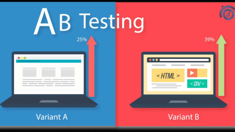
Trying out different options to see which one gets the best reaction is a smart way to improve your pages. By comparing various layouts, word choices, or button styles, you learn what truly clicks with your visitors. This hands-on approach also helps you decide based on real feedback instead of just guesswork. An ongoing process of testing and tweaking further means you can keep refining the site until it is just right for turning users into real connections.
Integrating SEO Best Practices
Drawing people to your page without paid ads comes down to using smart techniques. This involves adding keywords, clear summaries, and linking to trusted pages so that search engines naturally show your content. Beyond the technical tweaks, creating friendly, useful guides makes your page a go-to spot for answers.
Regular updates and fresh material not only boost your ranking, but also make people want to come back. This can be vital for keeping the conversions going. If you do not have an in-house team, working with a New York City digital agency or other dedicated professionals in your region is a good idea.
Conclusion
In today’s online scene, a site must do more than just share information. It should invite and encourage people to reach out. Focusing on a design that is welcoming and easy-to-follow helps create a solid digital space. The best part is that with regular checks, any platform can be easily kept fresh and friendly.
About the Author


