Crafting Multi-Step Forms That Boost Conversions for Professional Services

Image Source: Pexels
Filling out forms is a necessary step to securing new clients for any professional services provider. The problem is that this can be tedious if it’s mishandled. To avoid this and actually increase conversion rates rather than compromising them, here are some tactics to try yourself.
Understanding User Intent and Behavior
Grasping why users visit your form is key. Are they seeking a quote, scheduling a consultation, or something else entirely? Knowing their intent helps tailor each step to their needs, improving conversion rates.
Analyze user behavior through:
a. Heatmaps
b. Session recordings
c. Surveys and feedback forms
Let’s say you’re aiming to convert clients looking for legal advice. If they see irrelevant fields early on, they may abandon the process. But by showing them relevant steps first, you keep them engaged. Prioritize essential questions upfront but save detailed inquiries for later stages. This approach builds trust without overwhelming visitors initially.
And since 93% of businesses see trust as a way to boost revenues, it’s a financially savvy move as much as anything else. Also, use A/B testing to refine your forms continuously based on real data insights. It’s not just about design, as understanding behavior drives higher engagement and completion rates.

Structuring Forms to Reduce Drop-Off Rates
A clear structure keeps users engaged, and 60% of people value transparency above all else in the businesses they choose, so unambiguous form design is a solid starting point. Divide the form into manageable sections, each with a single focus.
Break down complex queries into:
a. Personal information
b. Service specifics
c. Additional details
For example, when creating an onboarding form for financial services, start with basic contact info. Next, move to specific service requirements before gathering optional details. Visual progress indicators show users their advancement through the form. It reassures them that they're nearing completion. Auto-save functionality ensures that partial completions aren't lost if users need to return later.
This small touch can make a significant difference in reducing drop-off rates. Using conditional logic helps streamline this process further by hiding irrelevant questions based on previous answers. Simplifying the flow and ensuring it aligns with user expectations fosters a smoother experience and ultimately boosts conversion rates.
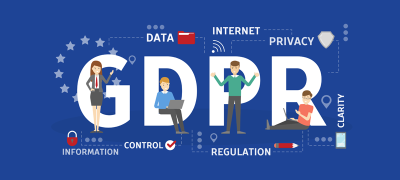
Ensuring GDPR Compliance in Multi-Step Forms
It’s sensible to make sure every data collection step adheres to GDPR guidelines. Even if you aren’t aiming to appeal to prospects in European countries, sticking to the specifics of this regulation will give you both flexibility and future-proof form designs.
Implement these steps:
a. Obtain explicit consent
b. Clearly state data usage purposes
c. Provide an option to withdraw consent

For instance, when asking for personal information in a healthcare service form, ensure you explain why each piece of data is necessary and how it will be used. Transparency builds trust. Include links to your privacy policy directly within the form. Also, use secure encryption methods for data transmission and storage. This protects user information from potential breaches.
If in doubt, work with a local data privacy attorney to iron out compliance issues with confidence. They’ll guide you through complex regulations and help safeguard against potential legal pitfalls. Lastly, regularly audit your forms to keep up-to-date with evolving laws. Staying compliant not only avoids penalties but also enhances user trust.
Utilizing Conditional Logic for Personalized Experiences
Conditional logic tailors form to individual users. By adjusting questions based on prior responses, you create a personalized experience.
Here's how to apply it:
a. Show relevant fields only
b. Simplify user journey
c. Avoid redundant questions
For example, in an insurance service form, if a user indicates they own a car, the next step can automatically ask for vehicle details. If not, skip that section entirely. This dynamic approach reduces unnecessary steps and keeps users engaged by making each question relevant. Employing conditional logic also helps streamline data collection.
You gather precisely what’s needed without overloading the user with irrelevant inquiries. Test different logical flows to see which resonates best with your audience. Fine-tuning this aspect ensures higher completion rates and better data accuracy. In essence, tailored interactions through conditional logic foster smoother experiences and higher satisfaction.

Designing Visually Engaging Form Interfaces
A visually appealing form makes a world of difference. First impressions count, so ensure your form looks professional and inviting.
Consider these elements:
a. Clean layout
b. Consistent branding
c. Intuitive navigation
Start by using ample white space to avoid overwhelming users with too much information at once. This keeps the focus on individual fields without distraction. Consistent color schemes and fonts that match your brand reinforce trust. If you’re a tech consulting firm, sleek modern designs may appeal more than playful colors. Interactive elements like hover effects and animations add a touch of dynamism but use them sparingly to avoid cluttering the interface.
Meanwhile, clearly labeled buttons guide users effortlessly from one step to the next, enhancing user experience. Basically, well-designed forms are easier to navigate and more likely to be completed, boosting conversion rates through visual appeal alone.
Conclusion
Multi-step forms which are designed with the user in mind, while also being structured sensibly and built with compliance as a cornerstone stand the best chance of converting leads into loyal clients. It may take time to iterate a suitably impactful form for your professional services, but the effort is worth the payoff.


