Smarter Form Strategies That Turn Visitors into Qualified Leads

Image by Bay Bank from Pixabay
Most visitors do not convert on the first visit; they skim, compare, and leave. Your job is not to force a sale. Instead, you should nudge the next micro step. It can be a scroll, a tap, filling a field, or opening a calendar.
Micro conversions warm up cold traffic and tell you who is leaning in. The right form patterns capture this momentum, and the wrong ones add friction and push people away. Use this guide to turn passive attention into qualified leads you can close.
1. Map Micro Steps to Intent, Then Match the Form
Start with a simple journey map. List the actions that show rising interest, such as email capture from a blog, a pricing view, or a features comparison. Each moment deserves a tailored ask. Use short forms at the top of the funnel, and deeper qualification near decision pages. Be sure to link behavior to form logic.
Work with Bizango designers to draft flows that fit the context and page goal. Keep the promise clear, and tell people what they get and when. The form should feel like a helpful next step, not a hurdle.
2. Reduce Fields Without Losing Clarity
Every extra field costs you, and many do not add value. Ask only for what you will use in the next seven days. Name, email, and one qualifier are often enough. Let the sales call collect the rest. Replace long text boxes with crisp choices, and make sure to use radio buttons or select menus where possible.
Add optional fields rather than required ones. If you need more data, trigger a short follow-up form by email. Keep the copy plain, and avoid clever labels that confuse. Clarity makes people feel safe. Track completion time and abandonment by field, then cut the worst offenders first.
3. Use Multi-Step Forms to Pace Commitment
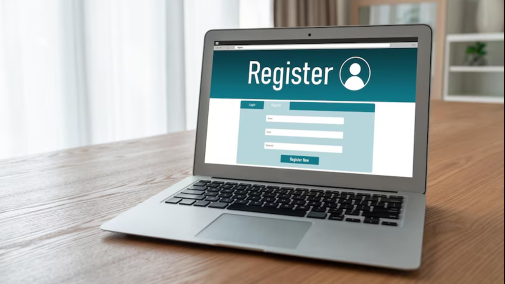
Breaking a form into steps lowers fear. People will start when the first step feels light. Begin with easy items to build momentum, and save identity fields for later. Show a simple progress indicator so that people know there is an end.
Use inline validation to catch errors early, and never wipe data when refreshed. If a form is long, add a save and finish later option. Pace the form so the next click feels obvious, and test different step names to reduce perceived effort.
4. Make Mobile View the Default
Most traffic comes from mobile users. Thumb reach and small screens change behavior. Place labels above fields, and make tappable areas generous. Use numeric keyboards for phone fields, and auto-advance between short fields. You should also avoid pop-ups that block the keyboard.
Additionally, cut long menus that make users scroll forever. Be sure to test with fat finger mistakes in mind. On desktops, keep the same clarity. Respect bigger screens with better spacing and readable type. Do not hide the submit button below the fold. Instead, make it easy to find.
5. Add Trust Near the Form
People decide with emotion, then justify with proof. Surround your form with quiet trust signals, and place a short privacy note under the email box. Additionally, link to a policy for details, and add one or two relevant testimonials close to the form.
Include badges that matter to your buyers, such as security seals, ratings, or industry memberships. Avoid a wall of logos that looks like noise. If you ask for a phone number, say why, and explain how often you will call or text. Make consent simple to understand.
6. Upgrade Microcopy, Error States, and Feedback
Replace vague labels with plain language. For instance, say “Work email” instead of “Email”. Use helper text to set expectations like “We reply within one business day”. When errors happen, be specific and tell the user what went wrong and how to fix it.
After submission, give clear next steps like “Check your inbox for a calendar link”. Add a progress bar for downloads. Small messages reduce anxiety. They also cut support tickets. Polite UX improves conversions.
7. Turn ‘Thank You’ Pages into Next Steps
Use the confirmation moment to advance the journey. For instance, you can show a calendar link to book a call, offer a short quiz to tailor the demo, or provide a case study that fits the segment. Add social proof that reinforces the decision.
If the lead is not ready, route them to a low lift step like subscribe, share, or save a checklist. Be sure to track which option they choose, then route automation accordingly. Your pipeline becomes warmer and easier to close. Additionally, attribute revenue directly from thank you actions.
Conclusion
Micro conversions reveal interest one click at a time. Design forms that meet intent, earn trust, and pace commitment. Trim fields, fix copy, and test on real phones. You should also treat the thank-you page like a sales asset.
When every step feels helpful, passive visitors move forward. Leads arrive pre-warmed, sales calls feel natural, and conversions rise because the journey respects how people decide.


