The gap between a fast website and a converting one
Website creation was the bottleneck in any marketing process before. It took weeks to draw wireframes, a little bit more to develop a website, and then the marketing calendar had to be aligned with the launching date. This constraint has been removed almost entirely. An advanced generator is capable of producing a decent-looking, responsive and well-structured website based on a brief description within one day, and small companies create pages they would have never paid for.
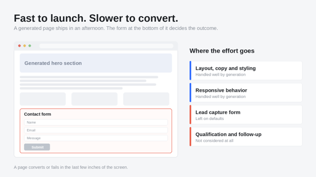
The only thing that has not changed is the point when the visitor decides to give away his contact information. And the form is precisely what turns into the bottleneck. It is the element that the automatic generation technology deals with the worst. Websites are created faster than ever, but their ability to capture leads remains generic: Name, Email, Message and Submit buttons.
What actually gets generated when a form appears
According to an AI Website Builder, a form looks just like any other layout element – it must look neat, be put in the right spot, and work correctly on mobile. By these standards, the result is truly great. The fields are evenly spaced, the label is legible, and the button contrasts with the background.
Unfortunately, a form is not a layout element. It is a negotiation, where the visitor is supposed to provide some private information in return for something that they have not got yet, and every single field either increases or decreases the apparent price. The generation systems optimize for aesthetic harmony since this is the only thing they can measure. No one wonders about the field which makes people close the window.
Thus, the website is built with a form which looks polished and works like an afterthought. The traffic comes in, people browse the site, a certain number of them scroll down to the form, and most of them leave without filling out the form. Analytics show a satisfactory number of sessions but an underwhelming number of leads, while the page gets the blame for the mistake which was made in the last six inches of the screen.
Four reasons the default form underperforms
Everything is requested at once
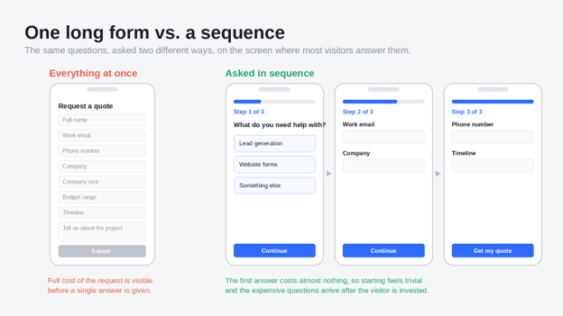
A generated form is almost always a single block of fields shown together. The visitor sees the full extent of the commitment before answering anything, and the decision to start becomes the same decision as the decision to finish. Splitting that same request across a short sequence changes the psychology entirely. The first screen asks for something easy, the visitor commits, and completion becomes a matter of momentum rather than willingness.
There is no qualification logic
Every submission arrives looking identical. A buyer with budget and a deadline lands in the same inbox as a student doing research, with the same three data points attached. Sales then spends its first conversation doing work the form could have done automatically. Conditional questions that branch based on earlier answers cost the visitor almost nothing and change the value of the lead completely.
The layout is built for the preview window
Generated designs are evaluated on a desktop canvas, but most lead forms are completed on a phone. What seems beautifully condensed at maximum width ends up being too small to hit in mobile view. Drop-downs with 15 options, calendar pickers that battle with the native keyboard, and labels that break poorly add friction that doesn’t come through in design view.
Nothing is captured before the button is pressed
This is the most expensive default of all. In a standard generated form, a visitor who fills in their name and email and then abandons the page at the message box leaves no trace at all. They were interested enough to type real information and they are recorded as a bounce. Capturing partial responses turns a portion of that abandoned traffic into a follow-up list instead of a statistic.
Form design principles that repair the leak
Break the request into deliberate steps
Group related questions and reveal them in sequence. Two to four steps is usually enough. Keep a visible progress indicator so the visitor can see how much is left, because an unmarked sequence feels endless and an endless form gets abandoned. The goal is not to hide the length of the form. It is to make the first action small enough that starting feels trivial.
Order fields by what they cost the visitor
Ask the cheap questions first. Selecting a service from three options costs almost nothing. Typing a work email costs more. Giving a phone number costs the most, because the visitor is imagining the call that follows. When the expensive fields sit at the end, the visitor has already invested effort and is far more likely to finish. When they sit at the top, they act as a gate.
Write microcopy that answers the obvious objection
A single line under a sensitive field does more work than any design change. An explanation as to why the telephone number is necessary, how fast one can expect a response, or that there will be no phone call without a set time relieves the very hesitation which leads to abandonment. Make it brief and clear and never let it sound like legalese.
Design for the thumb, not the cursor
Set input types correctly so the right keyboard appears. Make tap targets large enough to hit without zooming. Replace long dropdowns with selectable buttons wherever the option count allows. Test the form on an actual phone rather than a narrow browser window, because the two behave differently in ways that matter.
Match the form to the intent of the page
Designing one form that is going to be used throughout the whole website completely overlooks the aspect that people will come to various pages in various stages of preparedness. In a blog post, a person is browsing and not planning on making a purchase, and thus the form has to ask for something and give something else in exchange. On a page that has to do with pricing and services, the visitor is looking for comparison purposes, and qualification questions are fine since they mean a personalized answer. And on a paid landing page, where the traffic costs a lot, an interactive feature, like a quote calculator, earns contact information in exchange for results.
Making such decisions on a page-by-page basis doesn't take much effort.
Measure the form separately from the page
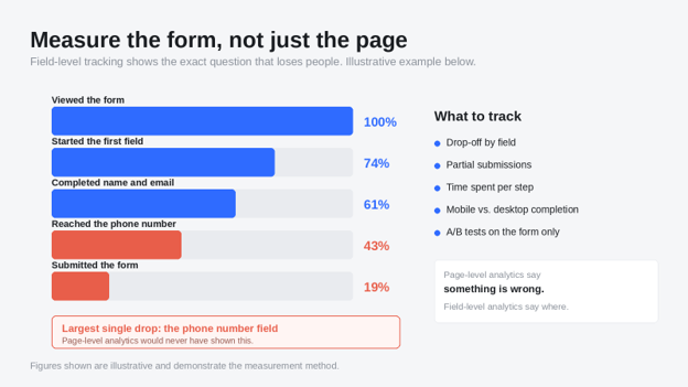
Most teams track conversions at the page level, which tells them that something is wrong without telling them where. Form-level measurement is far more useful. Field-level drop-off shows the exact question that loses people. Partial submissions show how many visitors started and stalled. Time to completion shows whether a step is confusing rather than merely long.
Running an A/B test on the form when everything else around it remains constant ensures that we can identify what really affects the result. Teams of Build Websites fast should do the same for iteration with the form, since this is one of the rare instances where we could run a test every week without redesigning anything else.
A short pre-launch checklist
- The form is split into steps, with a visible progress indicator.
- The easiest question comes first and the phone number comes last.
- At least one branching question qualifies the lead automatically.
- Partial responses are captured before the final submit.
- Every field has been completed on a real phone, not a resized browser.
- Sensitive fields carry one line of microcopy explaining the request.
- The button says what happens next instead of saying Submit.
- Field-level analytics are switched on before any traffic arrives.
Conclusion
Automated generation solved the part of website creation that used to consume the budget. It did not solve conversion, and it was never going to, because conversion depends on understanding a specific audience and a specific offer. The form is where that understanding either shows up or is missing.
The key lesson in all of this? Use the auto-built website as a fast, competent starting point, but take time to look at that 20% of the landing page that will determine if your visitors become leads. This is low-cost, it compounds over the number of campaigns that drive traffic to the landing page, and it is the best ROI edit possible when a website is built in an afternoon.
About the Author