6 Key Website Design Elements for Lead Generation
According to the 2023 State of Marketing Report from Hubspot, 50% of marketers say that the primary goal for their marketing campaigns is to generate more leads. And, considering the value of capturing high-quality leads — which have the potential to become long-term customers of your brand — this isn't much of a surprise.cBut the harsh truth is that successful lead generation is becoming more challenging than ever.
Small businesses not only have to contend with an ever-growing number of competitors. On top of that, even more buyers are less willing to convert due to privacy concerns, with 68% of people saying that they are 'somewhat' or 'very concerned' about data privacy. With this data in mind, you'll want to invest in web design to directly influence consumers' online behavior and their probability of converting into leads. So, without further ado, here are the key website elements for lead generation.
Amazing USPs
Unique sales propositions optimized to appeal to your audience are the most effective web design elements for improving lead generation.cAccording to research, people want to invest in solutions made by brands with a user-centric approach to doing business. In fact, 79% of consumers say that brands must demonstrate that they understand and care about user needs.
So, when upgrading your homepage and product pages with conversion-driving design elements, pay attention to how you frame and present your value prepositions.cIdeally, you should directly address user pain points, encourage an emotional connection between your target audience and your solution, and offer prospects a product that will genuinely benefit them in solving their problems.
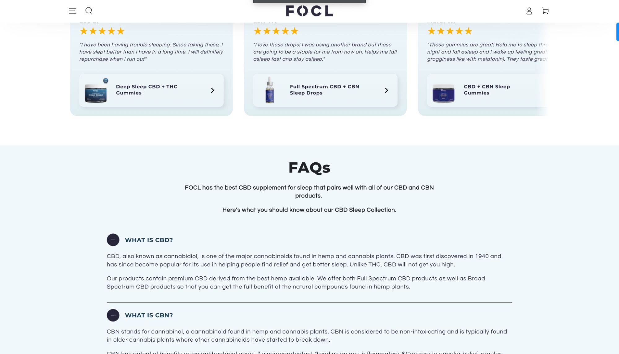
For instance, FOCL’s CBD for sleep collections page hits the nail on the head with the USP, saying that their products have “the best CBD supplements for sleep” — a phrase that defines a consumer frustration (sleep) and immediately offers an effective answer (their gummies).
Next-Level CTAs
Another crucial action you must take to boost lead generation on your site is to optimize your CTA buttons to help you attract and convert more leads.
Generally, you'll do well enough by adhering to the ground rules of high-converting CTA button design
- Choose CTA button colors that contrast with the background.
- Surround these conversion elements with plenty of negative space.
- Use action-driven language that inspires your audience to take the necessary steps to solve their pain points.
- Place CTAs in high-traffic positions, such as the hero section of your homepage.
However, to take your CTAs to the next level, consider some of the more advanced techniques for making them pop. For instance, by doing something as simple as surrounding calls to action with microcopy that addresses and removes conversion obstacles, you'll effectively encourage web visitors to turn into potential customers.
This is what Bay Alarm Medical does on its Medical Alert System product page, with CTAs that point out that getting in touch is "toll-free" and that web visitors can "Try risk-free for 30 days."
Authority and Trust-Building Design Elements
If you look at how consumers choose what brands to buy from, you'll see that expertise and credibility rank top of the list. Data from Statista shows that nearly 80% of Millennials prioritize brand trust when making purchasing decisions. So, to boost lead generation, you'll want to enrich your webpage's with design elements that communicate brand authority.
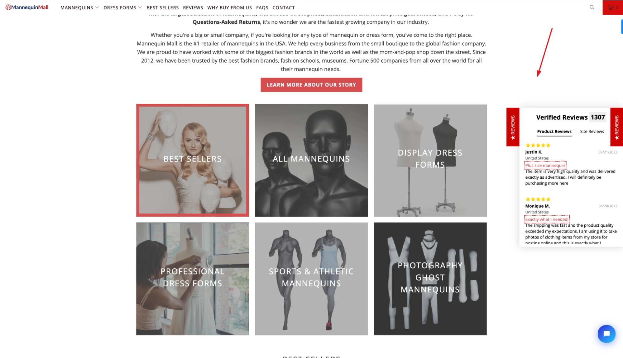
Naturally, there are multiple ways to use design to build brand trust and boost conversions. The traditional method would be to do something similar to Mannequin Mall. This business highlights positive reviews. Shares who its well-known customers are. And it points out its reputation as the #1 online mannequin retailer in the USA.
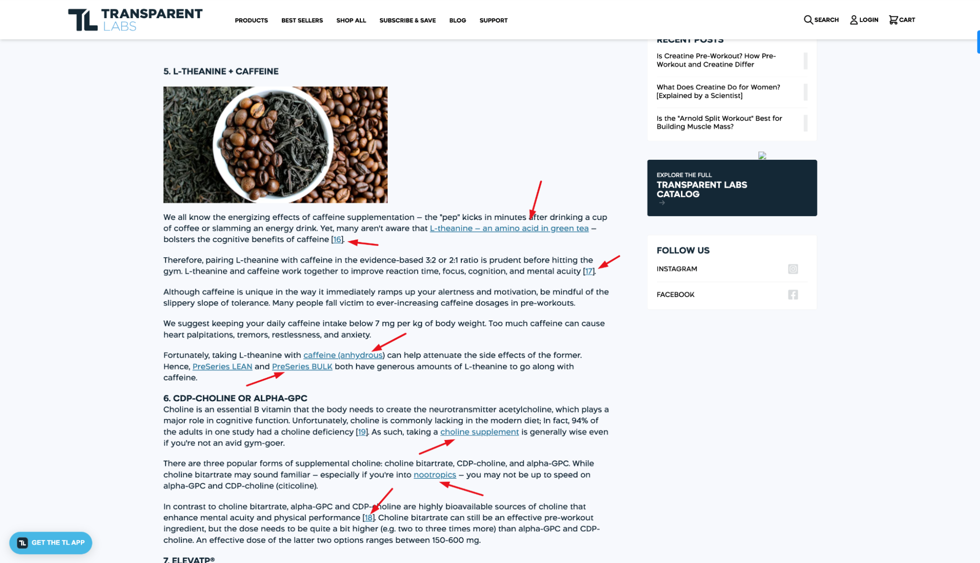
However, for a slightly more elevated approach to conversion-boosting trust-building design strategies, it's not a bad idea to think about ways to build brand credibility with subtle yet highly effective design elements, like the ones found on this guide from Transparent Labs. On this page, you'll find several small but impactful design components that aim to communicate expertise. For instance, the author's name is followed by their certifications to prove expertise.
Each claim is supplemented with links to relevant scientific studies supporting the data. Plus, every time the brand's products are mentioned, this is done by pointing out their potential benefits instead of framing Transparent Labs supplements as the only good source of specific micro or macronutrients for boosting athletic performance.
Effective Lead Magnets
In 2023, consumers want value above all. So, when trying to convert them into leads, present them with unique content that delivers the value they seek.By enriching landing pages with attention-grabbing lead magnets — explainer videos, ebooks, whitepapers, templates, cheat sheets, and webinars — brands can significantly boost their lead generation efforts while positioning themselves as credible sources of information and products/services.
There are multiple ways to make lead magnets work for your brand. However, remember that, in most cases, asking for less info in your lead generation forms will yield higher conversion rates.
In other words, try not to ask for too much data and prioritize getting people to convert vs. collecting irrelevant user information.
Easy Contact Options
When evaluating web design elements for lead generation, most marketers focus on lead magnets and CTAs. However, knowing that consumers greatly appreciate brand approachability and dedication to customer service, it's not a bad idea to enrich lead generation pages with options that allow web visitors to easily interact with brand representatives.
If you're not entirely convinced that user-friendly contact options boost lead generation, check out the State of the Customer Experience 2023 Report by CSG. According to this research, more than one-third of consumers would rather wait on hold to talk to a human agent than try to solve an issue using AI or self-serve options. For this reason, the lead generation elements on your landing pages must include at least one form of direct communication your prospects can take advantage of.
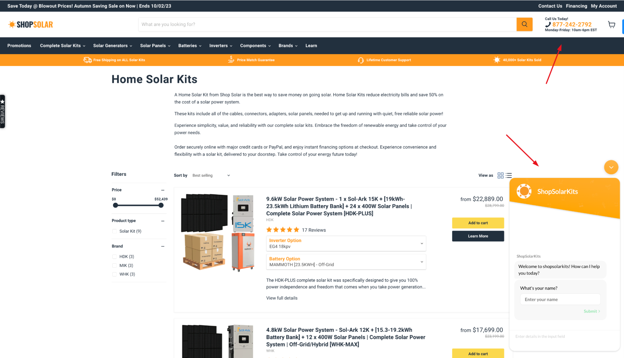
For instance, the ShopSolar Home Solar Kits page includes a CTA inviting web visitors to call the business during business hours or chat with an agent in real time.
However, if these contact options aren't the best type of communication for your business model, you're free to change them up. Just make sure you dedicate (at least) a small portion of your lead generation landing pages to a section inviting future customers to reach out.
Don't Forget the Thank You Pages
Finally, don't forget that capturing new leads isn't the destination. It's just one of the first steps toward turning potential customers into loyal supporters of your brand.
With this in mind, the one website design strategy you mustn't forget about is to thank your newly captured leads for putting their trust in your business.
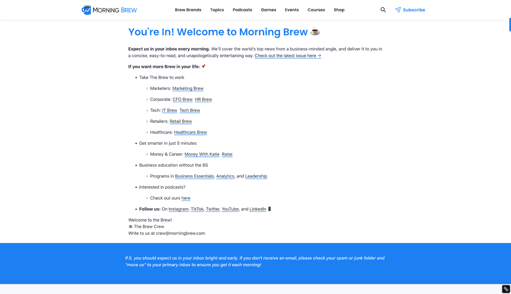
Thank you pages don't have to be complex or flashy. You can even get away with something as simple as the Welcome page on the Morning Brew website. However, they do need to exist. They're one of the best methods of showing (right away) that you care about customer experience.
 Conclusion
There you have it. The six key website design elements for lead generation.By including these on your landing pages, you're guaranteed to see an increase in the number of new leads you capture.
However, keep in mind that any design strategy you decide to implement must be optimized to appeal to your target audience. So don't underestimate the importance of defining your ideal buyer personas and do your best to attract the right people. That way, you'll achieve high conversion rates without wasting your marketing budget.


 Conclusion


