15 Best Practices to Increase Conversions by Optimizing Online Forms
The benefits of online forms are far too many to ignore. For one, they help you keep track of website visitors and leads. They help you send automated emails to your readers. And they help you capture data.
But, if you’re already on this page, you might already know of the benefits of online forms and are now looking to skip forward and understand how to optimize your online forms to increase your average conversion rate.
So, without further ado, let’s get right into it!
1. Make the form short and easy to read
One of the best practices you can adhere to when creating forms is to make them as short as possible. This is because, more often than not, longer forms will discourage users from completing them.
Cut down on any information that’s not needed or might not help you improve your communications with clients. For example, if you’re a software company, you might not need your client’s home and office address or both.
Consider the online forms Hims, a wellness brand, creates. To help personalize the website experience and to help customers avoid the harmful effects of over-the-counter ED pills, they ask customers questions in a short form (and provide multiple choice answers while at it too).
2. Convey your value proposition in your CTA
Your form CTA is one of the biggest motivators to help your prospects complete the survey. So, instead of writing something generic like “Submit,” you can try to experiment with your CTAs and write the value proposition in your CTA.
For example, if the online form they’re on is for a newsletter sign-up, the CTA can be “Sign up to get insider tips and tricks.” Or, if it’s for demo sign-up, the CTA can be “Book your free 15-minute demo now.”
While we’re on the topic, you can also try experimenting with the CTA colors — some experts recommend making the CTA a contrasting color from the form to make it stand out.
3. Add social proof
To convert more prospects, you can add social proof either on the landing page of the form or around the space of the form. This will help them reinstate the belief that their purchase is going to be worth the money.
For example, you can add any stat that’ll bring your product in a positive light, any testimonial that’ll help the respondent understand the value of your product or images of any awards you may have won in the past few years.
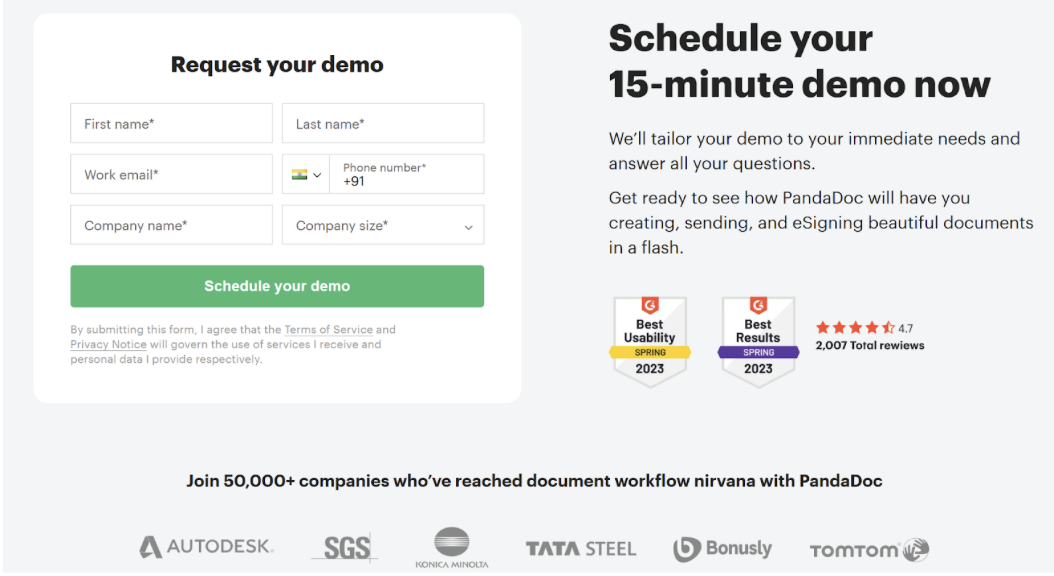
For reference, you can consider PandaDoc’s demo form as an example — the company showcases its awards, reviews, stats, and customer data all together.
4. Strategically use graphics
Online forms, in general, can get pretty monotonous. Especially if you’re creating longer-form versions. So, what’s the one sure way to break this monotony? The answer is simple — use graphics strategically.
What we mean by this is you can:
- Showcase a congratulatory graphic once the respondent is done filling out the form (this will help your respondents look forward to the task that comes after form filling — e.g., getting the demo, reading the newsletter, buying the product)
- Use eye gazes in line with your biggest value proposition (for example, if your CTA communicates the value your form will bring to the reader, the graphic’s eye gaze can be situated there because customers are more likely to follow the eye gaze)
- You can also use graphics to explain something to a reader (especially if the online form they’re filling out is a tad bit confusing)
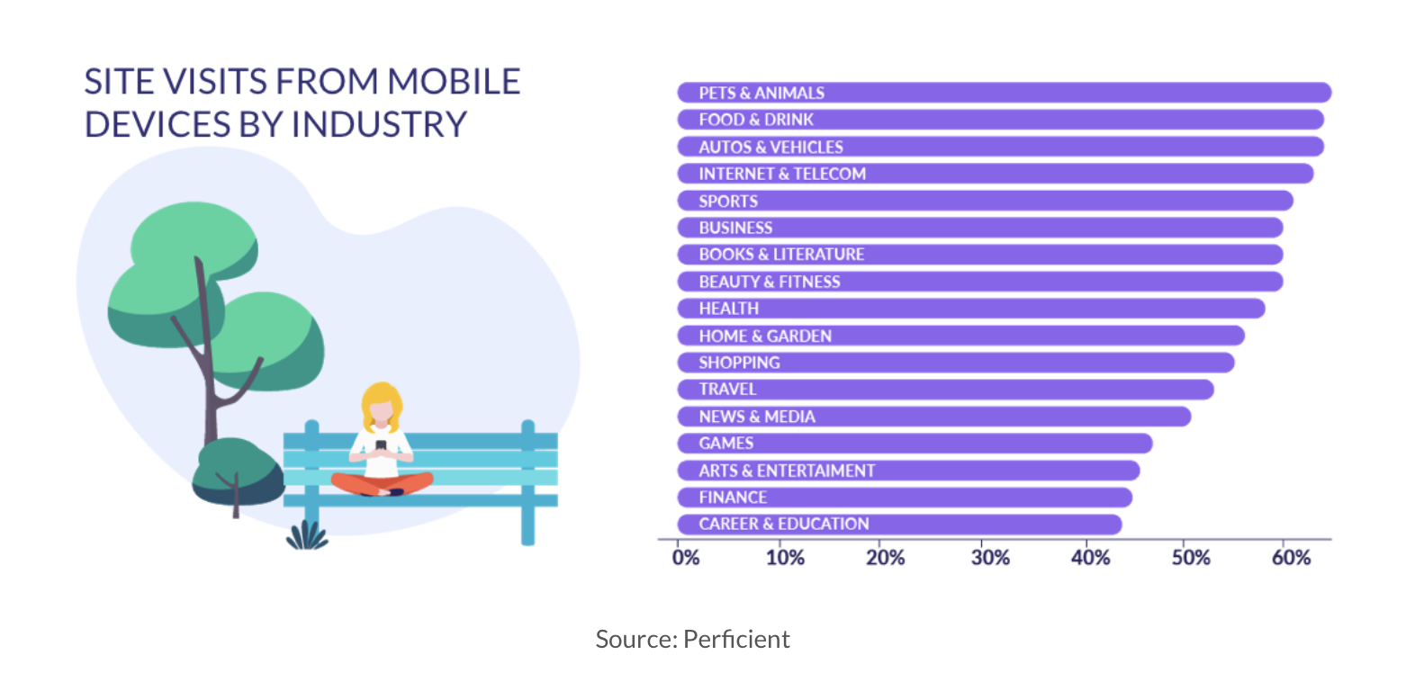
5. Make sure it’s mobile-friendly
When Sam McEwin of BizWisdom worked with a small manufacturer, they recorded a session with Hotjar to see how forms were being filled out.
In his own words, the story goes like this:
“We watched a session recording of someone filling in their form on a mobile device and pretty quickly realized that the form labels were rendering off the screen on mobile devices.
We watched as a user painstakingly scrolled all the way left to find the label and then back to the right to fill in the input.
It took them almost 10 minutes to fill in the form, and it was excruciating to watch. But by the end, it was pretty clear where the problem was, and the fix almost doubled their conversions.”
So, to achieve results like Sam, you must always make your forms mobile-friendly!
6. Consider the location of the form
The location of your form can also have a great impact on your form conversion rates.
Ryan Mckenzie, CMO of TruEarth, suggests placing the form where users can't miss it - usually, the top right corner of the page works well. Another thing on his recommendation list is to make the form stand out without being intrusive.
He says, “We experimented with different website positions and found that 'above the fold' placement led to a 24% uptick in form completions.”
7. Limit the number of form fields
If you’re creating a longer form with multiple choices for answers, all that data at once may get overwhelming for the respondent. As such, consider limiting the number of fields in the forms or breaking up text.
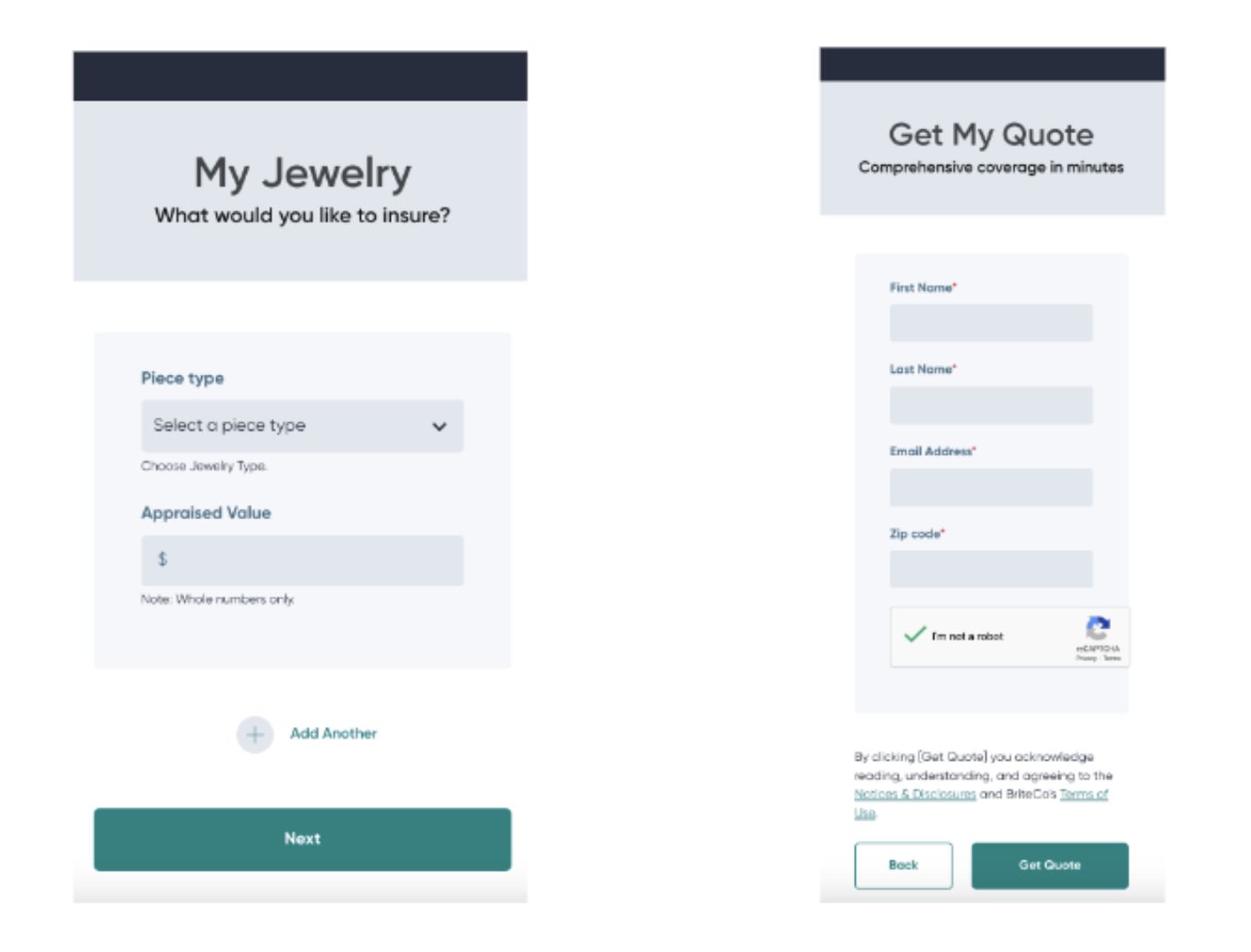
For example, if you look at BriteCo, an engagement ring insurance company, they break up the form into many slides — the first page acts as a self-service calculator for getting a quote, and the other page asks the client for their details.
Notice how they only ask for a few pieces of information from the potential customer, like: First name, Last name, Email address, Zip code
This strategy helps reduce bounce rates and boosts the likelihood that a customer will proceed with the form.
8. Make your forms accessible
While creating an online form, most people typically consider what questions to ask their target audience, which fields to validate, and the overall aesthetics.
However, it's often forgotten to assess whether the forms are accessible to everyone.
Using a website accessibility checker, you can effortlessly evaluate and adjust the layout to ensure inclusivity. This way, those with disabilities can complete your form with ease, leading to higher conversion rates.
Other ways you can make your forms accessible are by:
- Providing clear labels and instructions
- Showing notifications anytime a task is completed (or if there’s an error message)
- Using stylised elements that’ll help readers navigate text to the submit button
9. Offer a reason to fill out the form
Truth be told, your readers have a thousand different tasks to do than just filling out forms the entire day. Plus, you’re probably not the only brand who asked them to complete a survey — there are plenty more!
So, filling out the form (especially if you’re asking for feedback or recommendations, or insights) needs to be a give-and-take relationship. This is a key strategy for conversion rate optimization.
For example, participants who fill out a form may be able to able to get a chance to win a lucky draw or get a store credit or other such offer.
Having said that, in cases where they’re filling out a form for a task, such as ring appraisals or booking a demo, no giveaways would be necessary.
10. A/B test to see what works for you
Another handy-dandy tip that’ll help you out is to use your form analytics and, based on those analytics, run A/B tests to see what works and what doesn’t.
For example, if you have a long form, you can try breaking it up into a slider format to see what best practices work best for you and help you improve your conversion rates.
And, if you can't get your hands on analytics or if the data is too confusing to make sense of, you can directly ask your respondents to provide feedback about the form once they’re done filling it out.
Based on that feedback, you can go ahead and improve their experience.
11. Use autofill
No one likes to refill the same details as they had just added in previously. For example, if the billing details are the same as the shipment details — the added manual task of re-completing the action would be a headache unless you use an autofill feature.
The autofill feature reduces the burden on the respondent and makes the process extremely efficient, so we highly recommend using it.
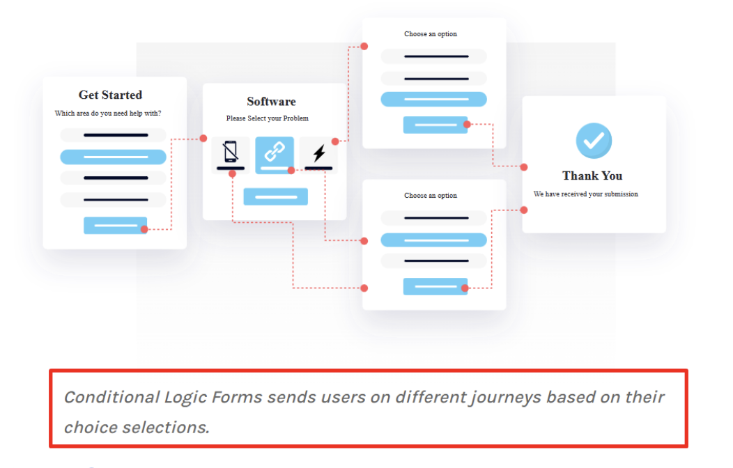
Another feature we recommend using is conditional logic. Basically, with conditional logic, if the respondent has added in their role at an organization, the form will show them questions specific to their role and use case.
In sum, anything that reduces time and effort on your respondent’s part is highly recommended.
(Just an FYI, with LeadGen, you can create forms with the auto-fill feature as well as the conditional logic feature.)
12. Add a progress bar
When you’re asking your respondents to fill out a large form without providing any details about when it could end, and what it may contain, they might easily get overwhelmed and bounce from your page.
So, to reduce this, you can do two things:
1/ At the start screen, provide a list of sliders that'll be included in the form (this will let the reader know what details they need to fill out).
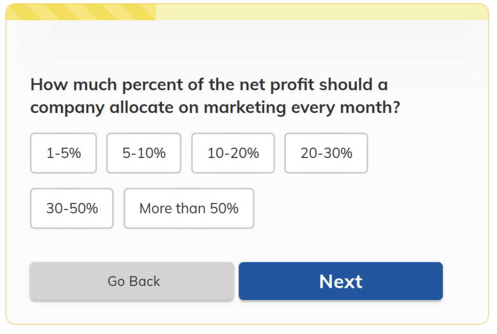
2/ Provide a progress bar to let them know how far they are on the journey. For example, a progress bar can include lines to indicate how many details have been completed and what more needs to be filled out.
For example, the top yellow line in the graphic below informs the reader of their form's progress.
13. Protect your customer’s privacy
These days, customers are very aware of data privacy and tend to guard their data. So, our recommendation would be to address these doubts and to provide a privacy notice.
For example, something as simple as “We don’t share your data with any third-party” will do too. But, you can also provide other data protection rules you adhere to. For example, how secure is their data with you, what tasks are you going to use it for, are you going to spam them, etc?
All these small things have a big effect — and you can attach a privacy note somewhere near the form to address all customer concerns.
14. Don’t ask for information that’ll make readers think
One of the best practices to ensure your respondent fills out the form all the way through isn't to ask them any questions that’ll make them think.
Paul Maher, head of content at Fourth Day, says, “Don't ask for information that people aren't readily willing to part with or ask questions to make them stop to think. If you want to do market research, then there are other ways to do that.”
Another thing he recommends doing is to eliminate anything that’ll ruin their experience of form filling.
In his own words, “If you really need to build up the CRM, you'll want to make filling those forms feel as least form-like as possible. They will also need to be super quick and easy to fill in, so doing so feels almost inconsequential.”
15. Be clear with your wording
Last, but not least — be crystal clear with your wording. And by that, we mean not only the wording you use in your form, but also in your privacy and error messages.
Tell the reader exactly what they need to do to fill out the form and how they can resolve errors (if they get any).
Another thing of importance is to avoid using jargon, especially if the form is available to the public and you’re not looking for role or niche-specific respondents.
Create better forms with LeadGen App
Now that we’ve gone through the whole nine yards to understand what makes a good form and how to optimize them such that your form conversion rates improve, it’s now time to get to the meatier bits and learn how to make these optimized forms.
The answer is right in front of your eyes. And that’s creating your forms with the LeadGen App.
Our solution allows you to build a variety of forms for a variety of needs. We have a bunch of templates to help you get started, we’re compliant with major security standards, and we have glowing reviews from our audience. Moreover, our solution is entirely free to use for the first 14 days.
So, what’s stopping you from taking your sign-up forms to the next level? Are you ready to see an increase in conversions? Start your 14-day free trial today!

