How To Optimize Your Landing Page For Mobile Devices
Imagine a user bouncing from your landing page because the typeface on the page was hard to read or didn't adapt to the small screen size of their phone.
Whether shopping online or binge-watching the latest hit series, users perform these activities on mobile phones over half the time.
So, mobile users should be your priority as you connect with your primary target audience. If you haven’t already, it's time to optimize your website and landing pages for mobile devices.
Sound complicated? We have you covered. In this article, we'll share a few best practices to help you navigate landing page optimization for mobile screens.
Let's dive in.
Why should you optimize your landing pages for mobile devices?
With more users accessing websites from their smartphones and tablets, ensuring that landing pages are optimized for mobile devices is essential. For businesses in Grantham looking to strengthen their local and online presence, investing in professional web design services in Grantham can make a significant difference. Partnering with a mobile app development company can further enhance user experience by creating seamless, responsive, and high-performing mobile solutions tailored to your audience’s needs.
This optimization is crucial across all sectors, whether a local restaurant trying to attract diners or a financial platform guiding users through a crypto tax calculator.
Similarly, if you're offering a personal safety app, ensuring that your landing pages are mobile-optimized can significantly enhance user engagement and safety awareness.
If you want to get eyes (and, of course, potential conversions) from mobile visitors, you need to optimize your landing page. After all, 53.03% of online visits come from mobile devices. Without optimization, your bounce rate will increase as users get frustrated and leave, costing you conversions.
But if you're still not convinced about the importance of mobile-friendly landing pages, here are a few more reasons you should optimize landing pages for mobile devices:
- Enhances user experience: A user-friendly landing page interface means a great user experience. It shows that your brand is up-to-date and cares about the users' experience on their website.
-
- Improves readability: When your landing page isn't optimized for mobile users, the fonts users see on mobile screens are too small to read without zooming in.
- Increased conversions: By lowering bounce rates and improving user experience, you’ll increase your chances of converting leads who visit your landing page.
In short, a user-friendly mobile experience keeps landing page visitors engaged, encouraging them to stay and interact with your content. Without this optimization, potential customers may leave out of frustration, leading to missed conversion opportunities.
5 Tips to Optimize Your Landing Page for Mobile Devices
Here are five simple tips to help you optimize landing pages for mobile devices.
Tip #1: Optimize landing page speed
The last thing you want your users to see when they land on your mobile site is to see "Please wait, the page is loading." across their mobile screen.
When the load time is longer than three seconds, users may get frustrated and eventually leave your page or website. Even Googe uses page speed as a ranking factor for suggesting trustworthy websites on search engine results pages (SERPs).
That's one of the many reasons optimizing the speed of your landing page is a must.
Here are a few simple ways you can improve the speed of your landing page:
- Compress images and videos to reduce file size without compromising their quality.
- Opt for accelerated mobile pages (AMP) functionality.
- Make sure your landing page loads above the first fold, even if you're struggling to load the page faster.
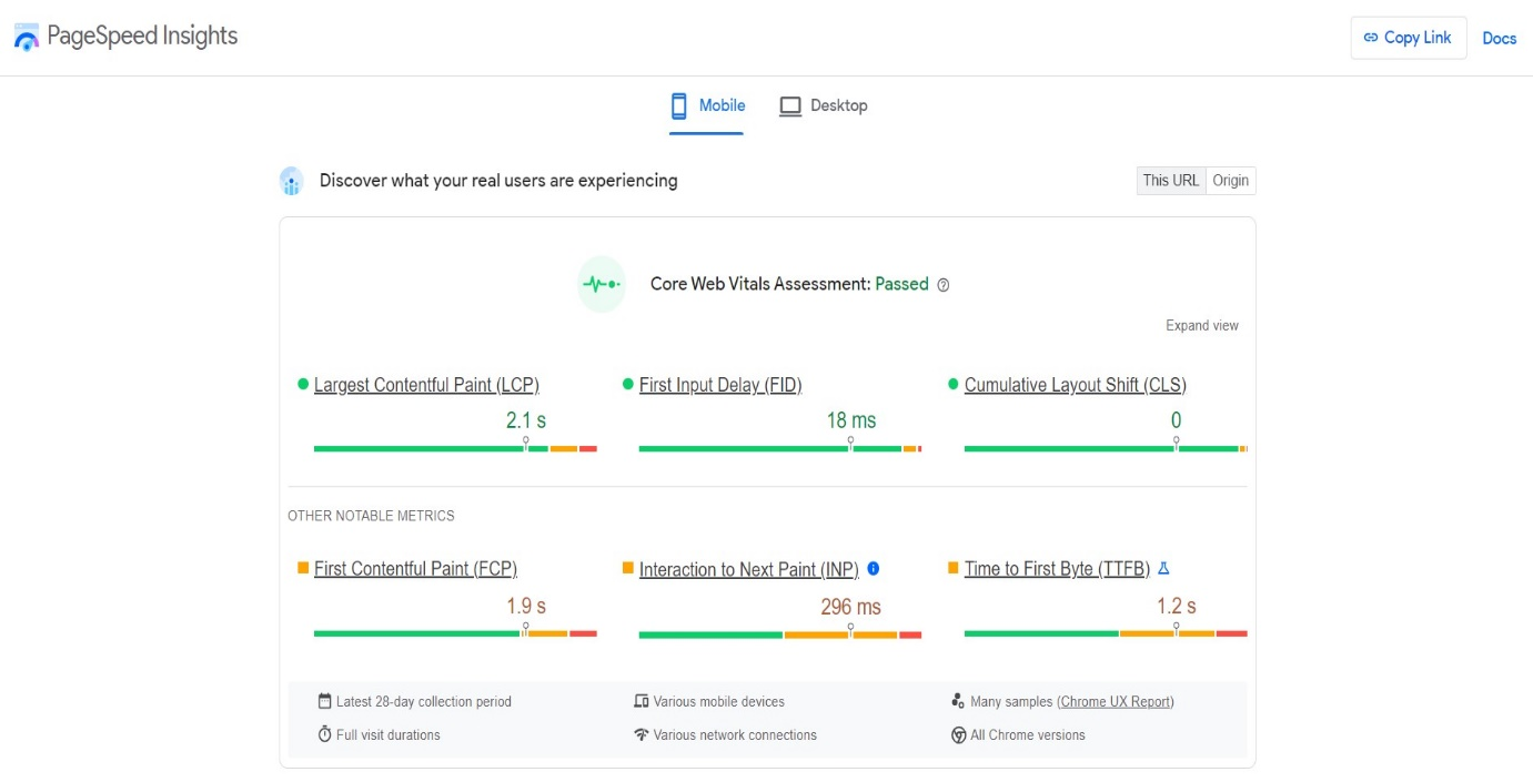
Use Google's PageSpeed Insights tools, where you can put in the URL of your landing page and check out its performance across mobile and desktop devices.
Tip #2: Use responsive design
Responsive design solves multiple problems for landing pages at once, such as:
- It improves how the landing page looks on both large and small devices.
- It makes your landing page mobile-friendly.
To have a responsive design on your mobile landing page, do the following:
- Invest in a content management system with a responsive design feature.
- Avoid light and thin fonts as they become non-readable on mobile screens.
- Find the best ratio between image quality and file size.
- Make action buttons and form fields larger.
- Keep the default font size at 16 px.
Tip #3: Optimize call-to-action (CTA)
Make sure your CTA is clear and discoverable. Ideally, it should be one of the first things visitors see when they land on your mobile landing page.
Also, keep it short yet precise because long phrases can be overwhelming and less effective for viewers on mobile devices. For example, 'Buy Now,' 'Sign Up,' or 'Get Premium.'
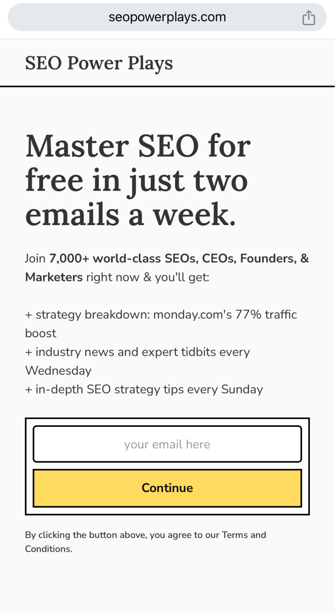
Here's an example of a mobile-friendly landing page by SEO Power Plays. It's easy to read, and the CTA (for an email address) remains front and center above the fold (read: no scrolling required).
Tip #4: Keep it simple
When viewing a landing page via a mobile screen, less is more. Keep the mobile elements minimal and focus on only the most important aspects of the landing page.
- Use larger fonts, bold headlines, and contrasting colors to guide the viewer's attention towards the CTA.
- Remove any unnecessary content, such as excessive text or images that aren't directly related.
- Leverage white space effectively to create separation between elements and avoid distractions from your CTAs.
For example, StudioSuits, a brand renowned for its personalized linen suits for men, has a clean and minimal mobile website. This landing page example has a clean and user-friendly design.

Here, StudioSuits places filters front and center, allowing mobile users to tailor their product searches to their preferences effortlessly.
Tip #5: Test your landing page on multiple devices
Testing your landing page is important for the mobile version of landing page optimization, as it helps you understand better how your landing page appears on different screen sizes and devices.
That said, mobile analytics supply the data-driven insights you need to enhance your landing page performance on mobile devices.
When leveraging mobile analytics tools, you can gain a comprehensive understanding of how users interact with their landing pages on smartphones and tablets.
This data includes metrics such as:
- User navigation patterns
- Click-through rates
- Conversion rates
- Bounce rates
With this information in your back pocket, marketers and web designers can make informed decisions to refine and optimize landing pages. The result? Responsive pages that load quickly and offer a seamless user experience on mobile platforms.
Mobile analytics empowers businesses to continually adapt and improve their landing pages for mobile users, resulting in better user engagement and conversion rates. By collaborating with a skilled development team, you'll benefit from in-depth technical expertise in optimizing the mobile user experience. Investing in mobile app design also plays a crucial role in delivering a seamless and engaging user journey, ensuring your brand stands out on every screen size. In addition to optimizing your landing pages for mobile devices, consider integrating SMS marketing into your strategy. SMS marketing allows you to directly reach your audience on their mobile phones, providing a more personalized and immediate connection. You can use SMS to send targeted promotions, product updates, or exclusive offers. Incorporating SMS marketing alongside mobile-optimized landing pages enhances your overall mobile strategy, engaging users through different channels and maximizing your chances of conversion.
Here are a few tips to keep in mind while testing your landing page on multiple devices:
- Invest in responsive design techniques to adapt to different screen sizes and operations.
- Leverage the Google Mobile-Friendly Test to verify how well your page performs on mobile devices.
- Make your landing page elements touch-friendly, with appropriate spacing, font size, and engaging elements for mobile users.
Your audience is using mobile devices to access your content. Mobile landing page optimization is a must to please these users.
Following the best tips in this article, you can create landing pages that adapt to different screen sizes and bandwidth consumptions.
But remember, mobile landing page optimization isn't a one-time thing. It's an ongoing process, and staying up-to-date with best practices is essential to meet the ever-evolving needs of mobile users.
Why wait? Mobile conversions are yours for the taking. Optimize your desktop landing pages to enjoy the success of online endeavors.
About the Author


