Web Form Errors Online Course Platforms Must Avoid
From enrollment to feedback collection, web forms serve as the gateways to crucial interactions between learners and the platform. However, in the rush to innovate and streamline learners’ experiences, they end up being the least considered element for most platforms.
As a result, common mistakes creep into these online forms, hindering user engagement and satisfaction. Ultimately, both the platform and instructors miss out on the chance to collect high-quality leads that are most likely prospective customers.
In this article, we delve into five prevalent web form mistakes that online course platforms must steer clear of to ensure seamless user experiences. Dive right in!
1. Improper field formatting
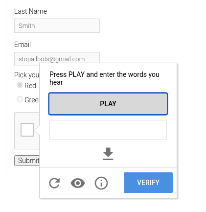
One of the most common web form mistakes is improper field formatting. This includes fields that are too small, too big, poorly aligned or lack clear labels. When users encounter such issues, they may feel frustrated and abandon the form altogether.
To mitigate this, you should first ensure web forms are appropriately sized. When form fields are too small, users may struggle to input their information accurately, leading to frustration and potential errors. Overly large fields can create a sense of intimidation and overwhelm users, especially if they only need to input a small amount of information.
So ensure there’s a balance in the size of form fields to accommodate the expected input length. Thinkific executes this perfectly.

Misaligned fields and labels easily disrupt the visual flow of a web form, since users struggle to associate labels with their corresponding input fields. Therefore, avoid this by aligning input fields and labels consistently. The labels should always be clear and concise to avoid any confusion.
Additionally, use placeholders within the form fields to give users valuable context and guidance, lowering the likelihood of input errors.
2. Lack of accessibility and transparency
Accessibility is paramount in ensuring that all users, regardless of their abilities, can interact with web forms effectively.
For instance, low contrast between text and background colors can make it difficult for users with visual impairments to read form content. Similarly, relying solely on color cues to convey information can exclude any user with color vision deficiencies. Just as in preparing for the expert cloud practice tests, ensuring accessibility and clarity in design is essential to reaching all users effectively, regardless of their abilities.
Besides that, many users, including those with mobility impairments, rely on keyboard navigation to interact with web forms. Hence, failing to provide adequate keyboard accessibility will prevent these users from completing forms effectively.
To ensure accessibility for all, course platforms should adhere to various accessibility standards. Some of the key ones you can implement on your platform include providing alternative text for images, ensuring sufficient color contrast, and implementing keyboard navigation options.
Moreover, you should ensure transparency regarding data usage and privacy policies. Lack of transparency can undermine user trust and lead to hesitancy in providing personal information. To avoid this, ensure your online course platform clearly communicates the purpose of collecting user data and how it will be used. See how this Udemy web form links to the terms and policies at the bottom.

Also, the matter of accessibility extends to the accessibility of data privacy policies. So besides being easily accessible from web forms, ensure your online course platform’s policies are written in clear and understandable language.
3. Absence of branded colors and fonts
Consistent branding is essential for establishing a strong visual identity and fostering brand recognition. Therefore, when web forms lack branded colors and fonts, they appear disjointed from the rest of the platform.
Colors evoke emotions and associations, while fonts convey personality and style. Hence, using branded colors that reflect the platform's logo or primary color palette adds visual interest to web forms and creates a sense of familiarity for users. Alison’s web forms are a great example of this.

Likewise, using branded fonts reinforces the platform's identity and contributes to a polished and professional appearance.
To integrate branded colors and fonts effectively into web forms, you should start by identifying primary and secondary brand colors that they can use strategically throughout the form design. Additionally, select branded fonts that are readable across different devices and screen sizes.
However, overusing these elements is just as bad as not using them. Therefore, your platform must maintain a balance between brand elements and usability considerations to ensure an optimal user experience.
Besides that, regularly review and update your web form designs to align with evolving brand guidelines and design trends.
4. Difficulty in entering captchas
CAPTCHAs (Completely Automated Public Turing tests to tell Computers and Humans Apart) are commonly used in web forms to prevent bots from submitting fraudulent entries. They have a lot of security benefits. For instance, CAPTCHAs can prevent email address harvesting which can in turn stop spam emails.
But while CAPTCHAs serve valuable security purposes, they can also pose challenges for users, particularly those with disabilities or limited technological proficiency.
Visual CAPTCHAs, which require users to identify and input characters displayed in an image, are still quite common. They can, however, be inaccessible to users with visual impairments.

To address this issue, your platform should provide alternative CAPTCHA options, such as audio challenges or text-based alternatives, to accommodate all users.

Some CAPTCHA challenges may be inherently complex or confusing, making it difficult for users to successfully complete them. For example, CAPTCHAs that require users to solve mathematical equations can be intimidating for users with cognitive disabilities or limited literacy.

To avoid this, opt for straightforward and easily understandable challenges. You can also implement CAPTCHA solutions that minimize user friction, such as reCAPTCHA v3, which operates in the background without requiring user interaction.
5. Lack of user confirmation or success messages
User confirmation or success messages play a crucial role in providing feedback to users after they submit a web form. These messages reassure users that their action was successful and provide guidance on the next steps.

The absence of such messages can leave users uncertain about whether their submission was received, which then leads to frustration and confusion. Therefore, it’s key that you deliver these messages promptly after form submission.
If the confirmation messages are set to appear on the same page, ensure they stand out visually from the rest of the page to draw users' attention. Contrasting colors, icons, and formatting will help distinguish confirmation messages from other content on the page.
In cases where form submissions encounter errors or validation issues, send error messages to inform users about the nature of the problem and how to correct it.
Conclusion
The design and functionality of web forms play a pivotal role in shaping the user experience. Hence, by avoiding common web form mistakes, online course platforms can easily elevate their offerings and foster greater engagement with their audience.
We comprehensively discussed some of the common web form mistakes to avoid above. They include improper field formatting, lack of accessibility and transparency, absence of branded colors and fonts, difficult CAPTCHAs, and lack of confirmation or success messages.
Now go ahead and optimize your web forms to effectively retain students that land on your platform.
About the Author


