Maximizing B2B Lead Generation Through Strategic Website Design
Source: Vector by Freepik
Imagine you're at a networking event, hitting it off with someone, and all seems well, but as you go to part ways, they hand you a crumpled, coffee-stained business card. Not a great first impression, right?
Your website is often the first handshake between you and potential leads. And let me tell you, I've seen my fair share of digital equivalents to that sad, crumpled business card. I'm sure you have too. Truthfully, businesses want to work with companies who look the part and are the part. And this means that using design for things like your website isn't just to keep things looking pretty.
It's about providing an authentic experience and nurturing real connections. B2B lead generation is like hosting the perfect dinner party. You need the right ingredients (your offer), the ideal recipe (your strategy), and—here's the kicker—a beautifully set table (your design). But why does design matter so much in the world of lead gen? This guide has everything you need to know, so let's get into it.
Understanding B2B Lead Generation
Source: Image by Freepik
B2B lead generation is the process (or art) of attracting and converting other businesses and companies into potential customers and clients. You know this, but for the sake of this guide, let's lay out the basics so we're on the same page. The process goes like this: you create something valuable (like this blog post!), put it out there, and wait for interested businesses to bite.
Someone reads your content, likes what you say, and is tempted to do business with you, so they reach out. Now you take the time to nurture that relationship, providing support, care, and value until they're ready to buy. Like dating, but instead of dinner and movies, you're wooing with whitepapers and case studies.
Why is this so crucial? Unless you've got a magic wand that conjures up clients (and if you do, please share), lead generation is your ticket to sustainable growth. It's the difference between hoping customers will stumble upon you and strategically placing yourself in their path. That's why you need to consider design. It's a critical factor in making that original content pop and getting those leads in the door. Then, the rest is up to you.
The Role of Design in B2B Lead Generation
Source: Image by Freepik
You might be thinking, "I get the lead generation part, but what does design have to do with it?" Well, everything. It's like asking what salt has to do with cooking - sure, you could do it without thinking about it, but why would you want to? Let's start with first impressions.
We've all heard the saying, "Don't judge a book by its cover," but let's be honest—we all do it. Your website's design is that cover. I once worked with a client whose website looked like it was built in 1999 (and not in an excellent, retro way). Their B2B lead generation was as dry as yesterday's toast. A design overhaul later, and boom! Leads started pouring in like it was happy hour at the local bar.
But it's not just about looking pretty. Good design is about creating an experience. It's about leading them through your content and sending your message in the best and most effective way so you're providing real value from start to finish—real value that converts and helps your business succeed. On a basic level, you don't want them going through your content and getting lost.
And here's the kicker: design affects trust. Would you trust a financial advisor whose website looks like a fifth-grader made it? Probably not. Good design signals professionalism and attention to detail—qualities your potential leads seek. And all of this combined leads us to conversion rates. A well-designed page with clear, compelling calls to action is like a neon sign pointing to your B2B lead generation forms. The gentle nudge turns "just browsing" into "sign me up!"
Remember, in the B2B world, we're not just selling products or services - we're selling trust and expertise. In this game, design isn't just the icing on the cake - it's a key ingredient in the recipe for B2B lead generation success.
How to Create a Better User Experience Through Elements Design
Source: Vector by Freepik
With the theory out of the way, let's take action and build a proper design for your B2B lead generation. Let's break it down.
1. Intuitive navigation
Think of your website as a roadmap. You want your visitors to find their destination without pulling over to ask for directions. Transparent menus, logical page hierarchy, and a working search function (I'm looking at you, sites with broken search bars) make all the difference.
2. CTAs
These are your digital salespeople, working 24/7 to convert visitors into leads. They should be clear, compelling, and impossible to miss. "Learn More" is fine, but "Unlock Your Business Potential Now"? That's a CTA that means business.
Here's a pro tip: remember mobile responsiveness. With more people browsing on their phones than ever, if your site isn't mobile-friendly, you're slamming the door on potential leads.
3. Visuals
A picture says a thousand words. That's because humans are visual creatures, and in the B2B world, looks matter. But creating stunning visuals doesn't have to be a headache. AI tools like Freepik's AI image generator can help you create professional-looking graphics in a snap. It's like having a graphic designer in your pocket.
When you combine all these points, you should have a winning formula for better design that produces results. Remember to test and adapt as you go.
How to Leverage Content Marketing and Design for B2B Lead Generation
Source: Image by Freepik
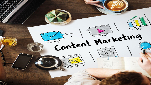
The strategies above are good, but they're just your starting point. Now, let's talk about the content itself. And yes, this is more than just writing words on a page. You can use elements of design in your content, too. Notice how I'm breaking these paragraphs into smaller chunks, typically no more than three sentences long? That's because it makes the content look more digestible and accessible.
If it were all one big block (what we call a "wall of text"), then you'd think it's too much effort, and you can't be bothered to read through it, so you won't, and the value won't be shared. And how about this? Did you find your eye drawn to that line that stands out boldly? Another trick is to grab someone's attention while highlighting valuable and essential points. Practice implementing this into your content.
But again, visuals are the way to go —we're talking infographics, eBooks, whitepapers, videos, social media graphics, and more. They're shareable, digestible, and, let's face it, way more fun than a wall of text.
But here's a pro tip: don't skimp on image quality. Nothing says "amateur hour" like pixelated graphics. That's why I'm a big fan of tools like the image upscaler, where you can enhance the image quality to 4K. It's like a magic wand for making your visuals crisp and professional.
Functionality Improvements that Boost B2B Lead Generation
Source: Image by Freepik
Design also affects the technical side of things, especially regarding functionality. Ever been on a website with a clunky-looking calendar or booking system? Doesn't instill professionalism and trust, right? So, what can you do to bring things into 2024? Here's what you need to know:
a. Forms: If your form is longer than a CVS receipt, you're doing it wrong. Keep it short and sweet, and only ask for what you need. I once reduced a client's form fields from 10 to 3 and saw conversions skyrocket. Less really is more. People just can't be bothered when it's long.Get the form right, looking its best, and working for you, and you’ll see a dramatic increase in leads. Powerful tools like Lead Forms, used by Unilever, Expedia, and the Parliament of Australia, can help.
b. Live chat and chatbots: These little digital helpers are like having a 24/7 concierge for your website. They can answer questions, guide visitors, and even quality leads while you're catching some Z's. Just make sure your chatbot doesn't sound like a bot. Give it some personality.
c. Personalization: Have you ever been in a cafe where the barista remembers everyone's coffee order? It's a personal experience that makes you feel valued and included. Incorporate it. Use dynamic content to show visitors what they want to see based on their behavior. It's not creepy; it's considerate!
d. Use A/B Testing: It's like having a crystal ball for your website. Test different layouts, copy, and CTAs to see what resonates best with your audience. I increased lead gen by 30% by changing a button color. Who knew green was so persuasive?
Remember, functionality isn't just about making things work but improving them. So go ahead, tinker with your site, and see what a difference it can make when you optimize your website.
Best Practices for Designing a B2B Lead Generation-Focused Website
Alright, let's talk about turning your website into a lead-generating powerhouse. It's not rocket science, but it does require some finesse.
a. Value proposition: It should hit visitors like a ton of bricks (in a good way). Make it clear and bold; for Pete's sake, make it above the fold. I once worked with a company whose value proposition was buried at the bottom of its homepage. Spoiler alert: its lead gen numbers were as low as its placement.
b. Use white space: It's not wasted; it's breathing room for your content. Use it to create a visual hierarchy that guides visitors' eyes exactly where you want them to go.
c. Consistency is key: Your branding should be tighter than a... well, let's just say it should be tight. Keep it cohesive from your website to your email signatures.
d. Speed things up: A slow-loading page is the kiss of death for B2B lead generation. I've seen bounce rates skyrocket faster than you can say, "Why isn't this page loading?"
Remember, your website is your digital storefront. Make it inviting, clear, and fast. When businesses love using your website, they'll want to keep doing business with you.
Conclusion
And there we have it—a guide to blending the worlds of design and B2B lead generation. From first impressions to data-driven decisions, we've covered it all. Remember, great design isn't just about aesthetics—it's about creating a seamless experience that turns visitors into valuable leads.
So, give it a go, and don't be afraid to think outside the box, experiment, and get it wrong on your way to getting it right; this is how you'll succeed—by being proactive rather than just hoping for the best and letting businesses come to you.
FAQs
1. What makes lead generation effective?
Effective lead generation involves targeted messaging, valuable content, and seamless user experience. It's about meeting your audience where they are and offering something they can't resist.
2. How do you generate leads?
Content marketing is your secret weapon here. Create valuable resources, optimize for search engines, and use social media to spread the word. Don't forget email marketing and paid advertising to amplify your reach.
3. How do I start lead generation?
Start by identifying your ideal customer. Then, create content that addresses their pain points. Set up landing pages with clear CTAs and implement a system to nurture leads. Remember, it's a marathon, not a sprint.
4. What is the best example of lead generation?
One standout example is HubSpot's Website Grader. It provides value upfront, captures leads, and introduces users to its product seamlessly. It's the perfect blend of utility and marketing—a lead-gen hole-in-one.

