Form UX Design Best Practices with Biometric Testing
What is Form UX Design and Why Does it Matter?
Form UX design is one of the key factors that define success in website lead generation. Online forms are the primary channel to capture lead and contact details via websites and landing pages. However, form user experience is often overlooked by marketers resulting in a consistent loss of potential leads and new revenue.
Together with UX design experts from Lnet Digital, a digital marketing agency based in the UK, we have studied form UX design in more detail. This user behaviour experiment uses biometric testing via eye-movement data.
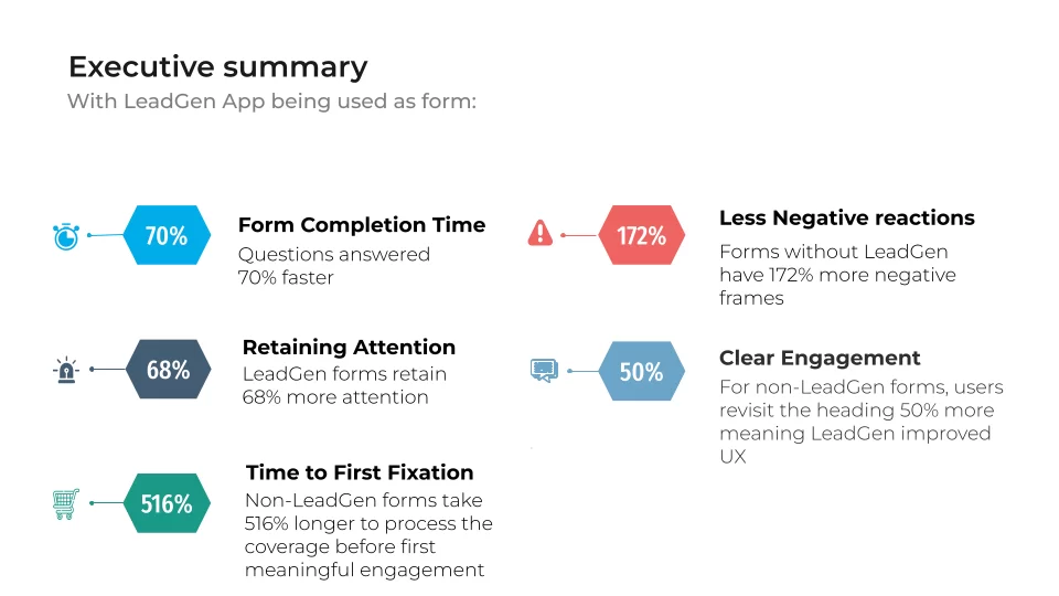
Executive summary of analysis findings with key statistics
Session Information
Study objective:
Use biometric analysis of consumer behaviour to demonstrate the effectiveness of LeadGen App forms for improving the user journey.
Stimuli
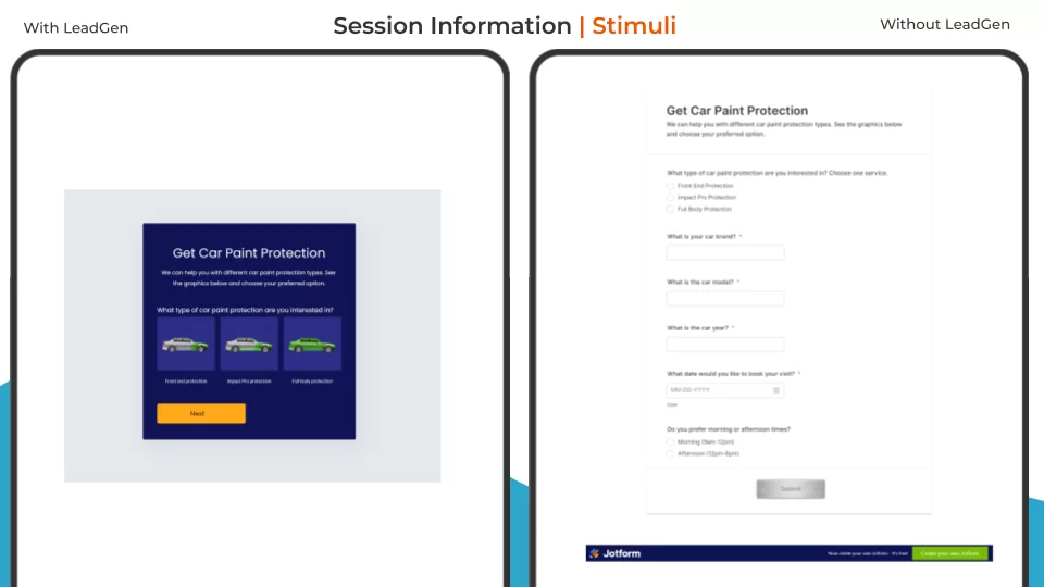
A: Stylised form with visuals for services (LeadGen App)
B: Standard form with all questions on a single page (Jotform)
User Intent: Select a car paint protection service and input details on their car
Stimuli
Form completion time
Better user experience
Objective biometric measures
Eye-movement tracking
Emotion recognition
Self-report measure
Greater / poorer engagement
Methods
A/B Testing
The Analysis
Hypothesis
Makes the user more engaged with visual aspects, allows users to process information in manageable bits to encourage them in taking their time and reduce focus on questions.
Analysis
This analysis will go over four key areas; A Heatmap, Areas of interest, Emotional response and the usability feedback:
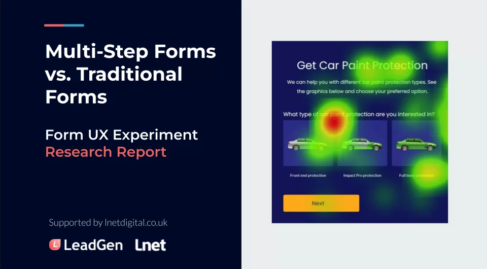
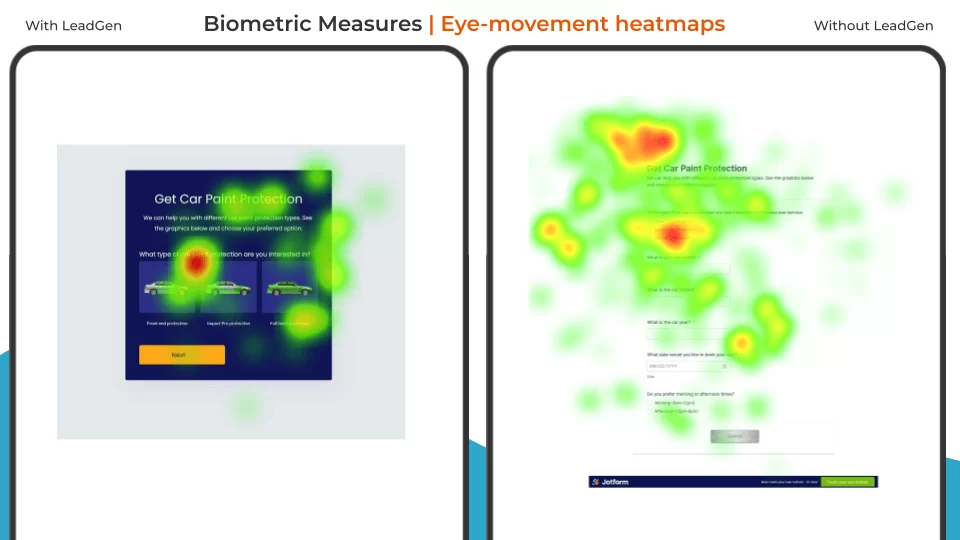
The Heatmap will show where all test participants would look at the most. Ranging from green to yellow and then to red, green meaning that they would have little attention in an area, yellow meaning a moderate amount of attention was spent there and red meaning that a lot of the participant would hone their attention there.
These visual maps, often referred to as eye tracking heatmaps, help UX researchers clearly identify which parts of the form draw the most user attention and where potential friction points exist.
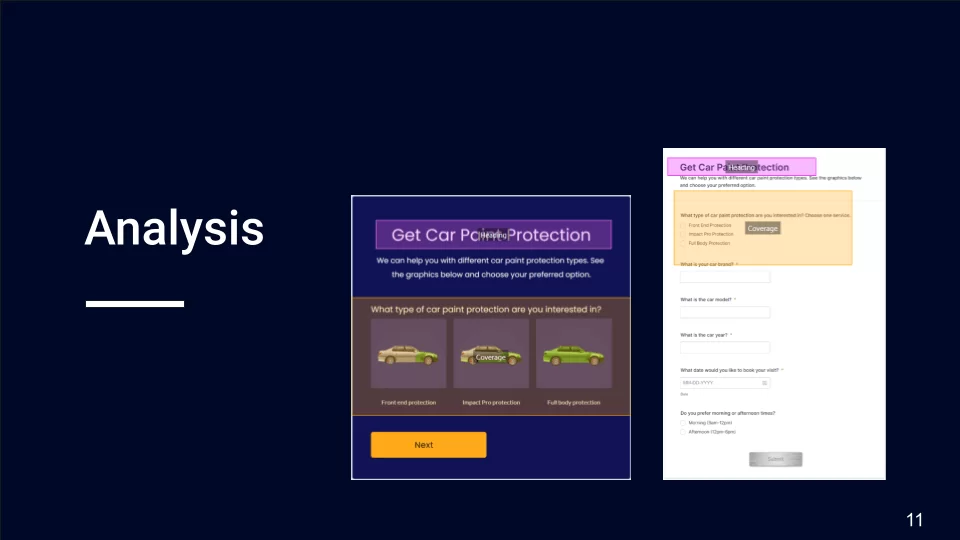
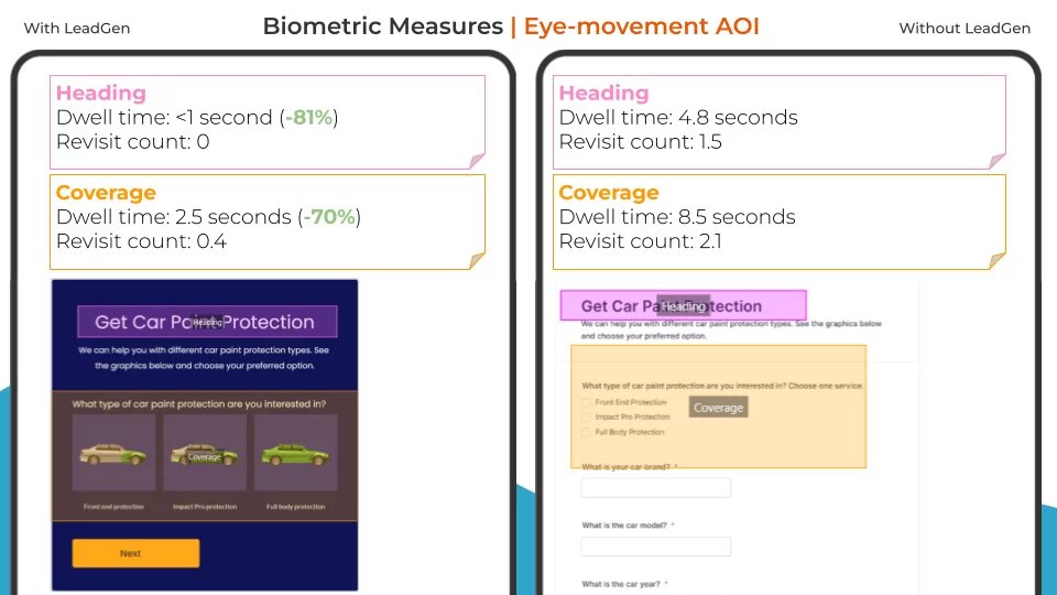
Areas of interest are places on the webpage that we would decide are important enough to have further analysis on, this allows us to collect data on; If an area would get attention, How many times an area would have attention, how long the attention would be for etc.
Emotional response would gives us an understanding of how participant would react to using the webpage, we can see a variety of positive and negative emotions to help determine if they had a better time experiencing one webpage over the other.
Usability feedback is a set of data that we collated from questions asked to the participant at the end of the test, this gives us further insight into how they felt about the tests and can help us get better results that we may have not realised from the eye tracking or emotional response.
Heatmap Measures
Heatmap summary
Both heat maps have the most attention around the instruction which is expected. Across the participants they have a high concentration around the first and second question on the form with LeadGen.
However looking at the form with LeadGen App we can see a moderate focus on the visual aspects, this difference could be due to the image giving the user a better idea of what the service would cover allowing them to answer with ease and confidence.
There is also a heavy amount of attention above the title of the form without LeadGen App, we believe this to be due to the error message that appears when a participant enters the wrong details into a field. Having an error message at the top of the page as well as under the field is not great for the users experience as their attention is being diverted:
Heavy attention on two separate error messages on the Jotform - Form structure (Left) and Heatmap activity (Right)
Insights:
Without LeadGen has higher attention, could show confusion or lack of understanding in what services are.
With LeadGen has fewer concentration points, can show a better understanding and give users the confidence in what they’re asking for.
Dwell time and revisit count numbers
Areas of interest (AOI) summary
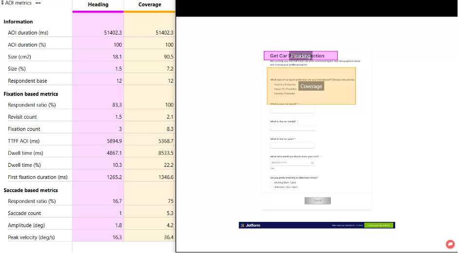
Participant spending less time on areas of interest (AOI) with LeadGen could mean that the imagery helped in making the options to the questions clearer to the participants, allowing them to answer the question faster.
To enforce this, participants also had a lower revisit count, meaning that they looked back at the area of interest less times on the with LeadGen form.
Analysis Explanation
During our UX research process, we use facial coding to detect and analyse expressions of each participant throughout the experiment, hence, to gain insight and an understanding of how they emotionally respond to specific elements of a webpage, as well as their emotional changes throughout the entire user journey.
When recording each participant’s face with their web camera, the combination of real-time minor changes in the face (facial Action Units) are captured by our biometric measures for real-time emotion classification, using AU detectors trained by large-scale global datasets including thousands of facial expression videos, captured from participants with diverse demographics, watching commercial videos as stimuli.
Our models of the emotion coding system are able to accurately detect 7 basic emotions including Anger, Disgust, Fear, Joy, Sadness, Surprise, and Contempt, as well as the evoking of sentimentality and confusion, we are also able to detect other high-level expressive metrics such as blink and attention.
Some of the metrics used by our biometric measures when gathering facial changes include:
Brow Raiser, Brow Furrow, Upper Lid Raiser, Cheek Raise, Lid Tightener, Nose Wrinkle, Upper Lip Raiser, Lip Corner Puller, Dimpler, Chin Raiser, Lip Pucker (AU18) Lip Stretch, Lip Press (AU24) Lips Part, Jaw Drop, Lip Suck, Eyes Closure
For instance, the detection of smirk is defined as the asymmetric lip corner puller or dimpler.
Once emotions are detected, they are then further classified into positive emotions and negative emotions for future analysis.
By combining the facial expression analysis system with eye-tracking technology, we are able to see in real time what area of the webpage they are reacting to. This will result in deeper understanding into users’ emotional response to any piece of content presented at the moment, so that we could use these insights as important guidances for the next steps of UX enhancement, with the aim to stir more positive emotions and change the contents stirring negative emotions.
More resources: Independent 2022 white paper: AFFDEX is one of the core facial coding engines we use.
Emotional Response - Positive
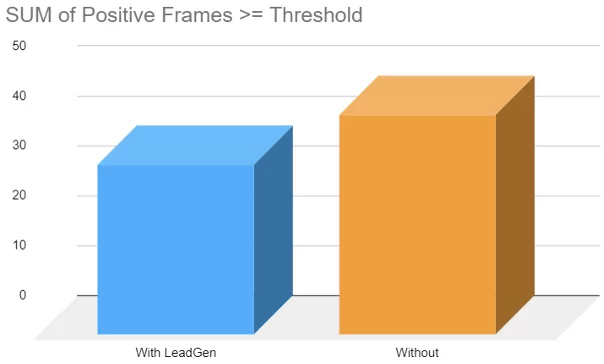
Looking at this graph, tells us that participants would show 26% more frames with positive emotions when not using the LeadGen form. This is an incredibly accurate way of measuring how long a participant would be reacting to the stimuli. As there is only a 10-frame difference, it's a very minute change in reactions
Summary:
26% more positive frame without LeadGen App
The difference in frames doesn’t mean that participants had a dramatically better time without LeadGen App.
Emotional Response - Negative
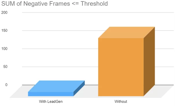
Adversely, from this graph we can see that participant had drastically (172%) more negative emotions without using the LeadGen form. Although the form without LeadGen had slightly more positive emotion frames, this huge difference in negative emotions shows that participants would show their distaste for the form without LeadGen more often.
Summary:
- 172% more negative emotions without LeadGen
- Difference shows the amount of negativity participants would have with the without LeadGen form.
Emotional Response - Attention
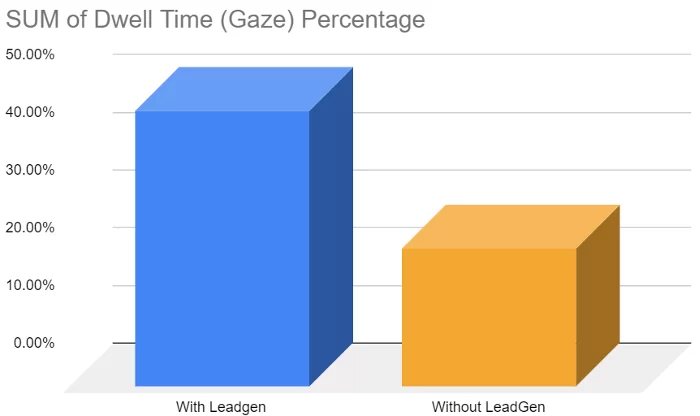
This graph shows how long participants would look at areas of interest. We detail this so that we are able to measure where their attention lies, we can see that with LeadGen has a 68% difference. This means that attention from participants would mostly be on the areas of interest showing that the content of the form is keeping them engaged.
Summary:
- 68% more attention on LeadGen form
- Shows LeadGen form keeps participants engaged
Usability Feedback
Questions
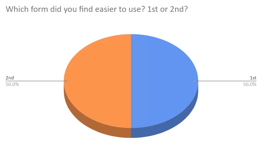
Which form did you find easier to use? 1st or 2nd
Why was it easier?
Results
1st form is without LeadGen App
2nd form is with LeadGen App
Respondents that preferred with LeadGen App found it easier due to the use of images giving a better understanding of questions
Respondents that preferred without LeadGen App found it easier as all questions were displayed on one page and users could complete it faster
With LeadGen App
“The visual aids help with the filling our process.”
“It was more visual, one question per screen. It also gave instant feedback”
Without LeadGen App
“It's easier if you know all the questions from the start”
“Was on a single page making it easy to simply go through the form.”
Observations
With the results of the experiment, a point that we found surprising from participants is that some of them had preferred the longer, pure-text form as they found it easier to complete and could see how long the form is. This could be due to individual participants reading habits. Some people will generally process visual elements faster than text and vice-a-versa, due to the limited range of respondents, it may be worth trying to test further on a larger sample group so that we could get more accurate results and better insight into why this is.
Analysis
Eye-tracking Areas of Interest With LeadGen App
Analysis
Eye-tracking Areas of Interest Without LeadGen App

