Optimizing Sign-Up Forms: 8 High-Converting Examples [+ Tips]
With the digital space becoming increasingly saturated, businesses need to leverage every tool to stay ahead, and high-converting sign-up forms are paramount in this race.
A high-converting sign-up form doesn't just collect information; it's the starting point of a relationship between a business and its potential customer. Statistics reveal that the average conversion rate for a website using optimized sign-up forms stands at an impressive 5.2%, significantly higher than the 2.35% average across the board.

What are sign-up forms?
Sign-up forms are more than simply electronic paperwork - they are innovative tools built into websites to collect visitor data and turn inactive visitors into prospective customers. They can vary in complexity, from simple email subscription forms to detailed account registration pages.
When optimized, these forms serve as a powerful touchpoint for initiating customer relationships and are instrumental in steering a business's email marketing and lead nurturing efforts.
Generating leads with sign-up forms
There is no proper way to show the importance of sign-up forms in lead generation. Sign-up forms are a powerful tool for generating leads, acting as a bridge between your business and potential customers.
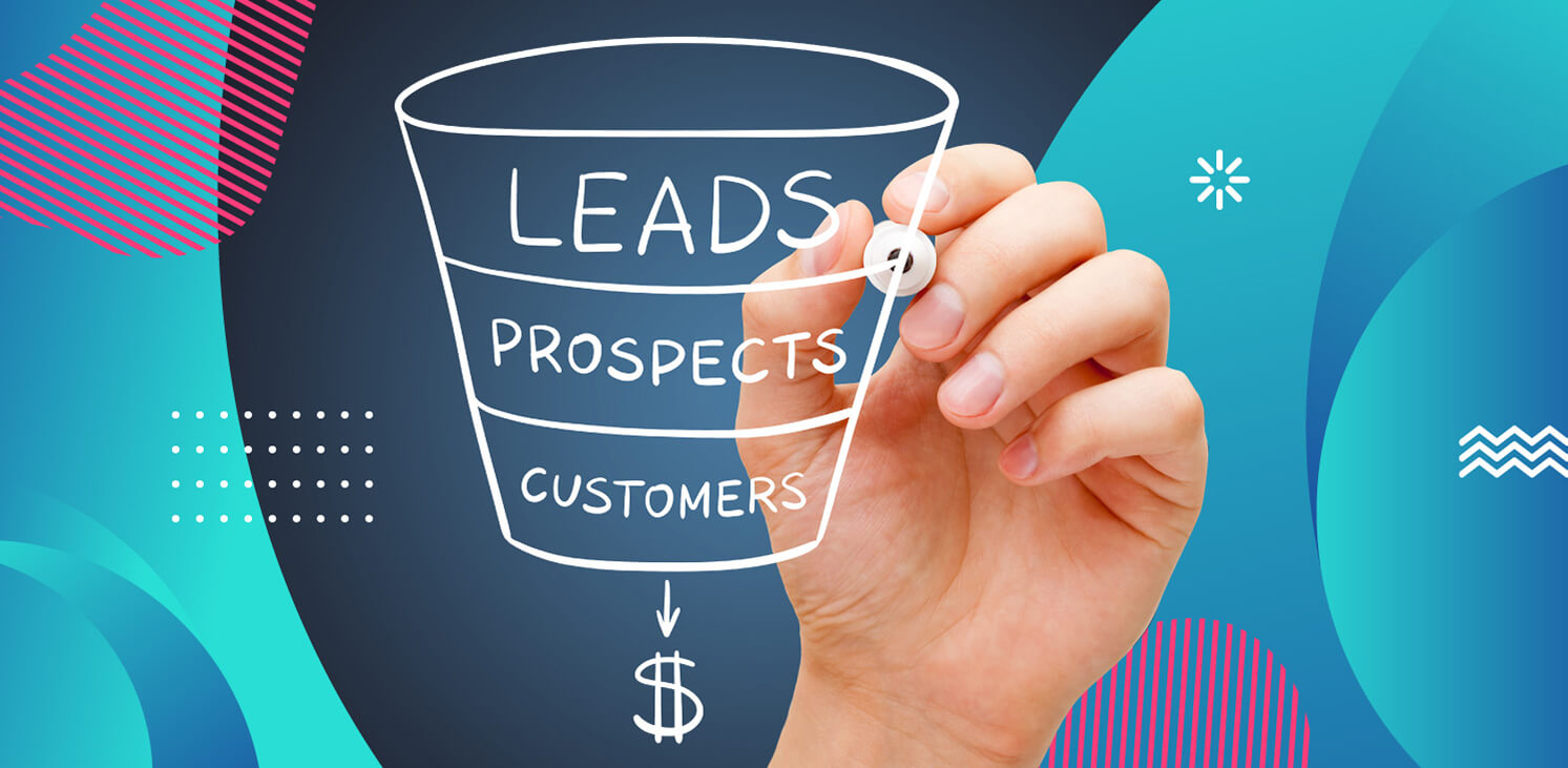
A well-designed form has the power to dramatically increase conversion rates, converting website visitors from potential leads to regular users. A Direct Marketing Association study found that email marketing brings an average of 4,300% return on investment (ROI) for US businesses. This staggering statistic underscores the potential of a well-optimized sign-up form as the first step in a fruitful email marketing journey.
What makes a high-converting sign-up form
Creating a high-converting sign-up form involves more than just asking for a name, phone number, and email address. It's about crafting an experience that is seamless, trustworthy, and compelling. Let’s take a look at the key components that make a sign-up form irresistible to users. Here are some of the key elements you should include to optimize your sign-up forms.
Compelling headlines
The headline is the first thing a visitor notices. It should be engaging and clearly state the value proposition. For instance, a headline like "Join Our Community and Unlock Exclusive Insights" is more enticing than a plain "Sign Up."
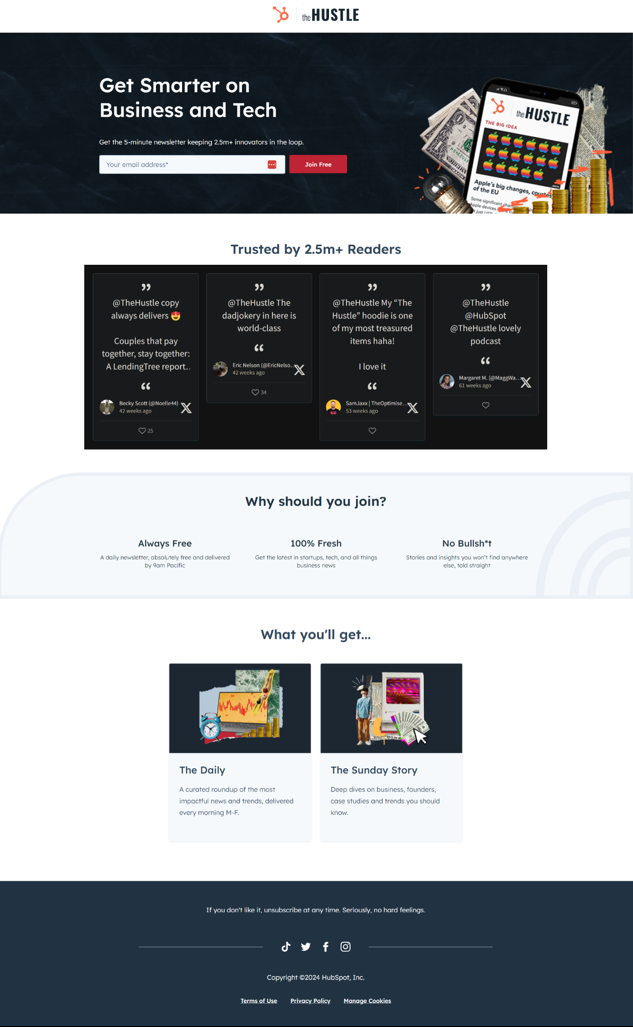
The Hustle website has sign-up forms that contain a clear benefit statement, allowing website visitors to easily understand what they will get by signing up.
Relevant and concise form fields
Each field in the form should serve a purpose. Asking for unnecessary information can deter potential leads. Keep it concise; a study by Imagescape found that reducing the number of form fields from 11 to 4 can increase conversion rates by up to 120%. Besides, there are GDPR-compliant ways to fill in the gaps in your leads’ info later that might occur due to fewer form fields - if your contact database is B2B, for instance, you can always use data enrichment tools.
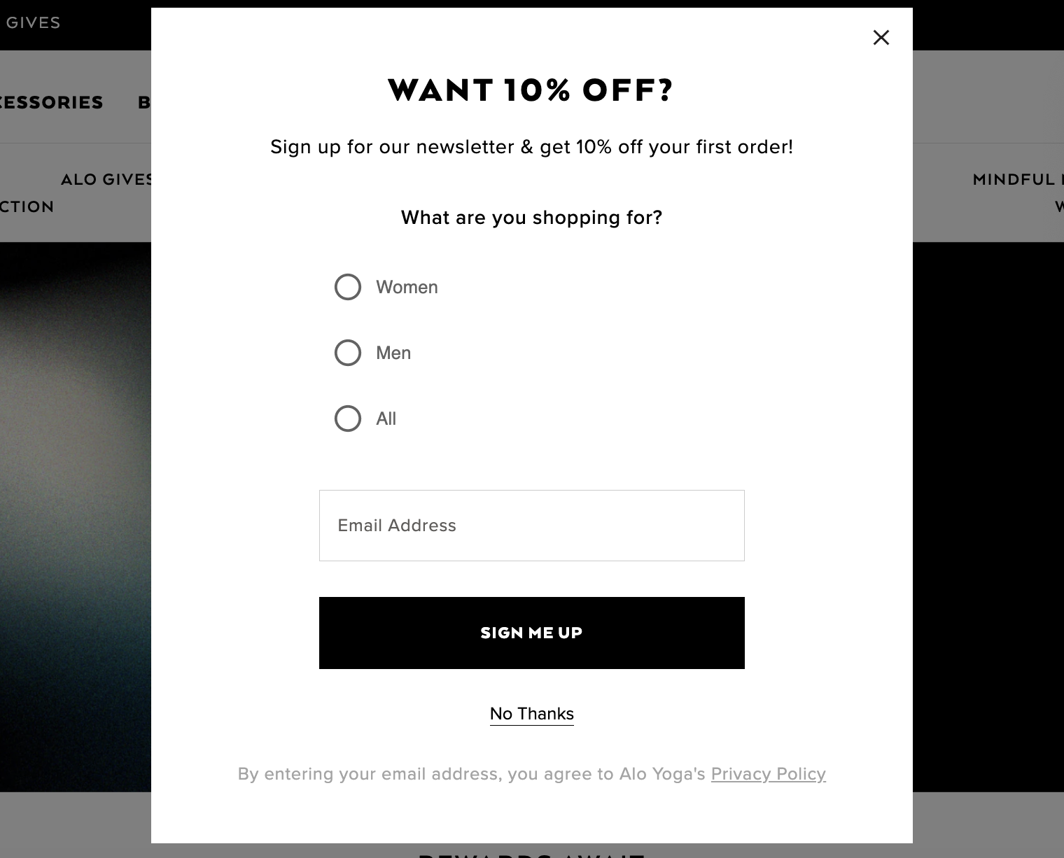
Alo Yoga uses a cleverly designed discount form at the beginning of the user’s journey to bring in the visitor straight away. The form offers a 10% discount in exchange for signing up for the newsletter but it doesn’t show up immediately to avoid annoyance and create a good user experience, while still offering an incentive to visitors.
Optimized design and layout for a better experience
Contrary to popular belief, there is more to design than just the color and size of the form. To have a proper layout, you need to know how a visitor is shown your popups in other contexts and what they ask of them.
How many fields are there? Do you want your visitors to spend ten seconds entering their name and email address, or are you bombarding them with too many requirements? If you want to make the process less intimidating, you should consider using multi-step forms to gather more data and still keep the visitor with you.
When it comes to icons and images, you need to determine whether your audience prefers text-only or image-based popups when they visit your page. You can also play around with different types of images and change between using people, animals, or products on your forms.
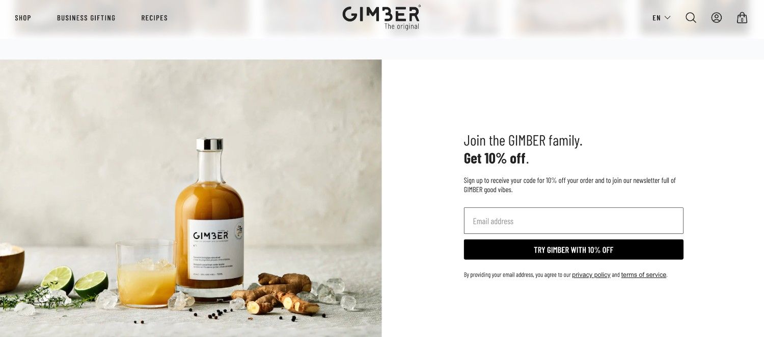
A great example of a form with a user-friendly design is Gimber. The design is visually appealing and done according to website branding. The layout is simple yet effective, with a clear call to action and an incentive to sign up for the newsletter. Visitors are more likely to subscribe because of the form's wording, especially the line "Join the GIMBER family," which fosters a feeling of belonging and personal connection.
Strategic placement of form elements
The layout of the form should be intuitive. Eye-tracking studies suggest that forms following a simple, vertical structure are more effective and user-friendly. There is also the use of “sticky elements” where a strategically placed element like a sign-up button can be fixed to follow the user while they scroll through the page.
According to the Nielsen Group, there is an 84% average difference in how website visitors treat material above and below the page fold, regardless of the screen size. This indicates that form placement is essential to your business's capacity to produce leads at a steady rate. That's quite the difference.
Pat Flynn of Smart Passive Income uses the sticky player bar at the bottom to place a “Join SPI Newsletter” button in the corner, so inconspicuously yet effectively.

Use the sign-up form in your website’s hero section
The hero section of your website plays an important role in the lead generation process - and it’s a great place to optimize for sign-ups. Given that persuading users to subscribe is the primary objective of the home page, it’s only natural that the call-to-action (CAT) and email signup are placed in the most prominent parts of the page.
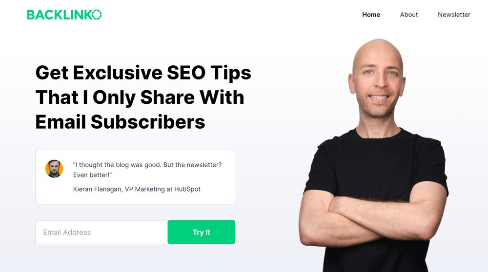
Brian Dean’s Backlinko uses its hero section to great effect. The website has a clear, concise, and direct hero image to invite visitors to sign up for their newsletter and receive free tips.
Mobile responsiveness and user-friendly design
With over 50% of global web traffic coming from mobile devices, ensuring a mobile-friendly sign-up form is non-negotiable. The efficiency and user-friendliness of forms can significantly influence a visitor's decision to engage further with your brand or move on to a competitor. If the mobile version of your website is slow or not properly designed, you won’t be able to keep the user on it and make the conversion.
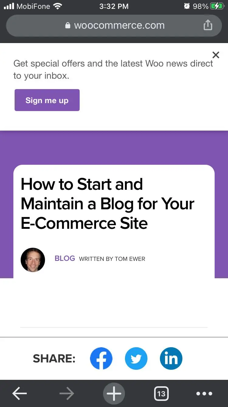
A great example of how a sign-up form can be integrated into a mobile-friendly website is WooCommerce. The sign-up form in no way interferes with the user experience and how the visitors view the content. But, with a click of a button, visitors can easily open the email form and sign up.
Optimized and clear call to actions
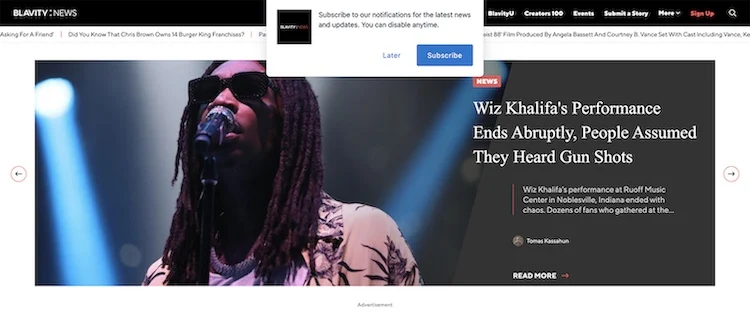
The call-to-action button is critical. It should stand out and prompt action with compelling text like "Get Started" or "Join Now." A great example is Blavity’s website, where the first thing you can see is the pop-up promoting the option to subscribe to their email notifications.
Social proof as a trust-building element
Incorporating elements like social proof (testimonials, user count) and security badges can build trust and reassure users that their data is safe and that they're making the right choice.
A great example of using social proof to drive sign-ups is on Ripped Body’s website - a popular fitness website that is run by Andy Morgan. Their newsletter subscription box on the homepage welcomes all new visitors with highlighted information that 100,000 other people have already subscribed.
Sign-up forms tips to help you improve form conversion rates
Creating an effective sign-up form is a critical step in optimizing your website's conversion rate. A well-designed form can be the gateway to a growing audience, customer base, or user community, making every field, button, and piece of text crucial for engaging potential subscribers or customers. Whether you're looking to increase newsletter subscriptions, drive registrations for a service, or grow your membership, the following tips will help you create a more effective and user-friendly sign-up form.
A/B testing
Never settle on the first draft of your sign-up form. Test different versions to understand what resonates best with your audience. By A/B testing, you can get valuable insights into user preferences and tweak your form accordingly.

Exit-intent popups
Implementing exit-intent popups with a sign-up form that get triggered just as a visitor is about to leave can capture leads that would have otherwise been lost. With these popups, you can seize the last opportunity to engage users, offering targeted incentives, exclusive promotions, or valuable content to encourage them to stay or convert.
Personalization is the key
To make the sign-up experience more relevant and interesting, customize it depending on user behavior or demographic information. Customizing an experience at each touchpoint through analysis of user behavior, preferences, and demographics is the essence of personalization, which extends beyond just addressing consumers by name.
Follow-up emails after sign-up

The journey doesn't end at sign-up. Send a welcome email to acknowledge the new sign-up and set the stage for future communications. These messages at the start of the user's journey can be a powerful tool for relationship-building.
Make sure your email communications look good
When people sign up for your email communication, you want to keep them signed up. So when you learn how to design a newsletter or other types of email communication, make sure you implement best practices that will keep people signed up and potentially incentivize or push them to start using your products.
Why optimizing sign-up forms should be your top priority for your email marketing
Sign-up form optimization is not just a best practice It is also a must for companies looking to increase lead generation and conversion rates. Businesses may maximize the efficacy of their sign-up forms by emphasizing aspects that foster trust, engaging content, and user-friendly design.
Remember, the goal is to create a seamless experience that respects the user's time and privacy and aligns with your business's lead generation objectives. Embrace these tips, test rigorously, and watch as your sign-up forms transform into gateways for growth and opportunity.
About the Author