Smart SaaS Web Design Choices to Reduce Conversion Barriers
SaaS as an industry is growing faster than ever. In 2023, the average SaaS spend per employee reached $9,643 in 2023. Even more impressively, the average department used 87 SaaS apps over the past year, showing how irreplaceable software solutions are for running a business.
However, the issue with such expedient growth is that it can make it more challenging to convert new customers. According to the latest data, the average visitor-to-lead conversion rate is 1.9%. In other words, achieving average conversion results means letting more than 98% of your web visitors leave your website without turning into potential customers.
Fortunately, you can employ SaaS web design to prevent that from happening. So, without further ado, here are the smart design decisions you can implement to reduce conversion friction.
Lower the Stakes for Clicking a CTA
SaaS solutions can be hugely valuable to both end consumers and businesses. But the harsh truth is that people only use about 47% of their app subscriptions. In other words, spending on software does not always pay off.
Now, this may not seem that significant at first glance. After all, people invest in all types of products, regardless of whether they utilize them or not. However, if you're trying to reduce conversion friction on your website, you must understand that the three main priorities for software buyers include:
- Easy implementation.
- Ease of use.
- The ability to get ROI within six months.
What does this data show? It demonstrates that the key to achieving a high conversion rate on your SaaS website means ensuring your audience understands that investing in your solution isn't a risk. Instead, they should perceive your offer as an opportunity to get unmatched value.
One of the easiest ways to drive this message home is to adjust your CTAs. Lower the stakes for your audience. Replace messages such as "sign-up now" with less intimidating copy. That way, you can reduce friction and increase your audience's likelihood of converting on your website.
For example, check out how well Going, a service to find cheap flights, implements this strategy on its homepage, where almost every CTA highlights that people can access the brand's services for free.
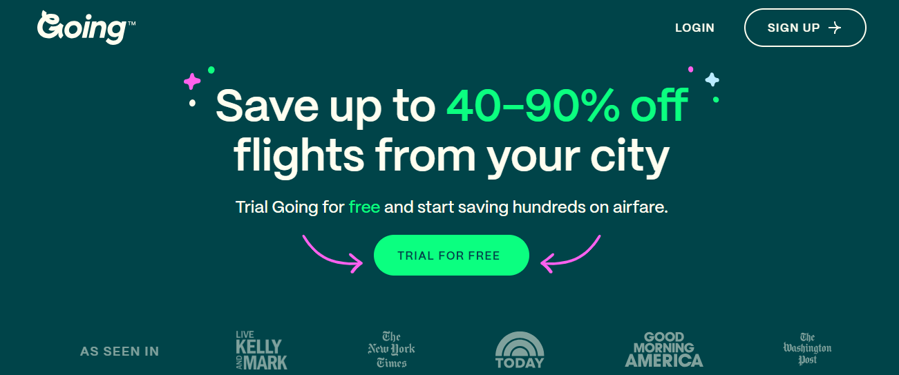
Source: going.com
Provide Relatable Testimonials
Social proof is crucial for reducing conversion friction and growing your business. Especially if you're targeting a B2C audience.
According to Power Reviews, nine in 10 consumers consider reviews when evaluating purchases. Even more importantly, 74% of people see ratings and reviews as crucial information when researching products they haven't used before.
With this in mind, you must enhance your SaaS web design with testimonials. Even more importantly, you must utilize social proof that's relatable and relevant to your audience.
Instead of only showcasing product ratings, do your best to use social proof in a way that allows your audience to take a deep dive into the benefits of investing in your solution.
For instance, check out how Bay Alarm Medical, a medical alert company does this. The brand features video interviews on its homepage, with each one focusing on one specific benefit of signing up for a medical alert provider. This doesn't just convince prospects to give the service a chance. It also removes conversion obstacles, demonstrating that Bay Alarm Medical genuinely has the answer to its audience's needs.
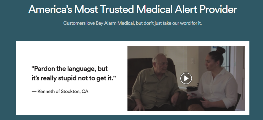
Source: bayalarmmedical.com
Make Pricing Plans Very Easy to Compare
Today's consumers are very committed to researching solutions to get the most value for their money. According to PWC, 29% of all consumers now use price comparison websites to perform their pre-purchase research, with mature buyers being particularly reliant on this type of resource.
However, while many SaaS brands include this format on their websites, they regularly overlook a common conversion killer: the lack of clarity.
In fact, if you look at consumer psychology, you'll find that in-depth product info can drive conversions — but only if it's not too overwhelming. Otherwise, it leads to information overload and negatively affects shopping decisions.
To overcome this source of conversion friction, do your best to make pricing plans very easy to compare on your website. Use highly readable language. Don't rely too much on jargon. And do your best to visually organize information to aid understanding.
A brand that does all these things is Aura, an Amazon repricing tool. On its Pricing page, the SaaS brand makes it extremely easy for prospects to compare plans, ensuring that it doesn't bombard them with unnecessary information and doing its best to highlight the differences between each subscription option.
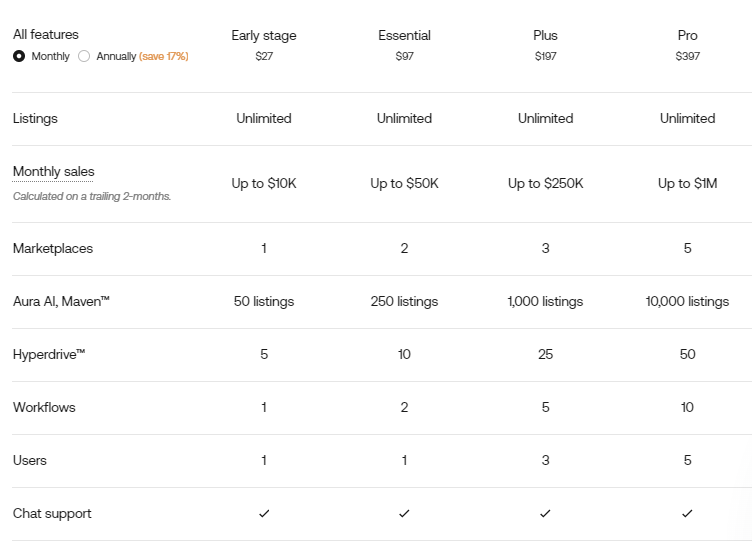
Source: goaura.com
Make Very Specific Promises That Will Resonate With Your Target Audience
If you look into what consumers want from brands, you'll find they're after an exceptional customer experience. And they won't settle for anything less. Surveys have shown that 61% of people want brands to deliver better service and experiences. On top of that, 51% would be willing to switch brands when they don't get higher-quality service.
When trying to boost conversion rates on your SaaS website, you'll find there is one excellent tactic to remove conversion friction and convince your audience to invest in your solution. And that hack is to optimize your value propositions.
By making specific promises, you won't just demonstrate that you understand and care about your audience's needs, which 79% of consumers want from brands in the first place. But more importantly, you'll use SaaS web design elements to convince your prospects that what they need is what your business offers.
For a great example of how you can do this, check out the homepage of Goldcast, a webinar software service. This brand doesn't just state that it can help users up their event marketing game. It also quotes real-life results from successful clients to demonstrate the impressive outcomes future customers can achieve if they invest in Goldcast's software solution.
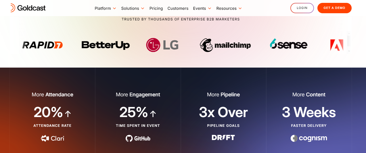
Source: goldcast.io
When Targeting B2C, Appeal to Customer Emotions
While proven data and specific promises work marvelously for B2B leads, remember that thrilling B2C clients requires a slightly more emotional approach to removing conversion obstacles.
Look into consumer psychology. You'll find that people don't always make shopping decisions based on cold-hard data. Instead, approximately 95% of purchasing decisions are subconscious. In other words, people often invest in products based on impulses or emotions.
With this in mind, when designing a SaaS website to appeal to end-consumers, try your hardest to appeal to your target audience's emotions.
For example, if you check out BetterHelp, an online therapy service provider, you'll see that it expertly uses emotional marketing to show web visitors the outcome its solution offers. By pointing out that its audience deserves to be happy, the brand addresses its prospects' most frustrating pain point — being unhappy in life. BetterHelp also uses emotional messaging to give web visitors a taste of the outcome they could attain — better emotional health.
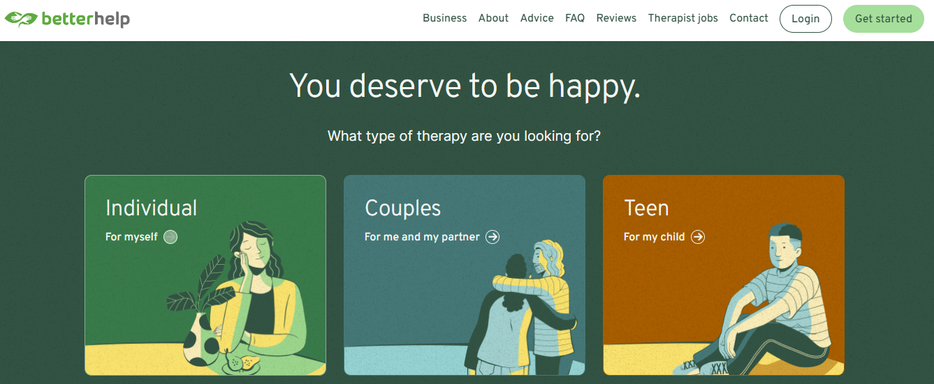
Source: betterhelp.com
Use Explainer Videos Rather Than Complex Text
High-quality, conversion-boosting web design needs to be user-friendly. And if you look at how consumers prefer to learn about solutions to their pain points, you'll find that reading lengthy product descriptions doesn't rank high in terms of appeal.
In fact, using complex text to describe product features could be a source of friction for your target audience, seeing that internet users don't have the necessary patience to read through entire blocks of text.
One effective design hack that can reduce this common conversion obstacle is to replace feature and value descriptions with explainer videos.
If you look at the benefits of adding video to your web design, you won't just find that this format helps capture your audience's attention with an impressive 46% engagement rate. But more importantly, video works wonderfully for boosting SaaS conversions as well.
According to Wyzowl, 77% of consumers were convinced to download an app by watching a video. Plus, when asked whether they would prefer to read an article, study a manual, jump on a sales call, attend a webinar, or watch a video, 44% opted for the last option.
So, if you wish to maximize your SaaS site's conversion potential, explore ways to incorporate video marketing into your product descriptions. For example, you can follow in the footsteps of AirCall, a business phone system service, and add a video right to the hero section of your homepage. In such a position, this type of content is guaranteed to attract visitor attention and help maximize product understanding.
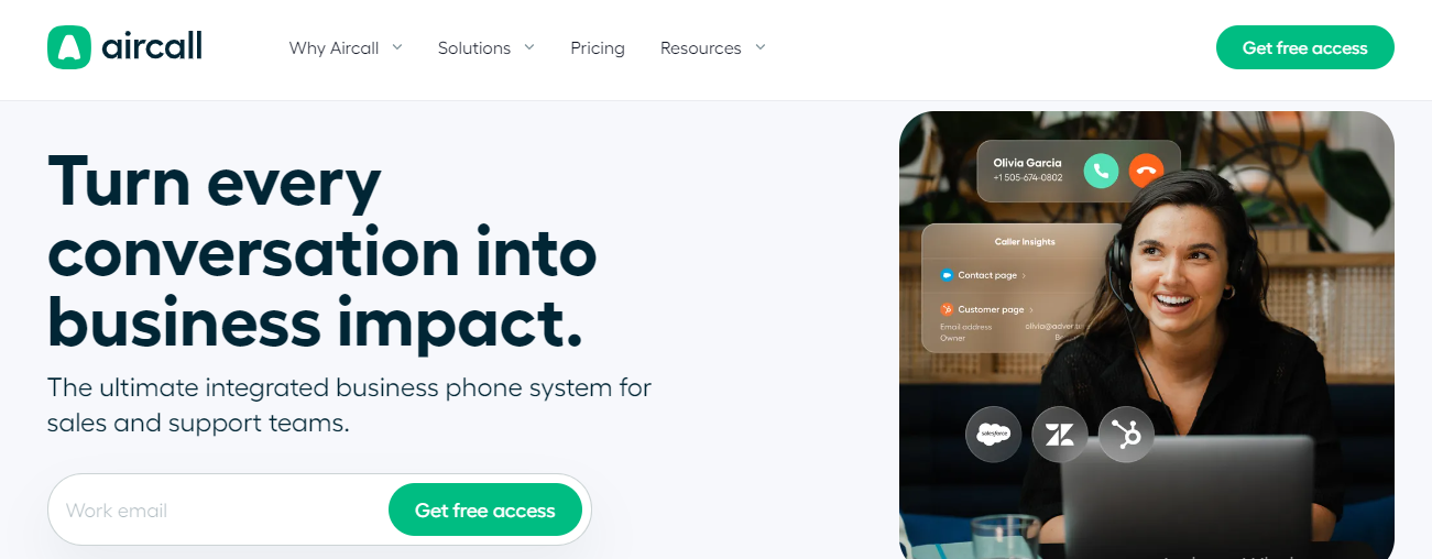
Source: aircall.io
However, if you prefer to get more out of the format — especially for improving product understanding for complex solutions — you could take inspiration from SaaS brands like ERP service Workday. Knowing that the complexity of its software product could be challenging to describe, this brand chose to transform some of the social proof on its homepage into short-form stories. That way, Workday gained an opportunity to show potential clients the benefits of investing in its product instead of only relying on text to tell them about the outcomes of converting.
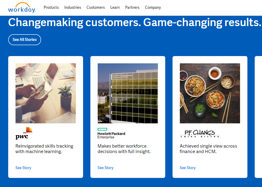
Source: workday.com
Minimize the Amount of User Data You Collect
If your primary conversion goals include generating leads for your business, you'll have to make intelligent design decisions to optimize your forms.
But here's the deal. Most consumers — especially end users — don't want to give away too much personal information to brands. A 2023 survey discovered that:
- 55% of people distrust brands with their personal info.
- 77% unsubscribe from businesses because they feel their data is being misused.
So, if you're trying to capture leads to nurture into customers, you must understand that you're toeing a fine line.
Fortunately, you can implement some effective design and marketing strategies to overcome this common source of conversion friction.
For one, if you're asking for extensive user data, ensure it benefits your prospects. While people don't want brands to have access to their data, 74% would be willing to share personal information if it meant getting a better deal, free resources, or access to exclusive perks.
Secondly, understand that getting personalized ads and offers could encourage your web visitors to share more of their info, such as their gender, age, language, and interests.
But, of course, also try your best to exercise restraints when designing lead capture elements. Essentially, do your best to only ask for the user data you genuinely need. Plus, consider the fact that a lengthy sign-up process could be a source of friction in itself.
Take inspiration from brands like online collaboration tool Notion. This brand only requires an email from new customers. Once that's been provided, the SaaS company takes them through a more in-depth onboarding process where it collects additional data that could improve the user's experience.
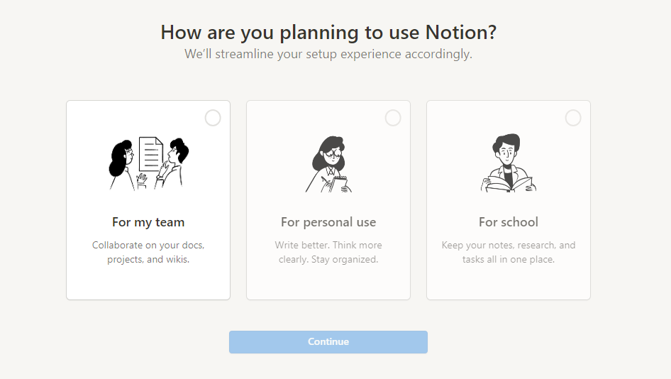
Source: notion.so
Make Smart Use of Negative Space
Lastly, as you explore ways to boost your SaaS site's conversion potential, don't forget to keep your design simple.
Ultimately, no matter how much you invest in creating the perfect website for capturing new leads, you won't reach your goals if the design is overcrowded. A maximalist approach to design can look great. However, lacking negative space will only provide friction, preventing visitors from noticing high-value elements and recognizing your solution's value.
To ensure a seamless user experience, your SaaS website should be easy to navigate and visually appealing. For an excellent example of a SaaS brand that manages to include many elements on its homepage without creating friction, check out Patreon. You can see that the business employs bold design choices.
Moreover, it utilizes numerous visuals on each page section to show the breadth of its solution. Nonetheless, using negative space — both in the design and the UX elements like the CTA buttons — ensures that web visitors still have a relatively straightforward browsing experience. And the result is a high-converting website that doesn't alienate but effectively communicates value.
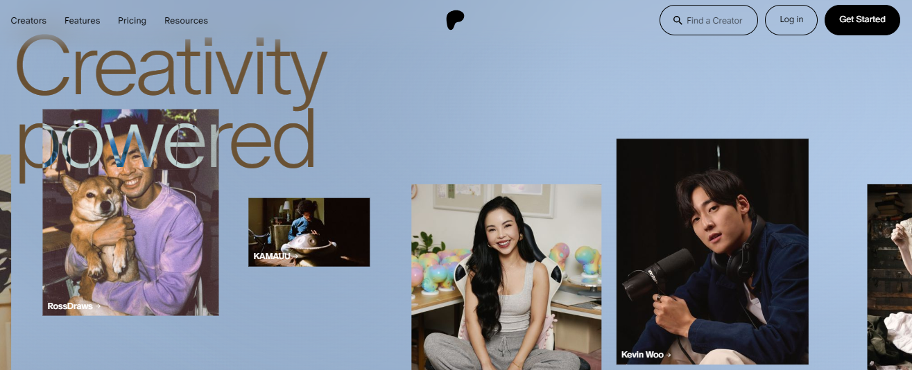
Source: patreon.com
In Closing
Removing friction and conversion obstacles from your SaaS website doesn't have to be a complicated process. In most cases, implementing the strategies from this guide will work marvelously to help you capture more leads and customers.
However, to guarantee the best possible results, don't forget to base your design choices on real-world data. That is, ensure you test each design decision by seeing how it affects conversion rates. And don't be afraid to make changes — even when they are unconventional — when you recognize an opportunity to boost your site's efficacy.
About the Author