7 Ways to Take Your Visual Content to the Next Level For the Holiday Season
The holiday season is just around the corner, and consumers are in the mood to spend.
If you want to get your share of the market, you should be taking your visual content to the next level. The biggest holiday spenders are millennials, and they prefer visual content to text-only content.
In fact, the average millennial is expected to spend $1,646 this holiday season. Followed closely behind are Gen Xers with an average spend of $1,594, and baby boomers who will spend around $1,347 each.
Millennials are known for clicking and sharing visual content like pictures, memes, videos, and infographics.
So, what should you be doing to enhance your visual content in time for the holidays? Let’s take a look.
1. Keep your audience interested
It’s no secret humans have short attention spans. In as little as eight seconds, a consumer can forget about your brand and move on to something shiny and new.
Your visual content should keep your audience interested. Whether it’s a post on social media or a parent page on your website, it should be attractive, relevant, and high-quality.
Professional visuals can be the key to better bounce rates and increased engagement. Just remember to format your visuals properly, so they don’t slow down your website.
Here’s an example of a brand that knows how to engage its audience. Preply’s parent page for learning Spanish uses a mix of content.

As you can see, visitors are welcomed straight away by a call-to-action, appealing colors and graphics, and a friendly face.
If you scroll down the page, there are more pictures, infographics, and videos to break up the text. And if you visit the brand’s social media pages, the visual content is consistent, so users know exactly what to expect.
2. Go, go, video
Video adds another dimension to your visual content. If video isn’t part of your holiday marketing plan, you could be missing out.
Consumers are now accustomed to seeing videos in their newsfeeds and on websites. They even seek them out on YouTube and video streaming platforms.
Of course, not all videos are going to win you fans. The wrong video content could have the opposite effect. So, what’s the secret to great video content? Keep your videos short, relevant, inclusive, and shareable.
Before you hit the record button, consider your audience. Do they have a sense of humor? Are they sentimental? Are they looking for a bargain? When you know who is watching, you can tailor your videos to their needs.
For example, GetSafe, a medical alert device, uses humor in their presentation video to match who their audience are.
For the holidays, time-sensitive, themed videos can work well. For example, you can work on website video production and showcase the top gift ideas from your online store. At the end of the video, include a call-to-action, such as “Shop Now,” so they know what to do next.
Are you working with an influencer? Ask them to upload a fresh video for your brand in the lead-up to Christmas.
3. Be informative
Sure, your visual content should be good-looking, but it can also serve a purpose. If your customers are likely to have questions, why not give them what they need to know in a graphic?
Infographics are a common way to share information and often include statistics and useful hints and tips. They’re made to be shared and can give your credibility a boost.
Or you can use banners to educate your audience. When strategically placed, a banner can nudge shoppers into adding your product to their cart.
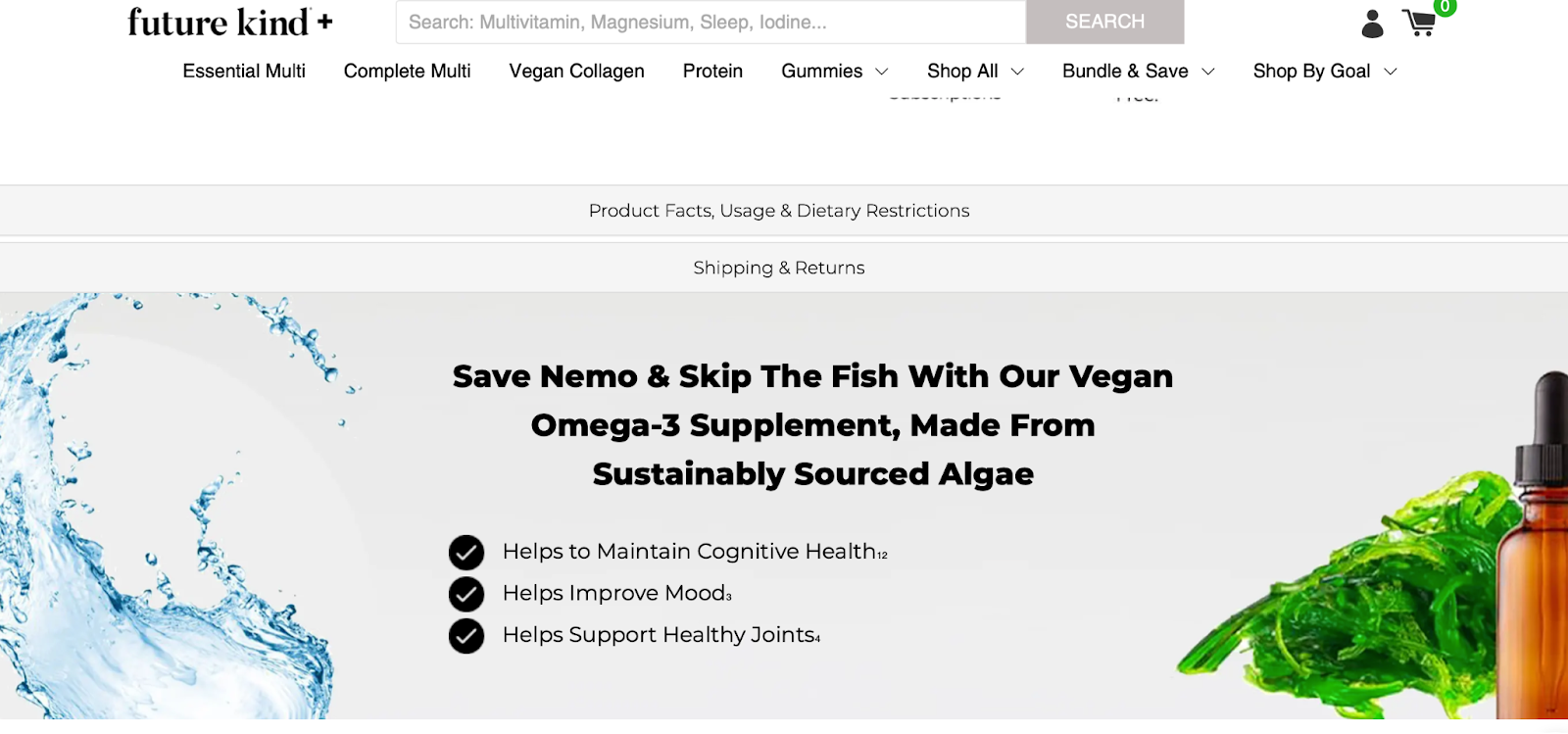
Here’s an example from Future Kind, a vegan supplement brand with a niche audience. It understands the needs of customers and has added a visually appealing banner to product pages.
There are splashes of nature, a brief explanation, and three bullet points to highlight the product’s features.
It’s simple yet effective, and despite the text, it doesn’t feel cluttered. The brand can re-use this banner on social media and email newsletters.
Readily available, informative visual content can be reassuring for potential customers.
4. Tie it all together
When you start planning your visual content for the holiday season, be consistent and tie your campaigns together.
Whether it’s an ad on a third-party website, a Christmas website makeover, or a Facebook meme, visitors should know it’s from the same brand. Fonts, styles, and images should be seamless across your visual content.
This means if you’re going for a rustic look with a crisp white Arial font and a witty tagline — stick with it.
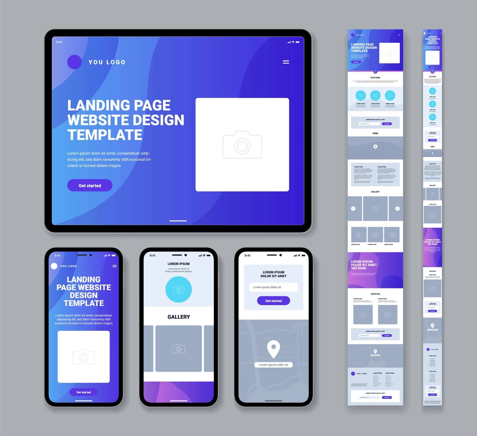
Consider creating a landing page for all your holiday promotions. Your landing page should be professional and match the tone, look, and feel of your holiday visuals. And, once again, make sure there’s a clear call-to-action such as a “Shop Now” or “Sign Up Here” like this fireplace store is doing.
If you have an Instagram account, have something similar in all of your images. For example, you can use the same color scheme or filter. When a user visits your page, your grid will look intentional and organized rather than eclectic.
5. Get in theme
When it comes to the holidays, more is more. Don’t be afraid to get into the holiday spirit and add a little festivity to your visual content.
If you use social media, you can share photos of Christmas trees, stockings, or a winter wonderland.
Holiday-themed imagery can be sophisticated. Try shades of gold, silver, white, and green. You can craft themed visuals easily using tools like MagicStudio.com.
Here are a few examples from Instagram with the Christmas hashtag.
Not sure where to start? Create a mood board with some of your favorite holiday visual content ideas from around the web. Once you know what you like, style your own photos and graphics. Or you can share your vision with your graphic designer.
If you want to add some festive cheer to your website, pop a Santa hat or holly on your logo. You can also showcase top gift ideas on your homepage.
For those with a newsletter mailing list, a holiday-themed email with product images and a discount code could drive traffic to your website.
If your holiday visual content is well-made, there’s no reason why you can’t re-use it again next year. Say no to bah-humbug and yes to Christmas-themed content.
6. Describe it
Your visual content can be part of your SEO (search engine optimization) strategy. Did you know that your images can help you get a higher ranking on Google?
When you upload media to your website, don’t skip the title and description. These fields tell the search engines exactly what the images are. The description is also used to help those with visual impairments understand your content.
If you use a content management system such as WordPress, filling in these fields is a breeze. There’s no need for coding skills, as you’re prompted when you upload your media.
If you have holiday content that’s shareable, consider adding your logo and website address to the image. When it’s shared, you may get extra visitors and improve your brand awareness.
7. One size doesn’t fit all
What works for one platform may not work for all. Social media platforms are all different, and if you’re going to share visual content, you want it to look its best.
Before investing time into new holiday graphics, think about where they’re going. Are you posting to your website? Or is it going on Facebook, Instagram, Twitter, TikTok, or YouTube?
Here are a few examples. Instagram is well-known for its 1,080 x 1,080 squares, but now you can upload portrait and landscape sizes.
Facebook uses a range of sizes, such as the 170 x 170 profile picture and the 1,200 x 1,200 shared image. Twitter has a 1,024 x 512 photo and a 1,500 x 500 header image.
Your website may also have unique image sizes, with different versions required for thumbnails and featured product shots.
If your images are too small, it can cause pixelation. If your images are the wrong aspect, they can be cropped in the wrong place. It’s worth taking the time to get it right.
Remember, it’s better to be too big than too small if you want your graphics to be high-quality.
Get your visual content ready for the holidays
The holiday season is a time for friends, family, and shopping. Take advantage of consumer holiday spending habits by improving your visual content.
First, you should keep your audience interested. When they visit your website, they want to see visual content that’s designed just for them. It should be inviting and professional, with a clear call to action.
Invest time in video, and add information to your images that will educate your customers. Tie your campaigns together with consistent branding, and don’t be afraid to add some Christmas flair.
Don’t forget to add image descriptions and choose the right aspect and size for the platform.
With these simple tips, you can smash the competition this holiday season. What are you waiting for?


