How to Optimize Your Website for Enhanced Usability
Your website is the most powerful business tool at your disposal. A well-designed website gives the audience an exclusive platform to engage with your products and services. It also establishes credibility and showcases your brand identity.
But is design the only thing that makes a website effective? No.
For UX designers, usability is also an influential factor besides aesthetics. Because even if you have an appealing website, visitors will click off without easy navigation.
Alternatively, an optimized website can increase signups, visit duration, and conversion rates.
In today’s article, we help you enhance your website’s usability with some proven methods and convert more visitors into loyal customers.
Understanding Website Usability
Website usability encompasses the ease of navigation for website visitors. It measures how ‘user-friendly’ a specific website is.
Various factors impact a website’s usability, including:
a. Site navigation
b. Lack of ambiguity
c. Device optimization
d. Content placement and readability
e. Loading speed
f. Personalization
g. Intuitiveness
Optimize Your Website for Enhanced Usability
Duman Zhumagulov, owner of BoxStar movers who successfully implemented these principles on their website and blog, recommends "With the right website optimization strategies, you can take care of the above aspects and reap the benefits of enhanced usability". Follow these key ones:
Conducting a Website Usability Audit
Start by detecting issues in the current usability of your website. The best way to approach it is by running a website usability audit.
A usability or UX audit is an interface evaluation process that examines user journeys on your website, identifies areas that of user friction, and provides improvement recommendations.
Through UX audits, you get actionable insights on exactly what’s working and what’s not. Instead of making assumptions about user preference, you can create data-driven designs. You can also decipher existing user behavior and hypotheses about future behavior.
Some common usability issues you can identify through UX audit include:
1. Design inconsistencies
2. Broken links
3. Unstructured site map
4. Too many submenus
For example, let’s look at Apple’s website. The menu on the top of the window disappears when you scroll down. For better usability, it should be pinned in the category menu. UX audits and user testing platforms can identify such issues and provide actionable insights to help you enhance the user experience.
This kind of audit is useful across industries—from e-commerce to service-based websites. For instance, if you're building a service-focused site, like one for landscaping professionals, incorporating proven lawn care marketing tips into your website structure and content can dramatically improve both usability and lead generation.
Simplifying Navigation
Poor site navigation is one of the primary reasons for a higher bounce rate. It reduces conversion rate, negatively impacting your bottom line and revenue.
Your website must have simple navigation to optimize usability. This allows visitors to easily explore and find what they want without getting frustrated.
Here’s what you can do to simplify your site navigation:
1.Plan out your page structure. You can use a sitemap creator to lay down some mockups quickly.
2.Follow the established standard because website navigation is more about usability than creativity. For example, you can use the familiar hamburger sign (☰) or the ellipsis icon (⋮) to indicate your website’s expandable menu.
3.Add your cornerstone pages and content to the footer menu to highlight valuable content and engage the fast scrollers. This not only enhances user experience but also ensures that your exclusive content is easily accessible to visitors navigating your site.
4.Use color, fonts, and white space to separate your menus from the sidebars and your main website content. Make the beginning and the end of your site navigation clear.
5.Avoid dropdown menus.
6.Organize content based on primary keywords and place them in different silos.
7.Add a search bar and relevant filters on your website.
8.If you have a large amount of content organized in a hierarchy, consider using the breadcrumb navigation scheme.
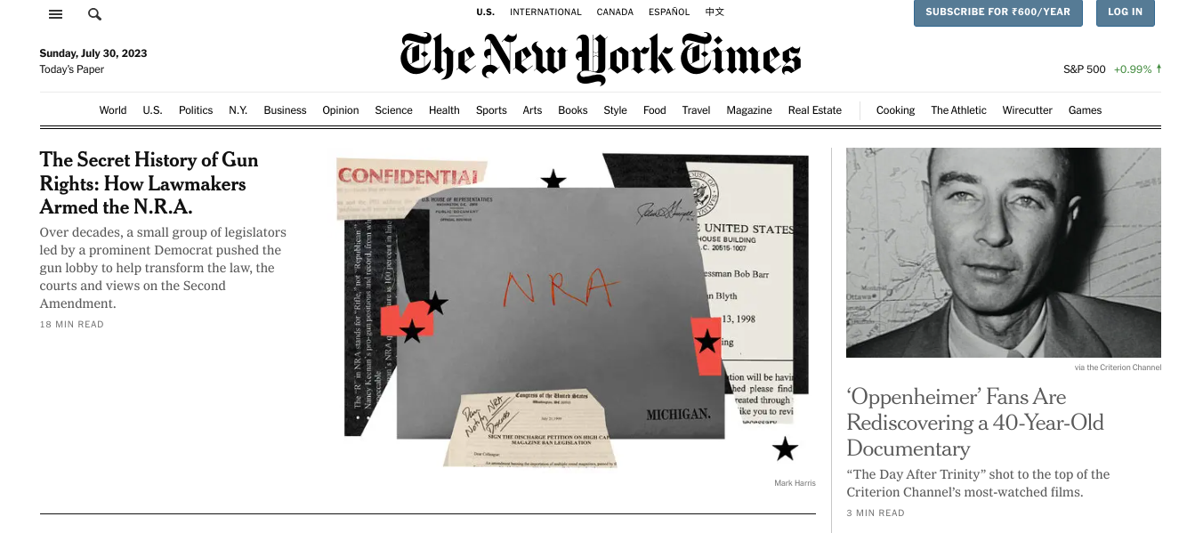
The New York Times website is a notable example of exceptional site navigation. Their landing page uses the hamburger sign for its menu. The homepage has a login option, CTA to the subscription package, and a search button for easy navigation.
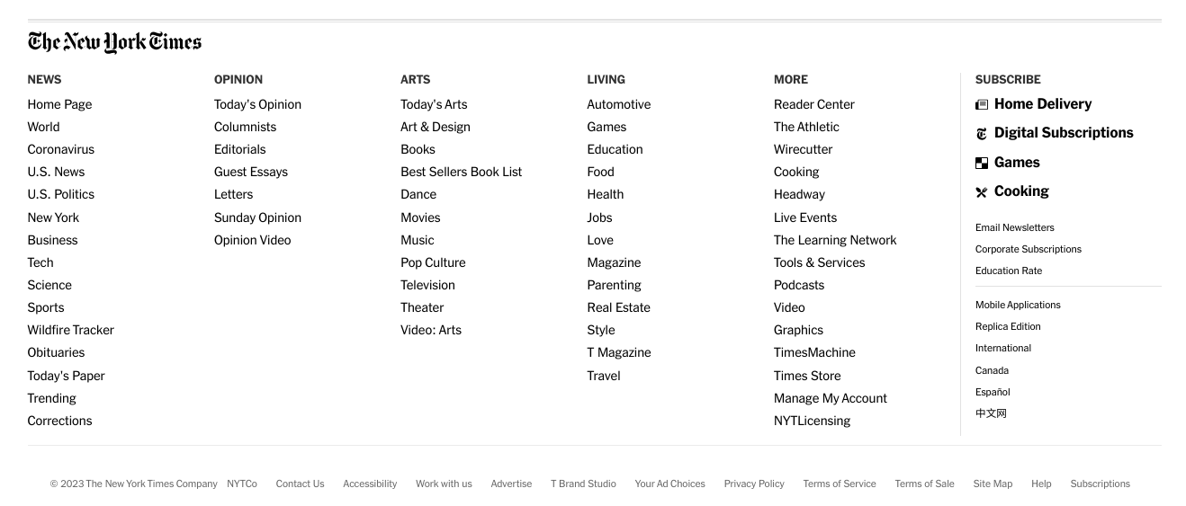
The NYT footer menu is detailed and consistent across every page, similar to the thorough approach taken by an Apple vision pro developer in designing seamless user experiences.
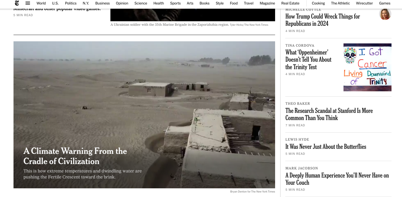
The content layout is also practical for a newspaper. Every featured article is clickable with its internal page on the website.
Neal Taparia from Cribbage-Online adds, “Once you have navigation implemented, review your data. Which links are users clicking on and which have value? If a navigation element is taking up real estate but not driving clicks or value, consider removing it and further highlighting the more important elements on your page.”
Optimizing Website Speed
Studies note that a website with a loading time of 1 second sees a 5x higher conversion rate than one with a 10-second loading time. A longer page response time loses the visitor’s interest and increases bounce rates.
So, you must optimize your website’s loading speed for better usability, especially when designing a SaaS website. Besides lowering bounce rates, fast websites also rank higher on search engines.
Follow these steps to improve your site’s loading speed:
1.Parallel HTTP requests take longer to connect the browser and the remote web server. So, reduce them as much as possible.
2.Too many high-resolution visuals can slow down your website’s performance. So, optimize image size, use a graphic maker, use JPEG for colorful images, and PNG for simpler graphics.
3.Upgrade your server hardware to have more memory.
4.Compress your CSS, JavaScript, and HTML code.
5.Cache every web page to store visitor data and minimizes the loading speed.
6.Ensure asynchronous CSS and JavaScript files load multiple files simultaneously, speeding up the response time.
7.Use Content Delivery Networks (CDNs) to optimize static file delivery.
Enhancing Readability and Accessibility
Your website content is what keeps visitors engaged on your website. Proper readability and accessibility of your copies help the visitors skim through the information quickly, enhancing usability.
Follow these steps:
a.Let your website’s typography follow a consistent and on-brand theme.
b.Use appropriate heading tags that are relative in size to each other.
c.The minimum font size should be 16px.
d.Use responsive web design for multi-device accessibility.
e.Use simple words and shorter sentences for better comprehension.
f.Photos make your website copy look more engaging. So, use relevant pictures to break up texts.
g.Use alt tags and alt descriptions for images to make the content more accessible.
h.Provide transcripts for multimedia content to accommodate the disabled audience.
Alongside the above steps, Damian Grabarczyk, co-founder of PetLab Co. says, “We have started to introduce audio widgets to some of their evergreen long-form content. This has been added to help make the articles more accessible to people who may have difficulties with their eyesight, as they can now listen to the expert pet knowledge and advice.”
Streamlining Forms and Calls-to-Action (CTAs)
Companies embed forms to get visitors to sign up for services, purchase products, make payments, submit feedback, etc. You need simple, user-friendly, and aesthetic forms for better usability and conversion. Here’s how you do it:
1.Keep minimal fields and use a straightforward tone.
2.Stick to a single-column layout for better comprehension.
3.Arrange the fields from the simplest to the most complex.
4.Embed inline forms for real-time verification.
5.Give your forms clear titles to help visitors make informed decisions.
6.Use auto-fill browsers for better convenience.
To streamline the process, you can also use conversion optimization tools. For example, LeadGen offers customized form builders with 400+ templates and conditional flows.
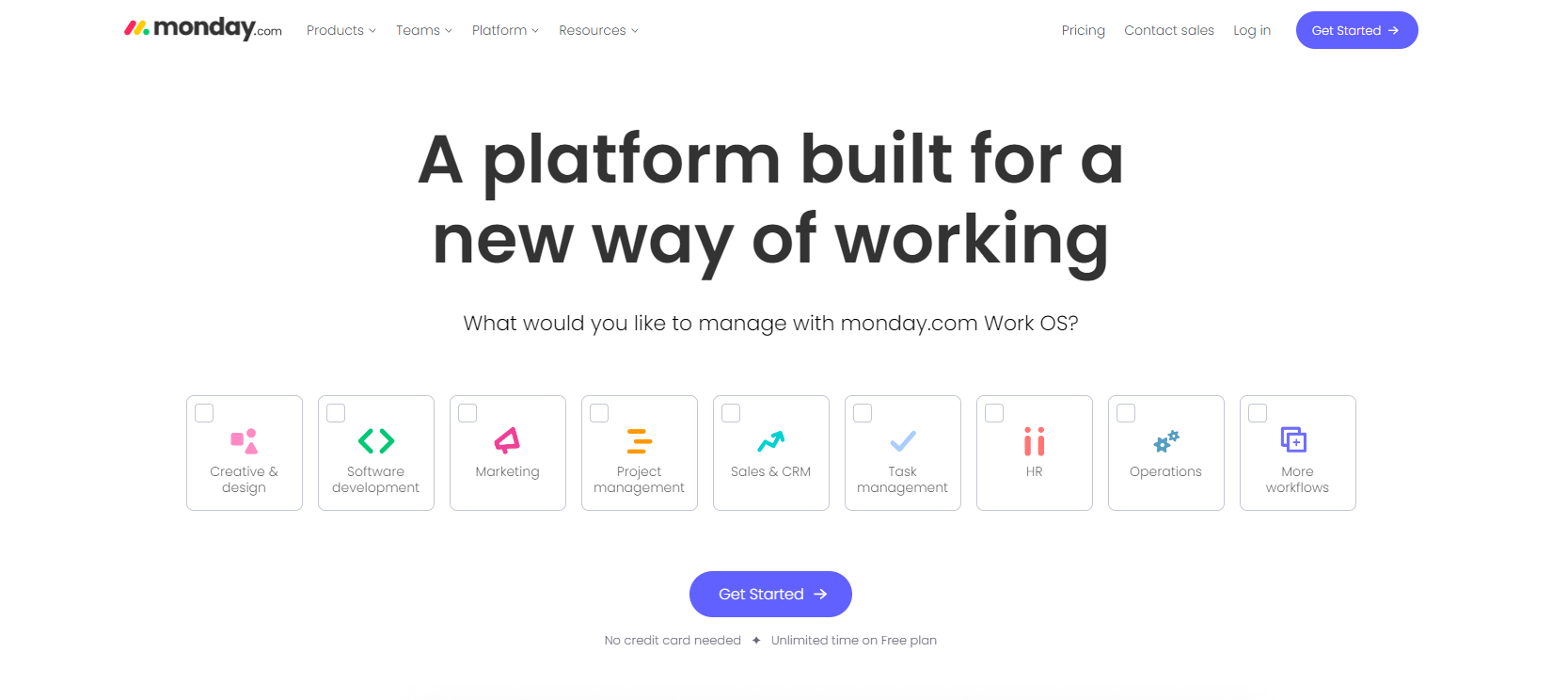
CTA placements are also vital to boost the conversion rate. Place your call-to-action buttons above the fold as Monday.com does. Use a scroll heatmap to identify your page's fold and if your CTA is below the cut-off. Keep it short, clever, and catchy.
Use micro-interactions like scroll bars, pull-to-refresh animation, notifications, loading clocks, etc. These will make their website visit fun and guide them through the journey. Moreover, make sure to communicate to the website visitors that you accept payments online and can keep their data safe in case of return purchases. Consider also implementing open banking payments for a more secure and convenient checkout process.
Mobile Optimization
Most modern users visit digital platforms on their mobile phones. So, you must implement a mobile-friendly interface for your website. Engaging a reputable mobile app development company can streamline this process and ensure optimal user experience across various devices
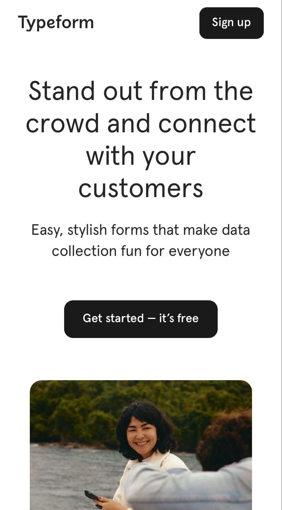
To create a mobile-friendly website like Typeform or similar, follow these steps:
a. Adopting a responsive interface adjusts the layout to the screen size.
b. Avoiding pop-ups and intrusive ads to enhance the experience.
c. Ensuring larger fonts for the mobile layout.
d. Adding text content above the fold to encourage scrolling.
e. Using plugins to customize WordPress.
Implementing User Testing and Feedback
Enhancing website usability is all about elevating the customer’s brand experience. To keep up with their preferences, gather consumer feedback regularly.
Create a prototype of your enhanced website and conduct usability testing with real users. Make changes according to their feedback. Use heatmap and other behavior-tracking tools to examine the user’s reactions to the changes.
David Victor, CEO of Boomcycle Digital Marketing, shares his perspective — "At Boomcycle Digital Marketing, we value the power of user feedback immensely. It's not just about delivering services but refining them based on our client's experiences. We believe in the continuous evolution of our strategies, and that's only possible when we listen to our clients. After all, they are the ones who truly understand the needs of their businesses."
Hiring Dedicated Developers can enhance your website’s usability testing process. With their expertise, you can implement more effective prototypes, user testing, and adjustments that are aligned with your business goals and user preferences.
Measuring Usability and Analyzing Metrics
Constant enhancements are important to sustain website usability. So, track relevant usability KPIs to identify areas of improvement. Using a KPI dashboard software can help you monitor these metrics in real-time, offering a clear visual overview that makes it easier to spot trends and take action. Some important metrics here include:
1.Time-on-task
2.User error rate
3.Time-on-page
4.Bounce rate
5.Net promoter score
Manually analyzing the collected data can be error-prone. Consider using web analytics tools for conclusive and data-driven insights about the changes you should make.
The Future of Website Usability
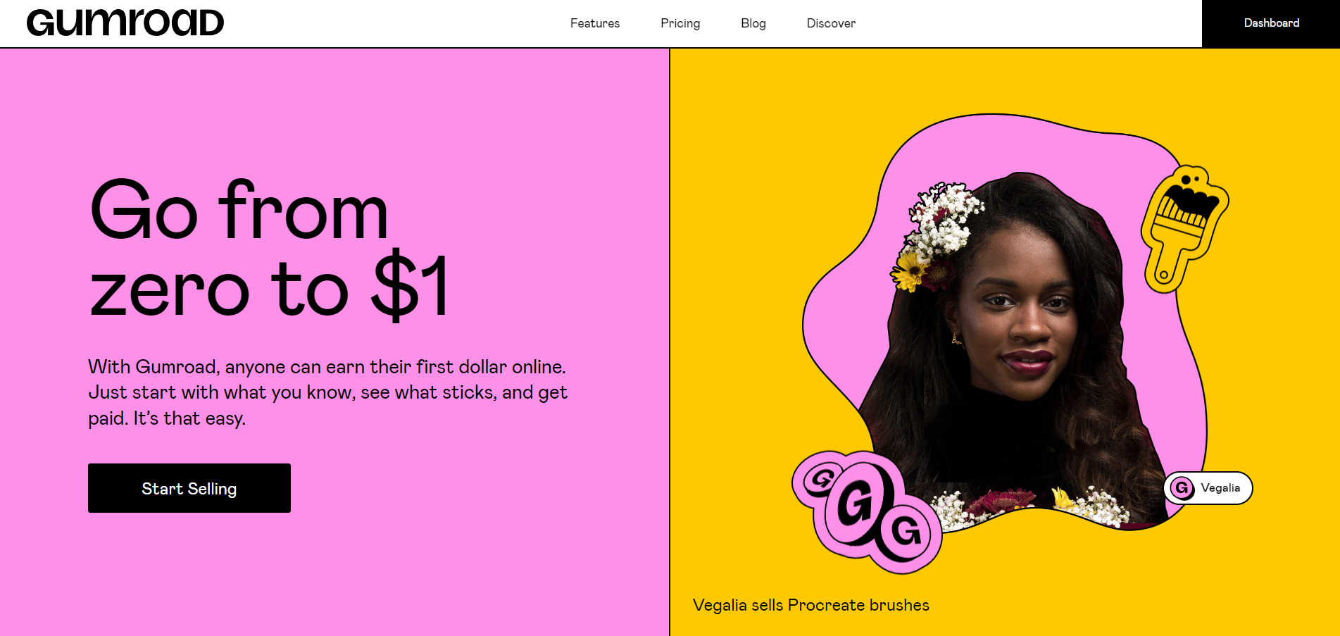
Customer preferences change rapidly. To keep your website usability ratio up-to-date, stay abreast of emerging UX trends. For example, UX trends 2023 include segmentation, mixed media, and striking visuals like Gumroad.
Run competitor analysis to see how similar brands enhance their website usability. This will give you an idea of audience response to different designs. It will also help you design more relevant computer mockups.
Many website developers use AI-based design practices to enhance the website’s appearance, strengthen search abilities, and manage content organization. As the technology landscape evolves, a developer advocate plays a crucial role in bridging the gap between developers and these AI-powered platforms, ensuring seamless integration and fostering a community focused on innovation and collaboration. AI-powered platforms also offer better personalization and elevate website usability.
Finally, ensure continuous improvement and usability optimization. It will help you stay on top of audience preferences and maintain website usability for longer.
Conclusion
While we wrap up today’s discussion, here are some key points you must remember:
a.Don’t skip the website usability audit.
b.Add search buttons, relevant filters, and categories for simpler navigation.
c.Use easy words and brief but impactful sentences in your website copy.
d.Conduct user testing.
e.Track key metrics.
f.Keep up with emerging trends to maintain the relevancy of your website.
Website usability is a tricky aspect to perfect. But if you follow the prescribed practices with strategic creativity, you can offer enhanced UX on your website and boost your conversion rate quickly.

