Online Form Design Tips: What's Wrong with Form Designs on Websites?

Brands and business owners put a lot of effort into great web design.
There is just a little problem with that.
Design alone, however, won't monetize your website.
More importantly, it's about building channels that generate leads and sales.
And that's where online forms come in.
Many brands neglect the importance of form designs, yet it's the key inquiry channel that determines the success of your website.
Most form design examples on the internet look boring, unwelcoming and consequently generate fewer conversions.
Online forms are the gateway for capturing new business potential.
Using user-friendly and enticing online forms is crucial if you want to take your lead generation seriously.
To help you connect better with your audience, here are our 10 best practices on how to make an online form fun:
1. Eliminate Confusion

Firstly, the form needs to be easy to understand for your audience. And that's often easier said than done. Before you think of making your oform design fun and exciting you need to ensure that it is functional and user-friendly in the first place.
The internet is full of form designs that have redundant questions, that ask questions in a confusing language and those that simply look boring. All of these characteristics make forms less encouraging for web visitors to complete.

Important factors to remove in a Form Design:
❌ Long forms (less is more)
❌ Redundant questions
❌ Unnecessary questions that don't provide good value
❌ Wrong question type for a question, e.g. use of open text field instead of button choices
❌ Jargon & technical language
❌ Standard Call-to-action text on buttons, e.g. Sign-up, Subscribe, Complete Form
❌ Colors and contrasts that are difficult to read
All of these points might sound obvious, but the reality is that even the simplest online forms violate some of these points.
The internet is full of thousands of form designs with lacking user experience.
A single negative experience can affect the user much more than a great experience with your form.
Review these practices and you will have much better chances to generate conversions and create engagement.
2. Switch The Format

When we think of online forms, we typically have simple long forms in mind. Long forms or single-step forms present all questions on a single step, typically one-by-one below each other.
There are tons of good use cases for single-step forms, e.g. for forms that just ask for first name and email address. However, you should definitely consider switching the form format when thinking of making forms more fun.
The alternative to single-step forms is multi-step forms.
Multi-steps forms, sometimes also called wizard forms, are much more intuitive and provide better experience along the user journey.

Because the user only sees one question step at a time, the information is less overwhelming.
It is much more encouraging to just see one question at a time vs. 10 or 20 different ones. It's no different from real life: In a personal conversation with another person, you would also just ask one question before you ask the next question.
Within multi-step forms, you can use progress bars that provide an indication of how much of the form is already completed.
Related: 7 Best Practices For Creating Long Forms To Boost Conversion

Progress bar in a multi-step contact us form design
We find multi-step forms more user-friendly in lots of cases, e.g. lead capture, user qualification, feedback forms, application forms and more. LeadGen App lets you build multi-step forms with custom text and graphic elements very easily.
3. Entertain Your Form Design with Content

In LeadGen multi-step forms, you can show textbox elements along with your questions and form steps, e.g. above a question.
These textbox elements can be added via the WSIWYG editor where you can add links, graphics and GIF images. Headlines can be set to different sizes, e.g. H1, H2, H3 format.

Enhancing LeadGen forms with textbox elements - Form-builder and Live form
By adding some lines of text for example, for introducing questions, you can make the form more individualized and easier to understand.
This can make your form look more conversational and less static like a typical online form (See image below)

Contact us form design customised header section with text elements
You can also use GIF images in the textboxes to let your creative juices flow. See the form design example below to enter a competition:
Prize draw competition registration form with GIF image
4. Best Practices For Form Design

The branding and styling of your online form is typically not something marketers pay attention to. On the other hand, people obsess about web design (which is obviously important too). The design of online forms, however, is the key element of the website that actually drives business.
Be one of the few marketers who take advantage of this potential and start optimizing your lead generation form for best conversion rates.
Here is one example of an online contact form design with before and after pictures:

Example form of capturing contact enquiries
The original design of form was built in long format. It was making things more complicated than necessary.
The questions were unclear and left room for interpretation. In terms of branding, the form was just using white and grey colours, the most boring it could possibly look.

New contact form design in multi-step format
Above you see the new form in the brand's actual design. The brand already used strong green colors in the logo and website, so we adopted this style for the form. The multi-step format makes questions much easier to understand and users more likely to follow-through.
Colors play an important role for online forms design in terms of:
1) Adding personality to the form and making it look less serious;
2) Matching the form style with your brand identity
3) Create more user-friendly experiences
5. Gamify

LeadGen form questionnaire to engage users on a website
People love games and entertainment. Use multi-step form journeys to engage users, build like a game.
This might not be the right fit for every form you build. For example, contact & lead capture forms should probably still look as simple as possible.
Gamification is "The process of adding games or game-like elements to something (such as a task) so as to encourage participation" (Source: Snappywords dictionary).
Gamified Online Form Examples

Gamified quiz website design form
The image above shows a gamified LeadGen form that provides answer feedback based on conditional question logic on the following steps.
Correct answers will show a different form step than the wrong answer. For example, if the user selects the correct choice "Manila", then the LeadGen form will open up the form step for the correct answer. For all other questions, you can prepare a question step which informs the user, either about the correct answers as well or the option to try again by clicking on the back button.

Questionnaire LeadGen form - Answer page for a correct answer
These response form steps can be customized any way you like, e.g. by writing a short answer text with an explanation. Both the right and wrong answer can be connected to the next question (Q2), so that the user simply continues the whole questionnaire until the end.
A gamified online form could also be something creative, out of the box, that you wouldn’t find elsewhere on the internet. One great example of a gamified online form is this quiz by the BBC

It asks you to guess the Champions League finalist by only showing you the player as a baby. Things like this make people curious to go through the form to see the answer. Furthermore, your quiz or gamified online form is more likely to be re-shared which will help you win exposure for your website which would not simply happen for conventional forms.
6. On-Page Navigation

It’s important to not just look at the online form itself, but the entire user journey.
The journey on the web-page start where the user lands and continues even after the form submission. It adds value to optimize the entire page for one call-to-action which could be your form.
7. Locate the Form Design in Page Content
When you design a form online, make sure to prominently place it on the site, in the best possible section. The form should be located at the right spot on the page where it can easily be found and where the user is navigating towards.
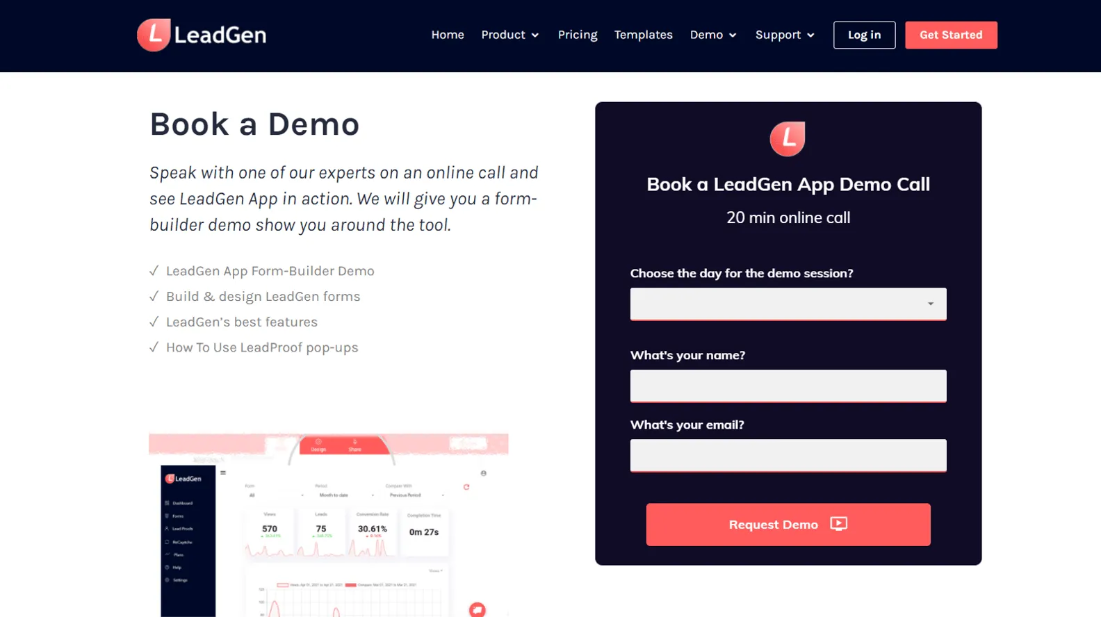
Finding the right place depends on the form use case.
A landing page or offer page typically has the form right on top (like our Demo booking page below)
Simple newsletter sign-up forms could be located anywhere on the web-page.
Lead capture forms, e.g. report downloads or consultation offers in blog posts are a different use case. These forms should never be shown at the top of the post because the user needs to first engage with the blog content to understand the value of the lead offer. Forms should be located 3/4 down the page or at the very end.

Visual representation of where you can place form designs on a web-page
8. Point Towards The Form Design

LeadGen App contact form design on website
Another tactic that helps to get more interest in your forms is to use web design elements that direct users to the form.
This could be a simple arrow image or an image of a human face that looks towards the form.
The image above shows our contact form design we use on our LeadGen website www.leadgenapp.io/contact. It contains an arrow graphic that points towards the form.
Furthermore, you can split your page structure into two parts and showcase a video on the left and the form next to the right.
These are subtle, yet effective tactics that make your online form stand out.

9. Easy-To-Read Font
The font used in your online form plays a big role in a visitor’s experience. Don't go with standard fonts. Implement an easy-to-read font that works best with your brand guidelines, colors, style, and your CTA on the form buttons.
10. Thank You Page
At the end of the cycle after form submission, you should show a Thank-you page or redirect to a custom Thank-you page URL. This is particularly important when using lead capture forms. The last thing you don't want to do is to confuse the lead whether the form submission was successful or not.
Build Your New "Fun" Form
Combining all these ideas, you can be sure that forms will be more fun for your audience.
And more fun also means that you can collect more responses and increase conversion rates.
If you haven't got a LeadGen App account yet to build your fun form, get started here:
About the Author