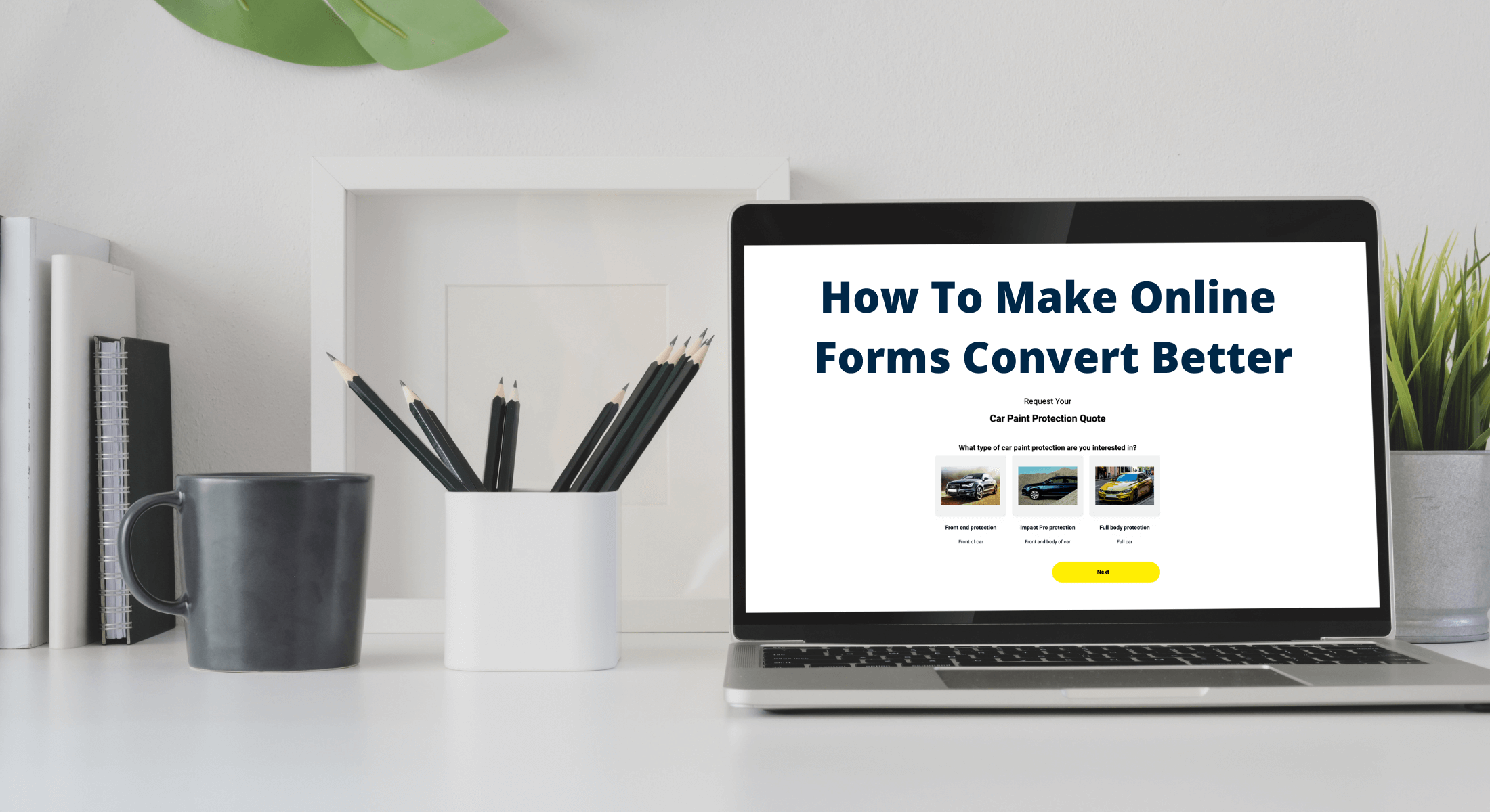
How To Make Online Forms Convert Better

Conversion rate is extremely important in any business. The idea is to get new customers and/or clients, who'll not only evangelise your product to others but also actually pay you for it, right?
When it comes to increasing conversion rate, you want to be sure you're maximising every opportunity for getting people to sign up for things, buy things, or give you their email addresses.
If you're wondering how to get on the ball with your form conversions, keep reading! I'm going to give you 08 tips that will help you along the way so your forms convert the way they should.
Build your form with a goal.
Forms are an important element of nearly every website and application, but they're also one of the most overlooked aspects of design. Many assume that since forms have been around as long as there has been a web, we must have figured out how to design them by now. But that simply isn't the case: Forms are still one of the most poorly designed elements on most websites and applications. Whenever you build a form keep the following tips in mind.
Be assured of your goal.
Make sure that you’re collecting the right information for your business case. If you’re not sure what to ask, consider listing all the information you need from customers and then prioritising based on what is absolutely required.
Make it easy.
Think about what you want to do with the data once you’ve collected it. This can help determine how much detail you should require upfront.
Collect only the necessary information.
Only ask for information that’s essential to achieving your goal — in other words, make every question count
Keep forms short and simple
Users won't read a lot of text, no matter how important it is. Keep forms short and include only the most relevant questions. Try to keep it between 5 and 7 questions - more than that and you risk lowering your response rate.
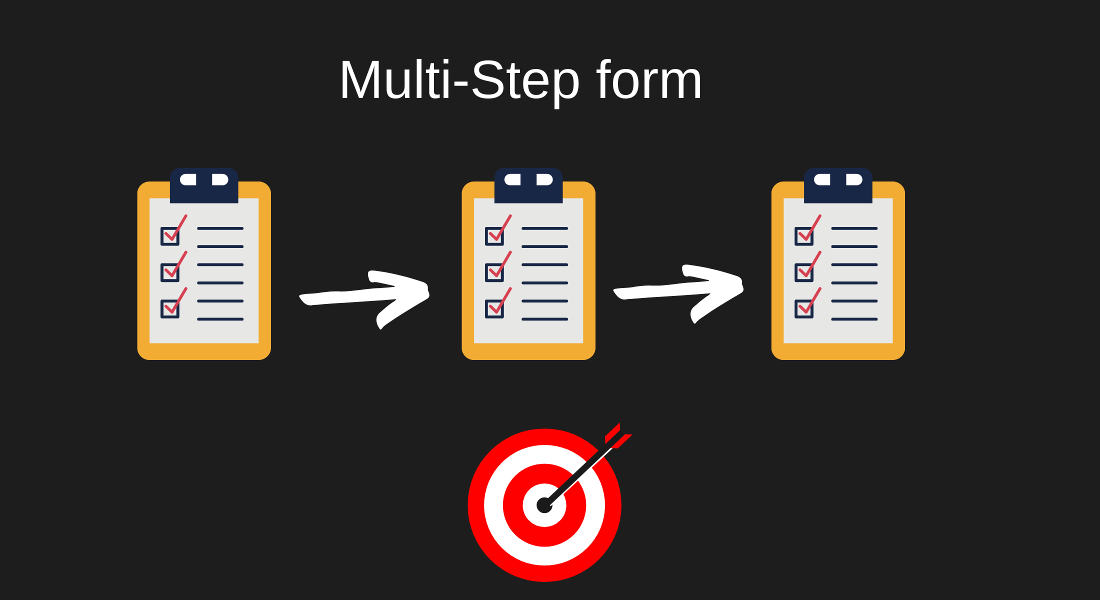
Use multi-step forms.

It's no secret that most people hate filling out forms on the web. However, there is a way to make them easier – multi-step forms.
The most successful online forms use multiple steps. In a single-step form, the user is asked to enter a single piece of information, such as an email address or a password. The problem with this approach is that it makes it easy for people to overlook important details that could affect their application.
When people are filling out an online form, they're scanning it for keywords and then filling in the blanks themselves. If there are too many steps and too many details to scan, they'll get frustrated and give up before submitting their application. That's why you should use multi-step forms whenever possible — you can keep the user engaged and provide them with all the necessary information at one time.
Create an effective call to action.
A call to action is the text placed at the end of a form that tells people what to do next. It's where you tell them whether they should submit their information or hit the back button. The most effective places for a call to action are at the end of the form after all other questions have been answered and at the end of your contact information. People want to know what they're supposed to do next, and it's easy to lose their interest in your product or service if there's no clear next step. Here are the three important tips:
First, use active verbs in your text. Instead of saying, "Click here to request an estimate" try something like: "Click here to request an estimate now." The active verb makes it clear that you want the visitor to take action on the link.
Second, provide action-specific instructions at the bottom of the page. Don't just tell people how to fill out a form; tell them exactly what they need to do. Here's an example: "Fill out the fields below with accurate information, and click 'Submit' when finished."
Third, consider color. Colors help prompt actions — green means get started, yellow means go back or finish later, so use those colors liberally. If you include a call-to-action button, keep it simple — don't use too many words or design elements that might confuse visitors or distract them from their purpose.
Collect the minimum amount of information possible.
When you are developing a form for your website, remember that users are more likely to complete the form if it is quick and easy. So, try to collect only the minimum amount of information possible.
Ask for enough information to make a decision about the user's account; if you don't need the information, then don't ask for it.
Sometimes you will need to ask for personal information from users that is not strictly required by your site, such as their age or gender. In these cases, consider whether you could offer an "other" option, or allow them to skip the question altogether. You are more likely to get accurate responses if they can choose not to answer.
If there are questions that you think might be sensitive or controversial (for example, a person's race), consider carefully how you label the options. Labelling options as "white", "black" or "other", could make some visitors feel unwelcome on your website. Instead, use different wording that is less likely to evoke emotional responses (for example: "I prefer not to specify").
Label all optional fields as optional so that your users know they do not have to fill them in. Marking optional fields with an asterisk (*) is a common way of doing this.
Make sure your form is mobile-friendly.
The most common mistake I see in online forms is that they are not mobile-friendly. That means they look great on a desktop computer, but when someone tries to fill them out on their smartphone or tablet, it's difficult to navigate or read. Make sure that you always use mobile-responsive forms for mobile and tablet users.
Create trust by including security badges and lead proof.
It's inevitable that you will ask for personal information — names, addresses, etc. — in your online forms. When you do, include a security badge or statement explaining the advanced encryption and other measures you take to keep consumer information safe. This is an important step in inspiring confidence and trust in customers who are submitting sensitive data. Visitors will be more inclined to complete a form if they feel their information is secure. You can also try using lead proof, lead proof helps in establishing trust and it also motivates the users to submit the form.
Include a progress indicator.
Use a progress indicator in your form to show the user how many steps they have completed and how many steps remain before their form is complete. This can help increase motivation by showing users how close they are to finishing.
A significant amount of effort and expense can go into creating an online form, particularly if it’s a long and complex one with lots of different fields. A common problem is that users don’t always complete it, so all of that work is for nothing. A progress indicator shows the user where they are in the completion process and can be a useful motivator as they see how close they are to completing the form.
Use conditional logic to improve the user experience
The most common way to use conditional logic is to show or hide a question based on the answer to another question. For example, if the respondent answers "yes" to a yes/no question, additional questions may appear so that they can provide more detail.
In general, you want to use conditional logic sparingly — only when it's necessary to improve the user experience.
Users may be confused if questions appear for no reason. They might feel like they're being tricked into providing information they don't want to share, or they might not notice a new question at all and submit their form without answering it.
When used appropriately, conditional logic can be a great tool for improving your form's usability.
Conclusion
The whole point of a form is to make people complete it, so it only makes sense to put thought into how your form is laid out. The goal of this article is to be a useful resource for you as you design your forms to keep them from being a huge mistake for your business. Keep the following tips in mind when designing your next online form and you should be set.


