Engage Visitors and Convert More Leads Using 7 Simple Tactics
With about 2 billion websites on the internet and 56 billion indexed web-pages in Google, users got plenty of content and brands to choose from. The amount of content and websites on the internet is gigantic. Furthermore, with human attention span down to 8 seconds, odds are stacked against marketers to convert leads from their website. What does it take to increase conversion rates from websites?
The quality of your content is the No. 1 factor to keep users engaged, to present your expertise, your solution and ultimately to capture leads. Great Copywriting is built on research and having an in-depth understanding of your target audience. In here, we want to look into simple tactics that can have an instant effect on increasing conversions on your website. If you are interested in copywriting for more conversions, then also check out our podcast episode with Copywriter Nelson Jordan.
Start optimizing your website with these 7 conversion-boosting tactics:
1. Minimize Links/menu items
2. Highlight Call-to-action
3. Use Multi-Step Forms
4. Maximize Lead Offers
5. Use Exit Intent Popups
6. Retargeting
7. Reverse IP-Tracking
1. Minimize Links/Menu Items
Websites are built upon content. Even the websites of smaller companies tend to have a number of pages. While informative content is key to build trust with users, e.g. on a blog post, it can get in the way when increasing conversions. Not the blog post or content page itself is the problem.
There are a lot of benefit is having lots of content, e.g. helping your website rank in Google search. It becomes a problem when the homepage as your main landing page links out to too many content or service pages, diverting users away from the core objective, e.g. to get a conversion via the main contact or product sign-up page.
Reduce the number of menu items and internal links to other pages on the homepage
Supply creates demands, and in digital marketing terms, increasing the number of links can easily make your users drift away from where they should go, to do business with you. Build your homepage like a landing page that contains all the information about your offering and a key call-to-action that users can click to get to the next step and help increase conversion rates.
Placing too many links in both page content and the header menu will divert attention and almost certainly leaves you with less visitors on the homepage to get in your funnel. Sure, having internal click-through traffic to more pages is not a bad thing, but you also shouldn't incentivise it either. Provide all the important content on the homepage, have important pages in the header menu and show all the rest of the pages in the footer of your website.
2. Highlight Call-to-Actions
Your homepage should have a key call-to-action button (CTA) that directs the user towards your first main offer. For a software or online tool solution, this typically is a trial or free account set-up. For a service business, it's a contact page or a similar entry offer, e.g. consultation booking.
Make sure to highlight your main CTA in the menu and multiple times across the homepage. As mentioned in 1) it helps to reduce internal links to keep users focused on your call-to-action, but it's not enough to just mention it once or twice. Your homepage should contain the CTA a number of times to help increase conversion rates. For software companies (SaaS) it can be as much as 5-6 times, for service brands slightly less might be sufficient.
Besides the homepage, also include your call-to-action in blog posts, service pages to always make it easy for new visitors to get started with your offer. You can solve their problem by adding a direct call widget at the bottom of your website, where they can simply call you to ask queries just by clicking on the “Call Now” button.
You can also create a scannable QR code so the users browsing on a PC can simply scan the code and make the call. The header of your website plays a key role because it provides your users with orientation to navigate. Having a visually distinct button to your CTA on there helps to attain more clicks. Some websites use sticky menus that stay on top when the user scrolls down the page.
Below or next to your call-to-action buttons within your homepage, you can place bullet points or statements to make the offer more enticing and to ease your user's anxiety that might still stop them to take action. Depending on what you offer this could be quotes like "30 Money-back guarantee", "Risk free, cancel anytime", "No obligation", etc.
3. Use Multi-Step Forms
To generate leads on your website you need a channel to capture them. It should be as easy as possible for users to get in touch with you. The best way to capture leads and help increase conversion rates on both a B2B service and software tool (SaaS) site is via lead capture forms. If you are relying on your site visitors to click on your email address or pick up the phone, you will end up getting fewer inquiries. It's useful to show the business phone numbers and email addresses, possibly even prominently on your site header, but the main inquiry channel should be an optimized online form.
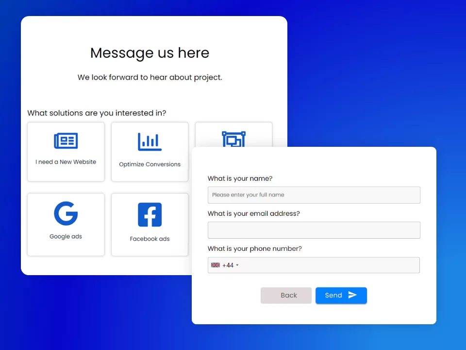
Instead of using a classical form layout, go with a multi-step form which nicely fits your website design. Simple forms that ask for the typical details, e.g. name, email, phone number and message are not the most user-friendly. Think about it this way. When you go to a store, e.g. to buy shoes or clothes, would the sales person ask for your name and email first? No, they would ask you a questions would type of offer you are interested in.
Multi-step forms, also called wizard forms, provide you with flexibility to ask for service requirement or goal first before showing more steps for asking for personal details. With LeadGen App you can create custom multi-step forms, designed in your branding to match your website in just a few minutes.
You don't always need to ask for the service requirement, e.g. if you have a clearly defined call-to-action, e.g. sign-up for a free trial. In that case you can start asking for details like first name, last name and then get to contact information like email on more form steps.
4. Maximize Lead Offers
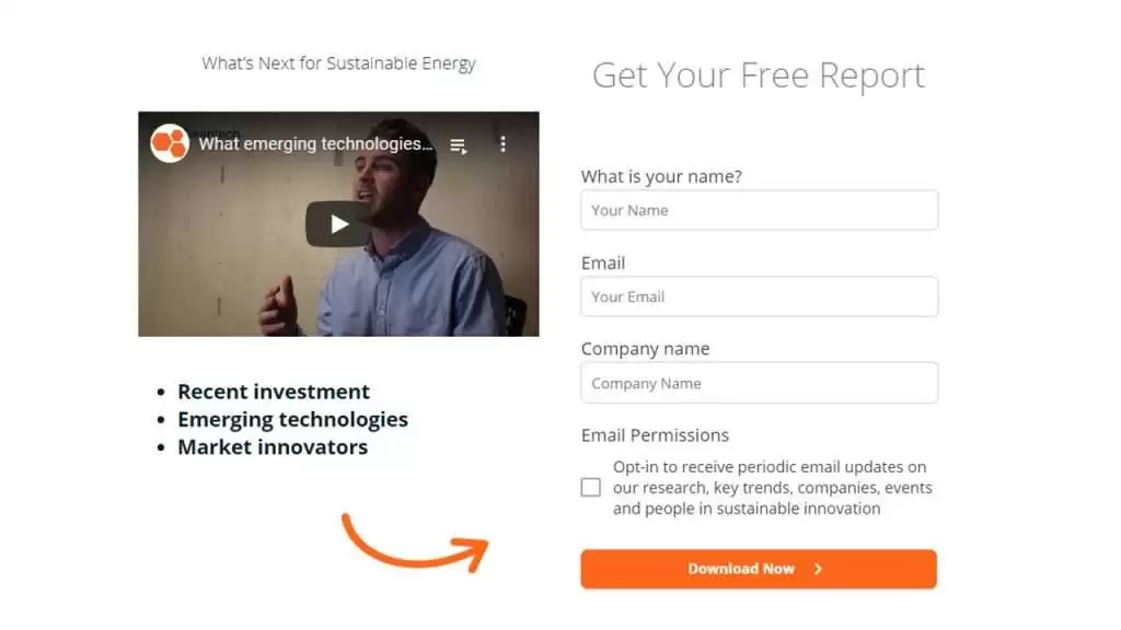
Many websites have content via service pages and a blog. However, few websites make use of those pages by placing lead offers that guide users to the next step. Putting effort in blog content, and maybe even simple but powerful video is great, but there's plenty of opportunity left on the table. Every blog post should have lead offers, at least one offer, that guides users to the next step and allows you to capture a lead.
Free report download, lead magnet within blog post
The range of offers you can choose from is endless. The best offers directly relate to the content on the page and provide the next logical action. For example, you can place offers like:
- Downloadable resources
- Checklists
- White papers
- Case studies
- Interactive tools like calculators
- Free consultations
- Content courses
and more.
5. Exit Intent Popups
Exit-intent popups help to retain visitors on your site and offer a lead offer as the last chance before exiting a site. These are behavioral intent popups that trigger when users move towards closing the browser, closing the tab or moving to a new website URL.
Some users might see those popups as intrusive. They pop up at the last seconds that they are about to leave your page. Certainly, popups aren't always the greatest user experience, but ultimately it's almost about timing. Pop-ups that are getting in the way while reading web-page content are a nuisance for users. Also, pop-ups that are hard to close and make users annoying they waste time being shown content they were not interested in.
Exit intent popups are different. They show up only at the time your visitor is about to leave, which can be seen as last chance to retain a user. Make sure that the offer showing within the popups is extremely enticing so that not just you but the user benefits. It can be as simple as a lead offer, like a downloadable guide or your main call-to-action with a special offer, e.g. discount. Ideally place the lead capture within the popups and don't direct users to another page again. This is a great way to increase conversion rates from your website.
6. Retargeting
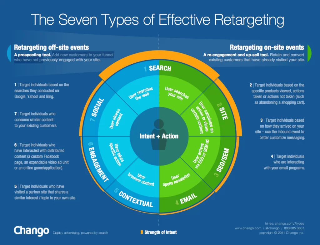
Retargeting is advertising towards users that engaged with your content before. It is a form of remarketing, a broader term to describe all means of following up with potential leads based on their behavior with your content.
There are several forms of retargeting as shown in this graphic, Source: Chango
One of the best ways to retarget users is via onsite events on your website. Using ad platforms like Google, Facebook and Bing you can specifically target users that hit certain pages or completed actions on your site, e.g. aborted a lead capture form or filled in a lead capture form, hitting a Thank-you page, etc.
Retargeting is relatively cheap as you are dealing with smaller audience for which less external competition exists compared to search terms or display ads. Don't rely on retargeting alone, but add it to your arsenal so that you are visible on the web, to not miss users that are still hot to convert. And simply use it anytime you have a longer sales cycle where users do more research and don't take action the first time they visit a website. For brands selling services of several thousand dollars, retargeting is key to stay on top of mind and keep providing content to those people that need time before they convert to a lead.
7. Reverse IP-Tracking
Reverse IP tracking software allows brands to see the visitors that engaged with their website. It reveals the companies and their publicly available email addresses that hit your website. This is an extremely useful practice for B2B brands, selling to businesses.
Not every visitor, but typically a high percentage of visitors can be identified. Because only a small percentage of visitors convert through websites, this practice can be a huge boost to your marketing and lead generation. It allows you to get insights into what's happening on your site and what brand engages with your site, how often.
The value of a cold website visit lead is significantly lower compared to captured lead via forms, but you should consider adding reverse IP-tracking into your website lead generation tactics as well. It will uncover a lot of data and give you a chance to target the emails of users that have an interest, but were not ready yet to take an action and convert.


