How Multi Step Forms Drive up to 5X More Leads
Curated by Priyanka Jain
Content Marketer
Expert reviewed by Christopher Lier
CMO LeadGen App
The Benefits of Multi Step Forms for More Engagement & Lead Conversions
Introduction
If you’ve ever wanted to create multi step forms and need some inspiration, you’ve come to the correct spot.
Having built dozens of multi step forms, we can assure you that it’s not simple…
A multi-step form with hundreds of field submissions may quickly become difficult, irritating, and time-consuming for your prospects. However, having the right knowledge, tools, and templates can make registration via a multi-step form a pleasant experience for your website users.
A well-designed multi-step form ensures that more visitors finish your web form with fewer difficulties.
There are several factors to consider while building your form, including selecting the appropriate questions.
That is why, in this piece, we will present 5 of our favorite multi-step form examples that you can mimic right now.
If you want to get it right and create your own multi-step form, we highly recommend joining up an account with the LeadGen App.
Otherwise, continue reading:
Table of Contents

For those who are still utilizing simple contact forms to generate leads, it may be time to consider improving your forms.
It’s 2024, technology has improved significantly.
Okay, maybe the technology isn’t mature enough to print pizza on demand.
That would be fantastic.
In the meantime, we can at least employ more intelligent, interactive forms.
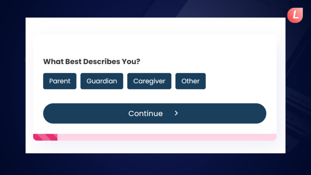
This is a multi-step form that is created using LeadGen App.
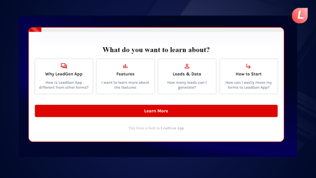
The LeadGen App homepage form is a user-friendly form that engages users and provides useful information about our platform.
Visitors may have a smooth experience thanks to interactive elements like conditional logic and progress monitoring.
Its instructional structure walks users through essential features of the LeadGen App, using multi-step functionality to simplify difficult material.
By utilizing these elements, our form functions as a complete resource, helping users to understand and make the most of our platform.
But hey, there’s no coding required.
Anyway, if you’re wondering why you should utilize multi-step forms, keep reading because we’re going to get into some serious conversion rate optimization theory.
 What are Multi-Step Forms?
Multi-step lead forms are forms that are broken down into multiple steps or sections, rather than being presented as a single, long form. Each step or section typically contains a subset of the form’s fields, and the user progresses through the form by completing one step or section at a time. The purpose of breaking a form into multiple steps is to make it less overwhelming and more user-friendly, as well as to improve the overall user experience by providing clear feedback and validation as the user progresses through the form.
You may have come across multi-step forms on checkout or briefing forms. Multi-step forms are also utilized for wizards such as sign-up forms, and multi-step login forms have lately become more popular. These are only a few examples of how to utilize them, although any lengthier form might be split down into parts.
Multi-step forms are also used for wizards like sign-up forms, and multi-step login forms have recently gained popularity.
One of the most significant advantages of a multi-step form is its conversion rate.
Multi-step forms are thought to have a higher conversion rate.
It may be odd that adding extra stages to a form can improve outcomes. The general rule in conversion optimization is that less is more, especially when it comes to forms.
So, why doesn’t this apply to multi-step forms? Here are some probable explanations:
- Multi-step forms minimize psychological friction.
- The initial impression is less overpowering.
- Progress indicators urge users to fill out the form.
- You can ask sensitive questions (e.g., email address) in the last stage when customers have more skin in the game after completing prior steps.
Other advantages include a less overpowering initial impression for consumers and progress indicators that motivate visitors to complete the form.
Okay, those are the main reasons why multi-step forms improve the user experience and enhance conversions. However, we can extend that list of benefits significantly by designing multi-step forms with conversions in mind and addressing some of the fundamental challenges that traditional forms face.
This is when multi-step forms result in significant conversion increases.
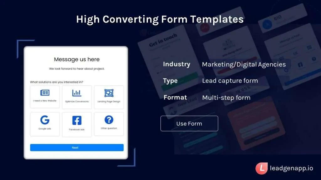
![]() See our extensive collection of form templates
See our extensive collection of form templates
Multi-Step Form Templates
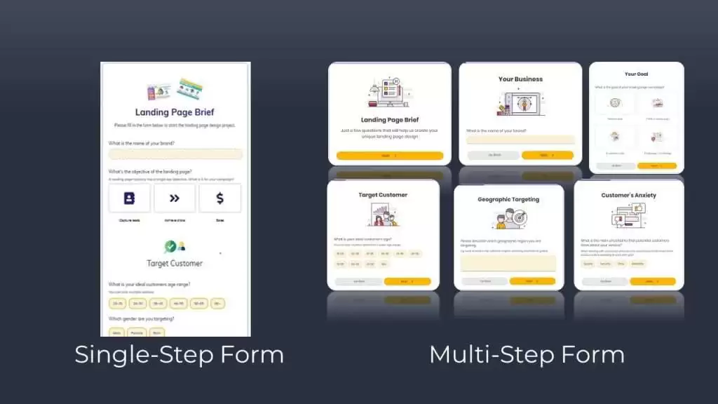
Multi-Step Forms Vs Single-Step Forms: Which is Better?
If you deploy a multi-step form under the correct conditions, your conversion rates can explode. But you must know when to enable a multi-step form and when to leave it as a single-step form.
Here are some ideas to consider while designing your shapes.
Multi-Step Forms
Splitting large forms into many phases will make it easier to examine the form entries. You will also make things easier for others completing your form.
Forms that demand a large amount of information, such as registration or order forms, nearly always benefit from being divided into several phases.
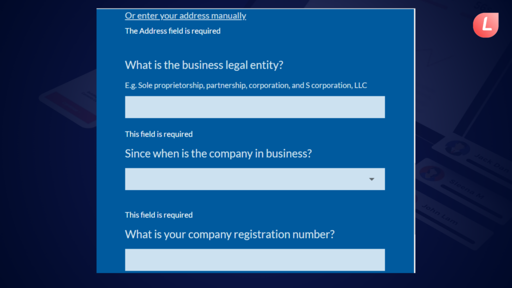
For example, check out this Credit Application Form for Business.
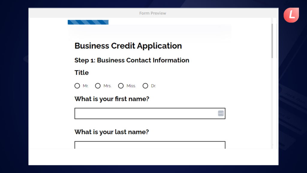
This form includes spaces for queries regarding your business as well as financial information. It divides each category of questions into segmented phases, making it easier to navigate.
Also, it only enables users to proceed with the completion procedure once they have successfully filled in all of the blank fields.
Each component of the form directs users to a different page. This is another method the organization breaks down the form completion procedure for users.
At the end of the form, consumers may quickly complete it by clicking the “Submit” button.

Single Step Forms
Single-step forms are useful when you simply require one sort of input from your consumers. This means that if all you need is a lead’s basic contact information or email address, there is no need to construct numerous processes.
The “Contact Us” form below exemplifies an excellent one-step form. There is just one category of questions, and there are enough of them to keep a website visitor from feeling overwhelmed.
Their form contains clear fields that make sense for the form type, and users have adequate room in the fields to complete all of the form fields on a single page and form.
To increase visitor conversion, keep things simple. The most straightforward option for conversion rate optimization is to decrease the number of form fields and just ask for what is necessary. This will assist gain the user’s trust while reducing form friction.
Single-step forms are practical for opt-ins or gathering basic client information. Contact forms, newsletter signup forms, and assistance forms are among the most frequent use cases. The idea is to make them appealing and arrange them strategically on the page to capture the user’s interest.
You may show them in the form of lead capture pop-ups, which generate a feeling of urgency and can be timed perfectly to encourage the user to engage. Using ready-made popup templates helps launch campaigns faster and test different approaches without starting from scratch.
So, if you want to make the most of single-step forms, keep them brief.
However, all marketers understand how tough it is to acquire and qualify leads for sales teams using generic information. As a result, single-step forms are not suited for lead-generation efforts focused on attracting, educating, and engaging clients with the highest possible conversion rates.
Furthermore, although being a key component of the website, they serve no function in making client involvement dynamic or conversational.
It is also not customized based on client preferences and conduct. But, behold, the future of marketing is shifting in a completely different direction: engagement-driven.
72% of customers indicated they only interact with tailored messaging. So, if you’re wondering what’s a better way to increase lead capture form conversions, stick with us!

Why Use Multi-Step Forms?
One of the favorite reasons for employing a multi-step form is to boost conversions.
As marketers, we all like to believe that we are conversion rate experts, right?
Well, we, too, like to assume that we are knowledgeable about CRO.
However, when it comes to CRO, the Waseem Bashir CRO Checklist is a go-to reference for us.
Waseem Bashir of Apexure presented the CRO Checklist, a methodology for examining online and mobile experiences. According to the CRO checklist, the elements that determine a page’s conversion rates are:
- Urgency (conversion driver)
- Relevance (Conversion Driver)
- Distraction (Conversion inhibitor)
- Clarity (Conversion Driver)
- Anxiety (Conversion inhibitor)
So, how is this related to forms? (By the way, one of your website’s largest conversion points)
Imagine you’re utilizing a lengthy form like this:
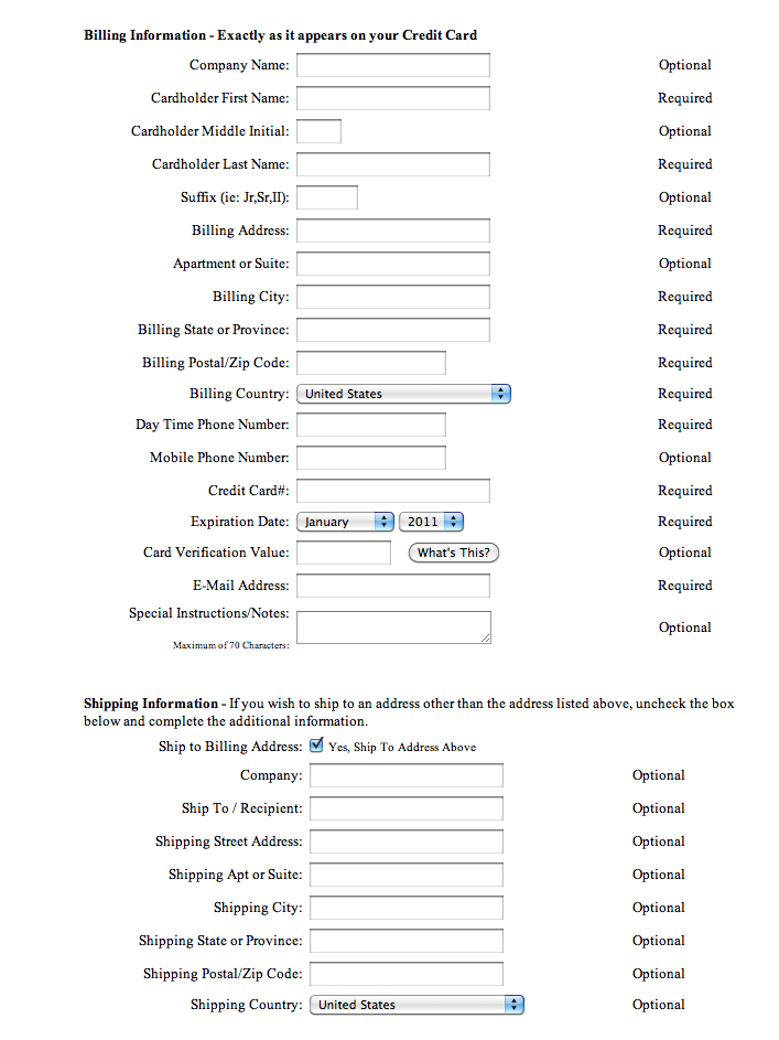
Not that appetizing, is it?
Let’s compare this form to the CRO Checklist. Some concerns include:
- Increased anxiety (conversion inhibitor)
- Unneeded distraction (conversion inhibitor)
- Clarity is lacking, as seen by validation mistakes.
- Additionally, the value proposition for supplying contact information is not clearly stated.
Assume you take the extremely simple form and transform it into a more inviting, interactive form with numerous phases, such as this one:
Instantly improved.
You may get this multi-step form template here.
Unlike our example’s fairly awful single-step form, this new interactive form is more user-friendly. This form is straightforward, less frightening, and fits well on the page.
When compared to the normal, single-step version shown above, the multi-step form wins hands out.
Aside from that, multi-step forms are proven to enhance a site’s overall user experience while also providing businesses with more quality leads.
These forms are also very dynamic in that they may be constructed and reorganized to meet current demands while remaining brief and simple!
This potential is not apparent in single-step forms. This implies that visitors can be directed to various paths/questions based on their responses to a multiple-choice question.
This results in a customized and relevant interactive chatbot-like experience.
You’ve read a lot of conversion-boosting approaches, hacks, and ideas. But if there’s one overriding thread in all of these best practices, it’s this:
Make your pages simple for everyone who visits them.
That’s all there is to it.
Make the page easy to read for him. Make it simple for him to understand what you have to give. Make it simple for him to do the action you desire. People pay more attention to things that are simple to grasp. And when something is simple to do, individuals are more likely to agree to do it. That is why multi-step forms work so well. They make it simple for a person to understand and complete the form. It reduces the “hostility” associated with forms by making them painless.
So, what happens to your visitors’ psychology when you go from one-page forms to multi-step forms?
A) Multi Step Forms are Mobile Friendly
Don’t you hate it when you’re on mobile and you go to a website with a long form to fill out? With such a small gadget and an even smaller keypad, the work can rapidly become overwhelming.
However, dividing the form into several pages makes it less intimidating. When you put in certain multi-step UX concepts, the work becomes much easier.
B) It Reduces Friction
It’s all about concentration. Doing (or thinking about) too many things at once places an undue strain on the brain. Our intellect is a force to be reckoned with. However, it is wary about devoting too much of its resources at any particular moment. If there is anything less taxing, the brain prefers to be there. What’s more, guess what? Most individuals find it difficult to fill out forms. Give a person a form with a lot of data to fill out, and the very prospect of it scares him away. There are far too many questions. Too much recollection is required. There is simply too much work.
When the questions are divided into numerous pages, each concentrating on a different topic, the brain can only focus on one activity at a time. It then receives the notion that completing the assignment is simple. At first, it may appear paradoxical. Will not having a lot of pages convey the impression that a lot of labor is involved?
You would think so. However, in our testing, constraining a person to think of only one object or category at a time minimizes friction and helps him accomplish the assignment.
![]() Learn more about growing website conversion rates
Learn more about growing website conversion rates
The Ultimate CRO Checklist
C) Small Asks Lead to Big Gains
A person is more likely to accept a short request. It’s not a huge deal if a buddy asks you to watch his child for an hour. However, if he requests that you look after the youngster for the entire afternoon, you will begin to reconsider your friendship.
But there’s another issue. What if your buddy wants you to babysit the youngster again a few days after the one-hour babysitting? Then the entire afternoon the following week? When it goes like this, you’ve had time to become acclimated to the work. And furthermore, you’ll start to think, “I’ve done a couple of hours before, a few more hours is not much of a hassle. Besides, the kid is a lot of fun to be around!”
When you utilize several step forms, the same thing happens. Each page has a little request. The small request does not trigger too much worry in the brain. Each stage gradually engages the person in the work. So when the big ask comes, which generally entails clicking a submit button or entering credit card information, it’s not as taxing. And she’ll be more inclined to agree. That is one of the reasons why multi-step forms are more likely to be completed.
Best Practices to Build a Multi-Step Form
Let’s take a look at how you may create multi-step forms to increase conversions.
1. To reduce distraction, create as many pages as feasible.
The primary goal of multi-step forms is to have the user concentrate on one activity at a time. It does not always imply asking simply one question on each page. You may include a few questions as long as they fall into one of the categories.
Assume you own an eCommerce shop and are creating a multi-step form for the checkout page. The initial page might just request basic contact information, such as name and email address. The next page might be for the delivery address. Then there’s another page with payment information. Each of these pages may include a few distinct fields, but because they all belong in the same category, there is no cognitive load.
2. Consider “gamifying” the form.
When I say “gamifying,” I mean making as little use of the keyboard as feasible. If the visitor is on a desktop, he will use the mouse to select an option from a list. If he’s on a mobile device, he can just press a button such as this.
With the above example, there is no need to utilize the keyboard. Simply select the best answer and click.
3. Use a Progress Bar.
Have you ever taken an online quiz when the questions just kept coming? And there’s no way of knowing how many questions remain. There comes a time when you wonder if you’ll ever complete the form. When you don’t know how many more steps, you need to accomplish, your mind wanders off and starts thinking of other things.
Do you know what’s going on here? Your mind has wandered away from the work at hand and become absorbed in another. That of being concerned and perplexed. And when your head becomes too wrapped up in this, you will most likely grow upset and depart. Many individuals are daunted by the uncertainty, and hitting the back button becomes the easy alternative.
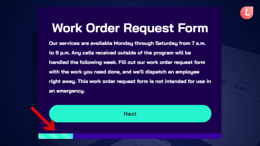
When you add a progress indicator, all that aimless meandering goes away. You now know how many stages remain, so you can devote your whole focus to the form. That’s the type of focus you desire when a consumer fills out a lead generation or checkout form.
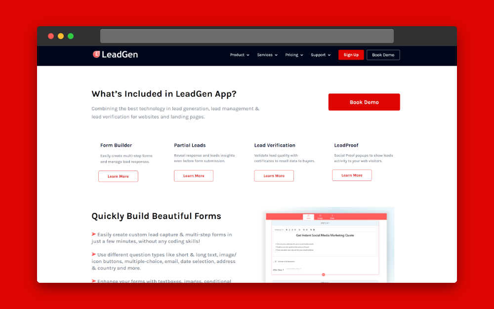
![]() Insights to building multi step forms with LeadGen App
Insights to building multi step forms with LeadGen App
Multi-Step Form Builder & Features Explained
4. Follow all regular form optimization principles.
Simply because you have a multi-step form does not mean you should disregard basic practices for creating online forms. Form optimization is something I’ve talked about before. So, if you haven’t already, read it after you complete this one. In any case, these are the key items to remember.
a. Spend time working on the copy.
b. Only request what you truly require.
c. Make use of white space.
d. Make the CTA button visible.
e. Indicate which fields are mandatory.
f. Include social proof.
g. Forms should be tested.
5. Add a summary form step.
It’s a good idea to include a summary of all the responses on the last page of a multi-step form. This provides the visitor one more chance to double-check that he filled out all the forms accurately. Ideally, make it simple to change any portion of the form in this last phase. LeadGen App provides a form-step summary feature to easily achieve this.
5 Best Multi-Step Forms Examples
Now let’s look at some of our favorite multi-step form examples.
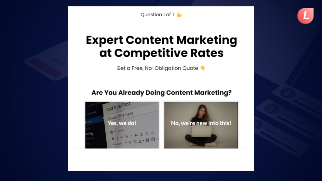
1. Lead Capture Multi-Step Form
Familyassets.com uses one of our favorite multi-step form examples made with the LeadGen App form builder.
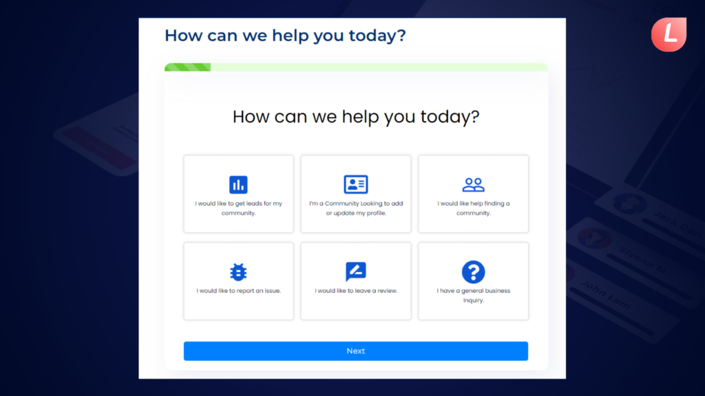
When a visitor initially arrives at familyassets.com there is a question that asks, “How can we help you today?”
Asking the visitor how we can help you today right away is significantly easier than seeking personal information such as their name and phone number. As a result, more visitors are likely to use this form.
After the prospect is engaged and drawn into the form, Familyassets continues to request further details about the query, allowing their team to gather as much critical information as possible.
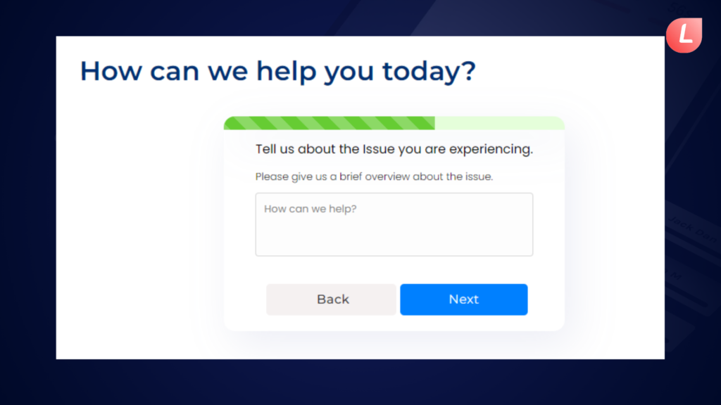
Before entering their contact information, the prospect has already provided details about their needs.
It turns out that creating a form like the Family Assets example is somewhat complicated, especially if you need to send leads to a sales staff or put the data into a CRM.
That is why we created the LeadGen App form builder. One of our aims is to provide marketers with a simple approach to creating multi-step forms without relying on technical staff to handle all of the work. You may also perform more complex things such as integrating with a webhook, TrustedForm, partial leads, Google Analytics, and generating TCPA-compliant leads.
Our form builder makes it easy to create multi-step forms.
2. Mortgage Multi-Step Form
If you’re in the financial business, mortgage, or loan field, this multi-step form example is for you.
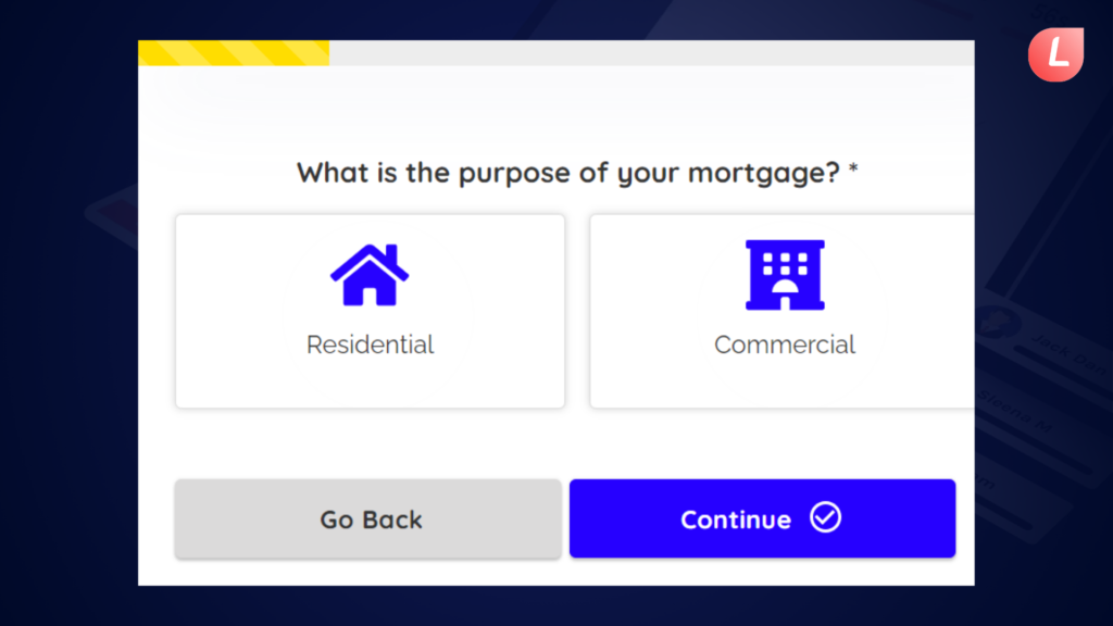
We particularly appreciate how this form uses icons.
The symbols definitely will bring your user’s attention to the buttons.
As they progress through the form, they’ll notice that your team has significantly improved the UX of your multi-step form design.
The user will also enjoy the slider in the screenshot above.
From a user experience standpoint, it makes perfect sense to utilize range sliders when requesting currency and number information.
LeadGen App allows you to create a user-friendly and conversion-optimized multi-step form like the one seen above. Here’s a template to get you started.
Choosing the proper question helps you increase response rates in online forms. LeadGen App provides you with a variety of question kinds to ask your audience. Here is a detailed breakdown of all available question types such as sliders.
3. UX Calculator Form
The UX calculator form has some distinct characteristics that distinguish it from standard forms. With the sleek and clean design it creates attractiveness. With a simple design and easy structure, the form conveys information in a visually appealing manner, minimizing cognitive load and improving understanding. This design strategy improves customer pleasure while also reinforcing the brand’s current and professional image.
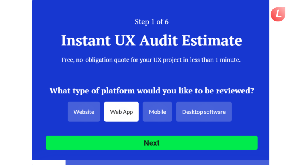
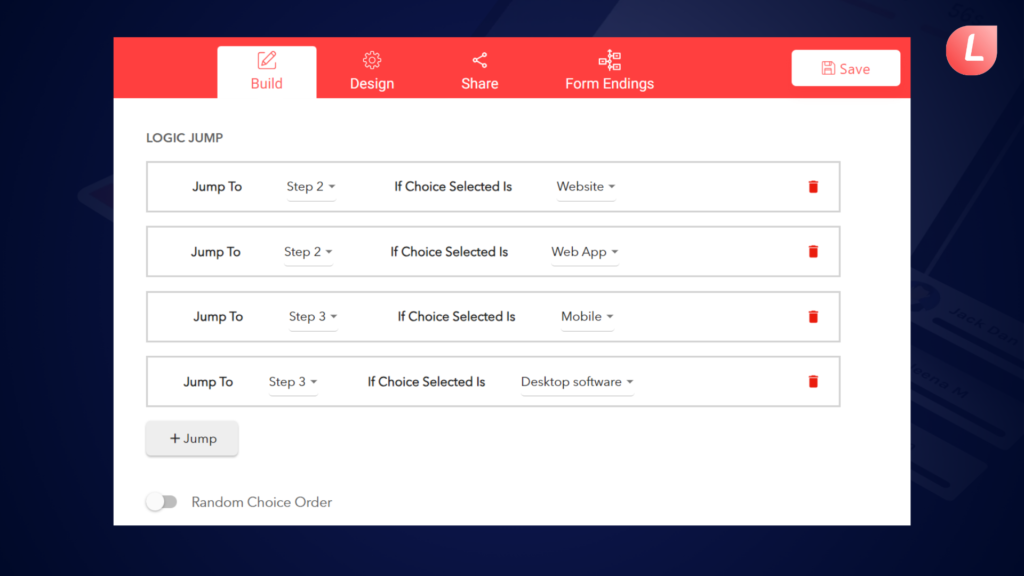
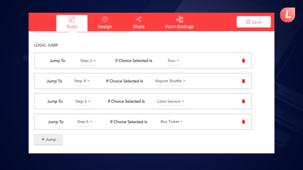
Secondly, its conditional flow feature provides a dynamic user experience by displaying future fields based on prior inputs. This tailored interaction speeds up the form-filling process, ensuring that users only see relevant questions, and improving usability and engagement.
Furthermore, the UX calculator form can be excellent for increasing the conversion rate. Optimizing each piece for user interaction and directing visitors through a smooth path, increases the possibility of form submissions.
Its user-friendly layout, progress bar to let you know how many steps you have finished, and straightforward navigation help to enhance conversion rates, resulting in desired outcomes for enterprises.
Finally, the form’s usability is impressive. Users may easily traverse the form thanks to clear directions, logical progression, and simple controls, which reduce frustration and desertion. This accessibility promotes a favorable user experience, encourages engagement, and facilitates the attainment of corporate goals.
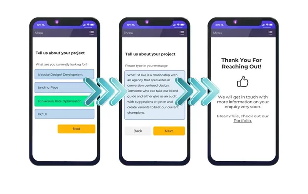
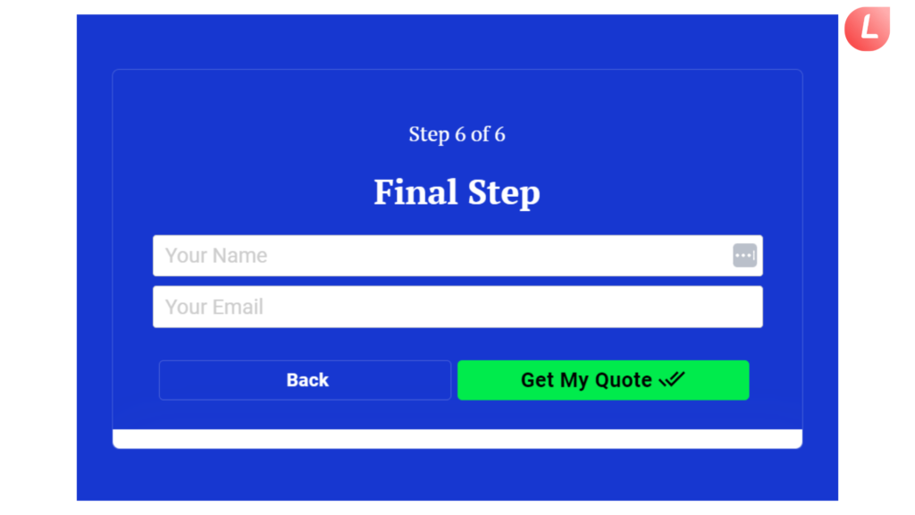
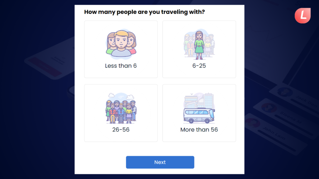
4. Quote Request Form
The quote request form provides various distinct benefits designed to simplify the quote-obtaining process while improving user experience.
Firstly, the option to include images/icons on the quotation request form improves its usefulness and value. Users can submit relevant photos or papers to provide extra context or parameters for their requests. This graphic aspect promotes clearer communication between consumers and service providers, resulting in more accurate quotations and outcomes.
Secondly, its use of conditional logic allows for dynamic form fields, in which new questions or alternatives are provided based on users’ past replies. This tailored method guarantees that visitors only see relevant fields, which reduces clutter and increases form completion rates.
Furthermore, the quotation request form enables customizing, allowing users to provide unique information or preferences related to their needs. This personalization generates a sense of ownership and control, allowing consumers to better define their wants and get personalized solutions from service providers.
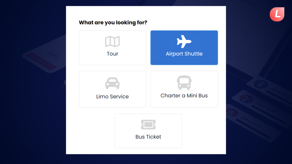
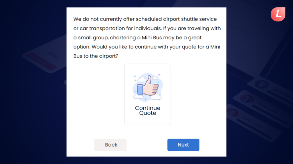
Furthermore, the form’s design focuses on simplicity and conciseness, with fewer form fields to browse. By lowering the amount of needed fields, the form becomes easier for users to fill out, reducing friction and promoting greater completion rates. This user-centric strategy promotes usability and accessibility, eventually improving the whole quotation request experience for users.
5. Quiz Form
The online quiz form created with the LeadGen App form builder has a variety of elements aimed at improving user experience and brand engagement. Personalization features allow users to personalize their form designs to their specific interests and needs, generating a sense of relevancy. This customization extends to branding choices, which allow organizations to match the form’s design to their visual identity for consistent brand representation.
Furthermore, the option to select from pre-designed themes or upload new themes provides a level of freedom and creativity, allowing users to tailor the form’s look to their tastes or brand requirements. This personalization not only improves visual appeal but also strengthens brand identification and professionalism.
In addition to its visual versatility, the online quiz form promotes user-friendliness, with simple navigation and instructions. By streamlining the form-filling process, users can easily browse the form, minimizing friction and increasing completion rates.
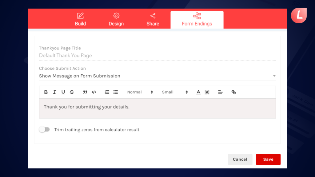
Furthermore, the multiple-form ending function enhances the user experience by personalizing it. Users may write personalized thank-you messages based on their comments, which increases engagement and leaves a lasting impression. This personalized strategy recognizes and encourages consumers’ contributions, building good emotion toward the business.
Overall, the online quiz form’s combination of customization, branding possibilities, usability, and customizable finishes results in a smooth and engaging user experience that fosters brand-consumer connections.
Use A Multi-Step Form Template To Help You Get Started
As you read this essay, you may have wondered:
How can we create a multi-step form like these examples?
The answer…
Here’s the deal.
To create a very fantastic, high-converting LeadGen App multi-step form like some of the examples above, you don’t have to reinvent the wheel by hiring a developer or writing one yourself.
We do not suggest it. Creating your own multi-step form may be both time-consuming and costly. There’s backend code, frontend, UX/UI, security issues, and email deliverability of lead magnets, and every single change you want to make necessitates more development.
LeadGen App focuses on the:
- Flexibility of designs
- Customization
- Automation
- A/B Testing
- Form tracking
- Multiple form endings
- The highest possibility of lead conversion practices like partial leads, Google Analytics, and much more.
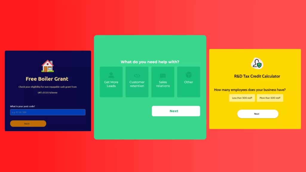
For this reason, we recommend starting with a multi-step form template. We have hundreds of templates from a variety of different sectors to help you get started.

How to Build Your Own Multi-Step Forms?
As you can see, a multi-step form is an extremely powerful lead-generation technique.
However, these smart, dynamic forms are not always simple to create.
From question selection to form design, it can be difficult to get it right.
Hopefully, the examples in this post offered some inspiration.
If you need help along the way, use LeadGen App’s multi-step form builder. We created the LeadGen App form builder to make it extremely easy to create your own multi-step forms without having to code or employ a tech staff.
Simply choose a template and make it your own.
Register for a LeadGen App account. No credit card is necessary during the sign-up process.
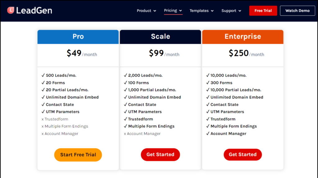
You can try the app free for 14 days and sign up for any suitable plan inside the app, depending on your needs and goals, such as the number of forms you need and how many lead responses you expect every month. Here is a breakdown of the LeadGen App pricing plans.
Do you need inspiration or want to see more instances of multi-step forms in action?
Get rid of those basic forms and start with high-end, conversion-optimized, lead-generating LeadGen App forms!
View our template store.
Q/A
1. What is the purpose of a multi-step form?
The purpose of a multi-step form is to break down a long form into smaller, more manageable sections. This makes it less overwhelming for users and improves the overall user experience.
2. How do I create a multi-step form?
To create a multi-step form, you can use a variety of tools and technologies such as HTML, CSS and JavaScript. You can also use form builder software like LeadGen App or a plugin for your website.
3. How do I make sure my multi-step form is user-friendly?
To make sure your multi-step lead forms are user-friendly, you should keep them simple and easy to understand, use clear and concise labels, provide clear feedback and validation, and use progress indicators.
4. How can I track progress and save data in a multi-step form?
You can track progress using a progress bar or step indicator, and save data using cookies or local storage. You can also use server-side storage to save data if you need to process it later.
5. Can I use multi-step forms for mobile devices?
Yes, you can use multi-step forms for mobile devices. Just make sure that the form is optimized for mobile and can be easily completed on a small screen.
6. How can I make sure my multi-step form is secure?
To make sure your multi-step form is secure, you should use secure protocols such as HTTPS, and make sure that the data collected is stored in a secure location.
7. Can I use conditional logic in a multi-step form?
Yes, you can use conditional logic in a multi-step form. This allows you to show or hide certain fields or steps based on the user’s previous answers.
8. How can I test my multi-step form?
You can test your multi-step form by getting feedback from a group of users and identifying any issues that need to be addressed.
We sincerely appreciate you taking the time to read this blog post. We hope you found it insightful and informative. If you have any questions or comments, please feel free to reach out here. Thank you for your attention, and we wish you the best of luck in your endeavors!
